Blog
Competitor Ad Analysis: Win Your 2026 Meta Strategy
Published July 20, 2026
You're probably doing what most new dropshippers do at the start. You open the Meta Ad Library, search a few brand names, save screenshots of ads that look polished, then try to make something similar for your own store. A few days later, you've got a swipe file full of random creatives and no clear idea why any of them might work.
That's where most competitor ad analysis goes wrong. The useful part isn't collecting ads. It's decoding the system behind them. Which angles keep showing up. Which hooks survive. Which offers connect to which landing pages. Which ideas competitors stopped using. If you're working with a small budget, that difference matters because you can't afford broad, messy testing.
Good analysis gives you a tighter path. You stop asking, “What ad should I copy?” and start asking, “What strategy is this brand betting on, and where are they leaving space for me?”
Table of Contents
- Finding Your True Competitors and Their Hidden Ads
- Deconstructing an Ad The Five Core Components to Capture
- How to Score Ads and Prioritize What Matters
- Finding Untapped Angles Your Competitors Missed
- From Insight to Action A Testable Campaign Plan
- Common Pitfalls and How to Stay Ahead of the Curve
Finding Your True Competitors and Their Hidden Ads
You open Meta Ad Library, search the obvious category leader, and spend 20 minutes saving polished ads you cannot afford to make. Then you test against the wrong benchmark and conclude your product is weak. The product usually is not the problem. The competitor set is.
A common mistake is tracking brands that look impressive instead of brands that compete for the same click, the same impulse buy, and the same buyer objection. For a small-budget dropshipper, the goal is not to build a giant swipe file. The goal is to map the ad patterns that are already working around your offer, spot the dead clusters that keep repeating, and find the emotional gaps nobody is covering well.
A cleaner starting point is a short list with structure. Use three tiers: direct competitors, indirect competitors, and aspirational brands. Semrush's competitor ad spend framework is a useful reference for organizing that watchlist and filtering for ads with signs of traction.
Build your list in three tiers
Direct competitors sell nearly the same product to the same buyer with a similar price expectation. If you sell a posture corrector, this group is not “health brands.” It is stores pushing posture correction to the same problem-aware shopper.
Indirect competitors solve the same pain from a different angle. That could include ergonomic desk brands, back relief tools, braces, or mobility products. This is often where the better insights sit, because indirect competitors reveal the emotional job the customer is hiring the product to do.
Aspirational brands have stronger systems than you do right now. Track them for message discipline, offer pacing, and how they refresh concepts without abandoning a winner. Do not use them as your default creative benchmark if their budget, product depth, and retention engine are far ahead of yours.
Build the list with a simple process:
- Search the product keyword first and log brands that show up repeatedly in paid placements, TikTok search results, and your social feed.
- Check how customers describe the problem in reviews, Reddit threads, comments, and creator videos. Buyers often mention alternatives more candidly there than they do on product pages.
- Use your earlier research notes to tighten the list before you start tracking creatives. If your research is still loose, this guide to market research for products helps narrow the field.
Practical rule: Track brands with overlap in buyer, promise, and price logic. If one of those three is off, the ad may look good and still teach you the wrong lesson.
Use the Ad Library like an analyst
Searching a brand name is easy. Reviewing ads in a way that produces test ideas is where most beginners waste time.
Start by looking for signs of repetition. The same hook in different edits. The same offer in multiple statics. The same spokesperson angle appearing across weeks. That is usually a stronger signal than one polished launch video. Repetition tells you the brand found something worth feeding.
This is also where dead clusters show up. A dead cluster is a group of ads built on the same angle that keeps getting refreshed visually without changing the core promise. You will see three to six variations saying the same thing with different thumbnails, cuts, or captions, but no new emotional entry point. That usually means the brand is trying to squeeze more from a message that is flattening out.
Create a tracker with columns like these:
| Brand type | Brand | Main angle seen | Format used | Offer style | Notes |
|---|---|---|---|---|---|
| Direct | |||||
| Indirect | |||||
| Aspirational |
Keep the notes column practical. Write things like “pain relief before posture,” “discount repeated across 4 ads,” “UGC clips all target desk workers,” or “strong proof, weak emotional payoff.” That gives you material for testing later, instead of a folder full of screenshots with no pattern behind them.
What hidden ads really means
Hidden ads are rarely secret ads. They are the ones beginners skip because they look plain, awkward, or repetitive.
Some of the best signals come from rough UGC, low-design statics, founder videos shot on a phone, and ads with one narrow objection in focus. Those creatives often survive longer because they are built around a clear sales job. Flashy ads get attention. Plain ads often get purchases.
Watch for what competitors are not saying, too. If every direct competitor pushes convenience, but nobody addresses embarrassment, fear of worsening the problem, or frustration with failed alternatives, that gap matters. That is where your first few test rounds can beat a better-funded brand.
Deconstructing an Ad The Five Core Components to Capture
A good ad isn't one thing. It's a stack of decisions. If you only save the screenshot, you lose the stack.
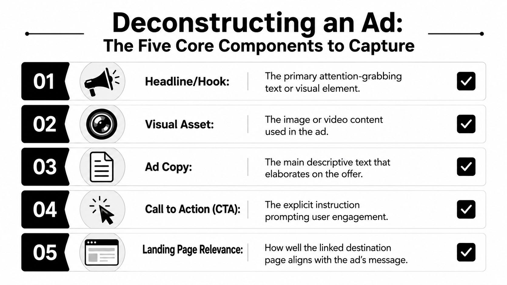
The fastest way to make competitor ad analysis useful is to break every ad into the same five components. That gives you something you can compare across brands, angles, and formats instead of relying on gut feel.
Capture the five parts the same way every time
Use this checklist for each ad you log:
- Hook. What stops the scroll in the opening moment. This might be a bold claim, a visual demo, a problem statement, or a face-to-camera opener.
- Visual asset. What the viewer sees. UGC selfie video, product demo, testimonial montage, before-and-after, static image, founder talk, meme edit.
- Ad copy. The main text, headline, and any on-screen overlays that carry the message.
- Call to action. What action the brand asks for, and how direct or soft that ask feels.
- Landing page relevance. Whether the page continues the same promise, angle, and offer, or breaks the flow.
That final point gets missed all the time. An ad can look strong and still fail because the page shifts tone, drops the proof, or asks for too much too soon.
Look for repeated angles, not isolated creatives
For Meta specifically, repeated messaging angles across competitors such as Problem→Solution, UGC, or Social Proof are strong performance signals, based on Coupler's competitor analysis framework. That matters more than whether one ad uses better lighting or sharper editing.
If you review ten ads in your niche and six of them use some version of “problem, simple fix, proof,” that pattern is the signal. Your job isn't to clone the exact words. Your job is to understand why that structure keeps surviving.
Here's a simple logging format that works well:
| Component | What to write down |
|---|---|
| Hook | First line, first scene, or first tension point |
| Angle | Problem→Solution, UGC, Social Proof, identity, offer-led |
| Visual | Selfie, demo, static, carousel, talking head |
| Copy | Main benefit, objection handled, CTA |
| Landing page | Product page, advertorial, quiz, collection, lead page |
If you're building new ads from those observations, a library of Facebook ad templates can help you turn the pattern into a usable draft without copying the original creative.
Don't ask whether an ad looks good. Ask whether the hook, angle, visual, copy, and page all point at the same belief.
A beginner mistake that wastes research
New advertisers often log “what” but not “why.”
They'll write:
- “Woman holding product”
- “UGC style”
- “Discount in headline”
That isn't enough. You need the strategic interpretation behind each one:
- Woman holding product becomes “creator credibility and relatability”
- UGC style becomes “low-polish trust signal”
- Discount in headline becomes “price friction handled immediately”
That's what turns a swipe file into a decision tool. Once you log ads this way for a few brands, patterns get obvious fast. You'll see the same objections, the same proof devices, the same emotional triggers, and the same landing page choices repeating under different visual styles.
How to Score Ads and Prioritize What Matters
Most competitor ad analysis collapses under one problem. Too much material, not enough judgment.
You save dozens of ads, maybe more, and they all start to blur together. One has a strong hook. Another has better comments. Another feels more polished. None of that helps if you can't decide what deserves a test first.

Longevity beats novelty
Here's the filter that matters most. Ad longevity is a primary success indicator, especially when ads run for longer across multiple platforms at the same time, as noted by Ryze's competitor ads analysis guide. A lot of beginners miss that because they chase whatever looks new.
That's backwards.
A new ad tells you what a competitor is trying. A long-running ad tells you what they kept funding. If you've got a small budget, that difference should shape your attention immediately.
Use a simple scorecard
You don't need a complicated dashboard. You need a repeatable way to sort signal from clutter.
Score each ad on these dimensions:
| Dimension | What you're judging |
|---|---|
| Longevity signal | Does it appear to have survived over time? |
| Angle clarity | Can you explain the message in one sentence? |
| Hook strength | Does the opening tension or promise land fast? |
| Proof depth | Is there demo, testimonial, visual evidence, or strong offer support? |
| Page match | Does the landing page continue the ad's promise cleanly? |
Keep the notes short. A sentence or two per row is enough.
Then sort your sheet into three buckets:
- Steal the structure for ideas with clear strategic value
- Watch longer for ads that might be promising but need more observation
- Ignore for clutter, weak messaging, or mismatched pages
This is also where disciplined testing matters. If you need a refresher on why too-early decisions wreck small-budget campaigns, statistical significance in ad testing is worth understanding before you cut winners too early or overreact to noise.
Working standard: A boring ad with clear proof and long survival is usually more valuable than a clever ad with no visible staying power.
What to prioritize first
When you're stuck between several ideas, prioritize in this order:
- Long-running angles that show up in more than one competitor account
- Clear proof mechanisms like demos, transformations, testimonials, or visual evidence
- Offers tied to intent, especially when the landing page confirms the same promise
- Creative styles you can realistically produce without forcing a fake brand look
Here's a helpful walkthrough on reviewing ad patterns with a more analytical eye:
What doesn't deserve your attention
Don't over-prioritize:
- comment count by itself
- flashy editing
- broad “viral” energy
- any ad you can't reproduce credibly for your own store
A solo founder with a simple product page usually gets more from a straightforward, believable ad structure than from trying to mimic a bigger brand's polished production.
That's the trade-off. You're not hunting the most impressive ad. You're hunting the most transferable strategy.
Finding Untapped Angles Your Competitors Missed
Copying active ads is the obvious move. It's also where most new advertisers flatten themselves into the same look, same promise, and same buyer conversation as everyone else in the feed.
The better opportunity often sits in what competitors stopped running and what they never explored emotionally.
Study dead clusters, not just survivors
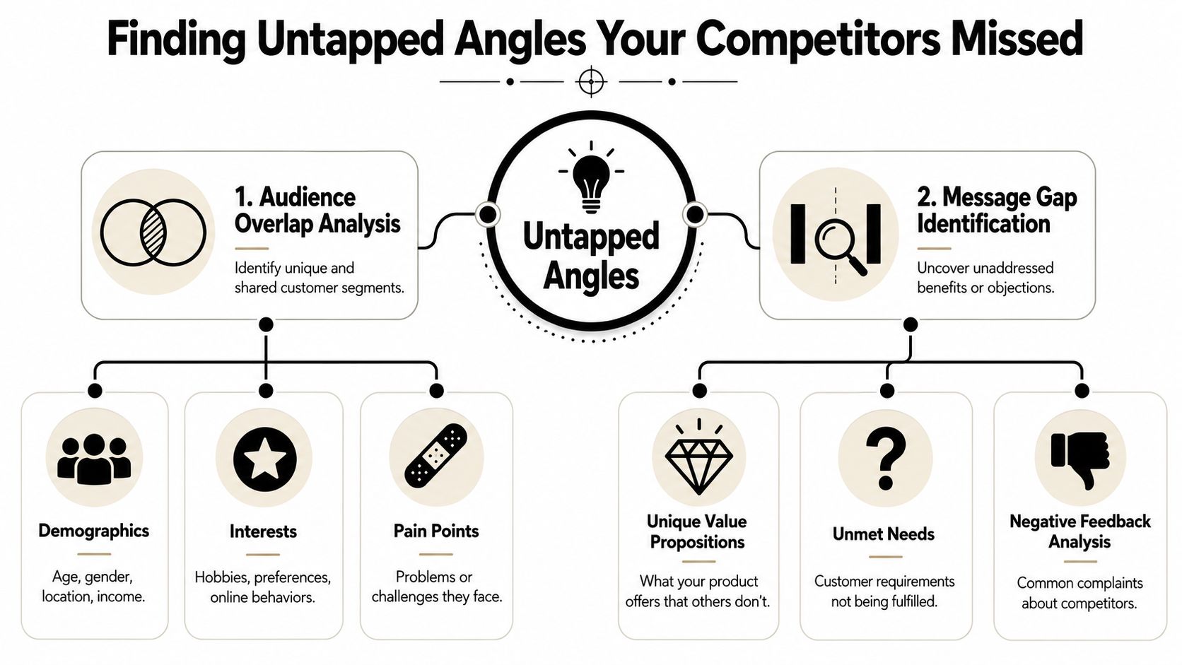
A strong contrarian move in competitor ad analysis is looking at dead clusters, which are ad angles competitors tested and then abandoned after a short run. According to Brandsearch's analysis of stopped ad angles, the highest-ROI opportunity often comes from diagnosing whether the execution failed, not whether the angle itself was bad.
That matters because beginners often see a dropped concept and assume, “This angle doesn't work.”
Sometimes the angle was fine. The hook was weak. The creator lacked credibility. The offer didn't match the promise. The format was wrong for the claim.
Use this lens when you find a dead cluster:
- Hook issue. The benefit may be valid, but the opening never earned attention.
- Format issue. The idea may need demo footage instead of talking-head delivery.
- Offer issue. The angle may create interest, but the page or CTA didn't convert it.
- Audience mismatch. The message may suit a different subsegment than the one targeted.
If competitors abandoned a concept quickly, don't copy it blindly. But don't bury it either. Diagnose it.
Build a themes-by-emotion matrix
Most beginners gain real separation here.
Only 15% of guides recommend building a themes-by-emotion matrix to find empty testing cells, yet angles derived from that method can produce 2.3x higher ROAS than generic angle tests, based on Markana Media's competitor ad copy research strategy.
The method is simple. Put your key product themes on one axis and emotional triggers on the other.
For example:
| Theme | Relief | Confidence | Control | Belonging | Status |
|---|---|---|---|---|---|
| Convenience | |||||
| Savings | |||||
| Results | |||||
| Simplicity |
Then map competitor messaging into the cells they already occupy.
You'll usually find clustering. Maybe every competitor sells “results + relief” and “simplicity + relief,” but nobody is touching “results + confidence” or “convenience + control.” Those empty cells can become fresh angles that still fit buyer psychology.
What this looks like in practice
If your niche is crowded with problem-solution pain language, try reframing the same product around identity, certainty, ease, or self-respect. If everyone is running direct-response discount hooks, test an emotional angle with the same underlying benefit but a different reason to care.
That's a better route than copying a winner line for line. You still learn from the market, but you don't disappear into it.
From Insight to Action A Testable Campaign Plan
You finish a few hours of competitor research, open Ads Manager, and still have no idea what to make first. That usually means the research stayed descriptive. The account needs decisions.
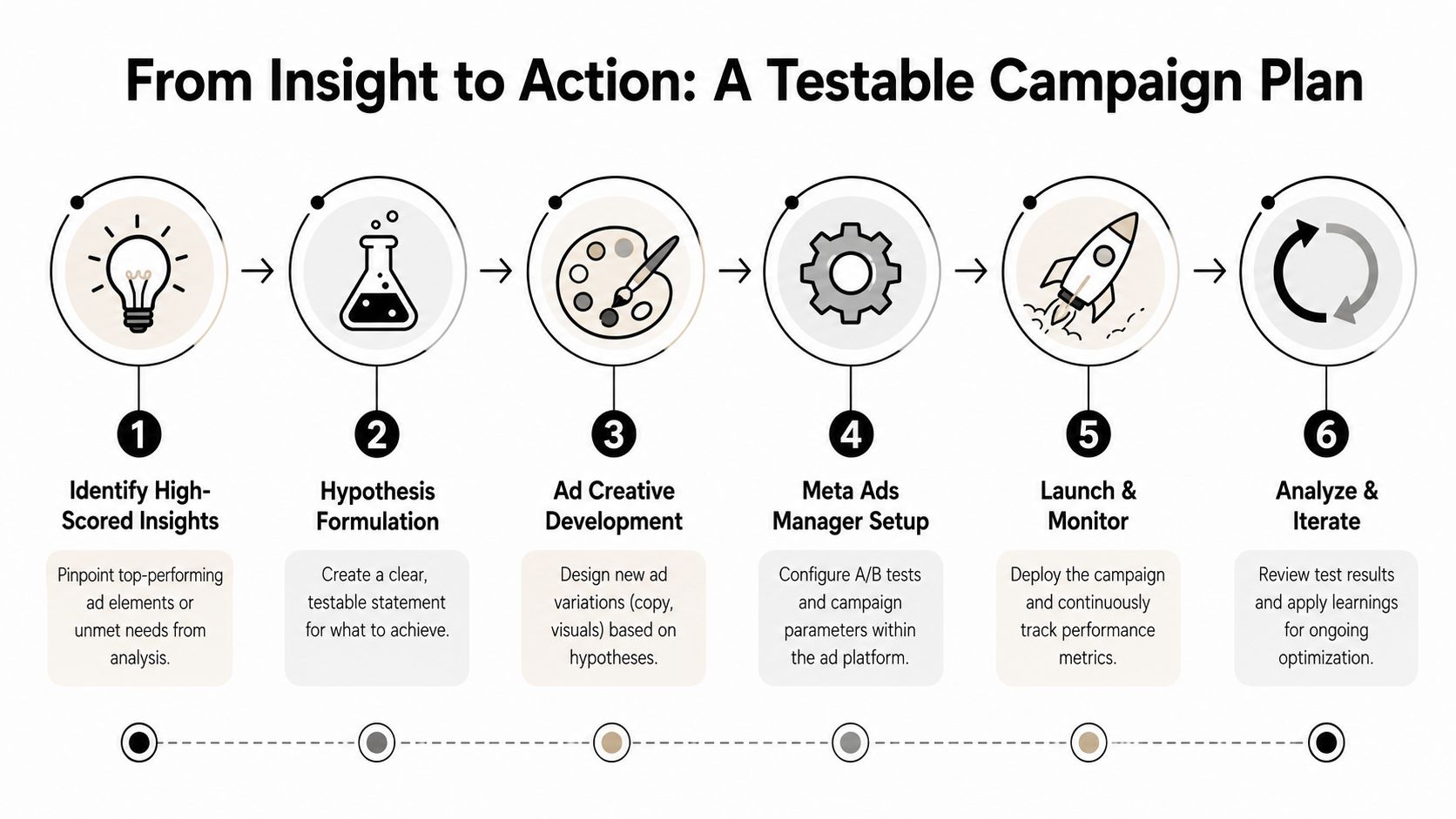
Turn every useful finding into a small testing plan you can build this week. For a lean store, that usually means three to five ads tied to one clear question per round.
Turn observations into hypotheses
Raw notes are useless in production. Hypotheses give your team something to test, reject, or refine.
Write them in a simple cause-and-effect format:
- If competitors keep winning with UGC problem-solution setups, a tighter first-person demo may hold attention better for cold traffic.
- If several brands lead with proof before mentioning price, proof-led hooks may beat discount-led hooks for this product.
- If a dead cluster had a believable promise but weak creative execution, that angle may still work with a stronger hook, clearer proof, or a better creator.
That last one matters. Dead clusters are where beginners can still find cheap lessons. If five competitors tried an angle and none of them scaled it for long, do not assume the angle is bad. Check whether they buried the payoff, used weak visuals, made the claim too broad, or matched the wrong format to the promise.
Write briefs that force clarity
A good brief for a small-budget test should feel almost too simple. If it takes a page to explain, the angle is probably muddy.
Use one brief per ad concept:
| Brief field | What to enter |
|---|---|
| Angle | The belief or desire you want the ad to sell |
| Hook | The first line or visual that earns the stop |
| Format | UGC, static, demo, testimonial, founder video |
| Proof | The evidence that makes the claim believable |
| CTA | The action you want after the click |
Keep each brief narrow. If one ad tries to test a new angle, a new mechanism, a new offer, and a new CTA at the same time, you will get a result but not a lesson.
Plan tests in rounds
Testing rounds keep the workload under control and make the read cleaner.
Use this sequence:
- Round one: Test distinct angles against each other.
- Round two: Keep the strongest angle and test different hooks, creators, or proof styles.
- Round three: Tighten the click-to-landing-page match, CTA, and offer framing.
This structure saves money because each round answers a different question. Round one finds where buying intent lives. Round two improves delivery. Round three helps conversion rate catch up.
For a new dropshipper with a small budget, I would rather see four disciplined angle tests than twelve random creatives launched on the same day.
Use ICE as a sorting tool, not a ritual
A simple ICE pass works well here:
- Impact: Could this angle change buying intent in a meaningful way?
- Confidence: Did your competitor review, customer comments, or product understanding give you a solid reason to test it?
- Ease: Can you produce it well with the assets, creators, and proof you already have?
Score fast and move on. The point is to rank ideas, not to pretend scoring is precise.
The best short list usually includes three types of bets. One obvious market-backed angle. One differentiated angle pulled from an emotional gap competitors missed. One reclaim attempt from a dead cluster that had strategic potential but poor execution.
That mix is what separates decoding from copying. You use competitor ads to reduce waste, spot where the market is overcrowded, and choose tests that still give you a chance to say something meaningfully different.
Common Pitfalls and How to Stay Ahead of the Curve
You spend two nights saving competitor ads, build a tracker, highlight three angles you like, and still have nothing live by Friday. That is the failure point for new dropshippers. The problem usually is not research quality. It is the gap between spotting a pattern and turning it into a test.
Small-budget accounts get punished from both sides. If you research too loosely, you copy the loudest ad in the feed and miss why it worked. If you research too long, the account stays inactive while competitors refresh hooks, creators, and offers.
The traps that keep showing up
Analysis paralysis shows up when the swipe file keeps growing but the testing queue does not. Fix it by putting limits on the process. Track fewer brands. Capture only the five components from your framework. Review on a schedule. If an insight does not earn a place in the next testing round, archive it and move on.
Literal copying burns money fast. The ad you saved may have worked because the brand had stronger comment proof, better creator-product fit, a cleaner offer, or a landing page that closed the sale. Surface-level cloning hides the lesson. The better move is to identify the mechanism behind the ad, then rebuild it in your own voice, with your own proof, for your own audience.
Shiny-object bias is quieter, but it hurts just as much. New formats and trendy edits pull attention because they look current. That does not make them a priority. Beginner accounts usually get more from repeated market signals than from chasing whatever looks fresh this week.
One more trap matters here. People misread dead clusters.
A dead cluster is not just a weak angle. Sometimes it is a strong strategic idea with bad execution. The hook was slow. The creator was wrong. The proof was thin. The offer came too late. If you write off the whole angle, you can miss one of the few affordable ways to enter a crowded market with a better version of something buyers already understand.
Stay ahead with a repeatable habit
Good competitor analysis runs on cadence, not mood. Keep the routine tight enough that you will maintain it.
A practical rhythm looks like this:
- Weekly: check for newly launched ads, repeated hooks, and concepts that disappeared fast
- Every two weeks: review your tracker for patterns, dead clusters, and emotional gaps that still look underused
- Monthly: choose what enters the next testing round, what gets cut, and what needs a stronger execution angle
That schedule is enough for a lean DTC team or solo operator. It keeps your read on the market current without turning ad research into a separate job.
Your edge usually comes from better interpretation, not better spying.
Keep your standards practical
Do not build a giant intelligence system if you are still trying to get your first winning angle. Build a useful one.
Track a short competitor list. Log ads the same way every time. Mark which clusters look saturated, which ones died early, and which emotional states competitors keep ignoring. Then turn that into a round-by-round plan with a clear purpose for each test.
That last part matters. Staying ahead is not about collecting more ads than other beginners. It is about reaching decisions faster, avoiding crowded clusters, and testing angles that competitors either executed badly or never addressed at all.
If you want a faster way to turn product research into a usable Meta launch plan, Social Loop AI helps first-time ecommerce founders go from product URL to angles, ad concepts, creative batches, and a round-by-round testing plan without hiring an agency. It's built for the exact moment when you've got limited budget, limited time, and need clearer decisions instead of more tabs.