Blog
7 Ecommerce Landing Page Best Practices for 2026
Published July 12, 2026
Your Ads Work, But Your Landing Page Doesn't. Let's Fix That.
You launch a product ad, see clicks coming in, and expect a few purchases by the end of the day. Instead, visitors hit the page, hesitate, and leave. That pattern is common for new dropshippers and small DTC brands, especially when the ad is decent but the landing page still looks like a default theme with a few edits.
The problem is usually not the product. It is not always the ad account either. In many cases, the page fails to carry buying intent from the click to the checkout.
That is good news, because fixing a page is often cheaper than chasing a better product or spending more on ads.
A small Shopify or WooCommerce store does not need an expensive CRO retainer to improve conversion. It needs a page that matches the ad, loads quickly on mobile, answers obvious objections, and makes the next step easy to spot. Those are practical fixes you can make today with your theme, your copy, and a few better decisions about layout.
Industry benchmark ranges show a wide gap between average landing pages and top performers. That gap usually comes from execution, not brand size. Clearer messaging, stronger proof, faster load times, and less friction at key decision points tend to beat fancy design. For budget-conscious brands, that is the opportunity. You do not need an enterprise playbook. You need a page that does the basic conversion work well.
Table of Contents
- 2. 2. Build Unshakable Trust with Proof and Guarantees
- 3. 3. Optimize Product Details for Scanners
- 4. 4. Implement Ruthless Mobile First Speed Fixes
- 5. 5. Create a Low Friction Path to Checkout
- 5. 5. Create a Low Friction Path to Checkout
- 7. 7. Start Simple A B Testing Even on a Budget
- 7. 7. Start Simple A B Testing Even on a Budget
- 7-Point Comparison: Ecommerce Landing Page Best Practices
- From Page to Profit Your Action Plan
2. 2. Build Unshakable Trust with Proof and Guarantees
A new visitor clicks your ad, likes the product, then hesitates for three seconds because the store feels unfamiliar. That pause is where a lot of budget brands lose the sale.
Small DTC brands and new dropshippers do not get the benefit of the doubt. Buyers have seen slow shipping, weak products, and sketchy return policies before. Your landing page has to reduce that risk fast, especially near the points where they decide whether to buy.
Put Trust Signals Where Doubt Shows Up
Trust works best beside the action, not buried in a footer. Place proof near the Add to Cart button, price, delivery estimate, and returns info. Those are the spots where buyers pause and start looking for reasons not to proceed.
For a lean store, a strong trust stack usually includes:
- A small number of real reviews: Ten believable reviews beat fifty vague ones.
- Customer photos or basic UGC: Clear phone photos often feel more credible than polished brand shots.
- Payment method logos: Shop Pay, PayPal, Visa, and Mastercard reduce uncertainty fast.
- Specific testimonials: “Used it on a 6-hour flight and it fit under the seat” does more work than “Amazing product.”
If you want examples of how customer proof can support both ads and landing pages, this guide to testimonial advertising is a useful reference.
Guarantees Need Specific Terms
A generic “satisfaction guaranteed” badge does very little. Buyers want to know what happens if the product arrives late, feels cheap, or does not match the page.
Spell out the policy in plain language. Say how many days they have, who pays return shipping, and whether they need the original packaging. If the policy has limits, state them. Clear terms build more trust than broad promises.
Budget brands should be careful here. A generous guarantee can lift conversion, but it can also create margin problems if your supplier quality is inconsistent. Start with a policy you can honor, then tighten product quality before you expand the promise.
Use Proof That Matches the Objection
Different products trigger different doubts. A skincare product needs texture, routine fit, and skin-type context. A travel bag needs size proof, pocket layout, and carry-on fit. A posture brace needs comfort, sizing clarity, and wear-time expectations.
That is why random five-star reviews are not enough. Choose proof that answers the most common hesitation for that item. If buyers keep asking about fit, show fit. If they worry about shipping time, show delivery expectations clearly. If they question quality, show close-up materials and real customer use.
This is also where solid product page optimization for ecommerce brands helps. The best product pages do not just describe the item. They remove the specific fear blocking the purchase.
Cheap Fixes That Usually Improve Trust Fast
You do not need a CRO agency to tighten this up. Start with the basics:
- Add 3 to 5 specific reviews near the buy button.
- Replace any fake-looking stock testimonial photos.
- Put shipping timing in plain English.
- Rewrite your return policy summary so a first-time buyer can understand it in one scan.
- Show at least one real-world product image that is not a supplier render.
Trust is rarely built by one badge or one promise. It comes from a page that feels consistent, specific, and honest. For newer brands, that alone can move conversion more than another round of design tweaks.
3. 3. Optimize Product Details for Scanners
A shopper clicks your ad on a phone, lands on the page, and starts hunting for three things right away. What it does. Whether it fits their situation. What could go wrong.
If those answers are buried in a wall of copy, budget traffic gets wasted fast. New dropshippers and small DTC brands do not need longer descriptions. They need cleaner ones.
Write for Fast Scanning, Not Deep Reading
Buyers rarely read product details in order. They jump between bullets, images, shipping info, sizing, and FAQs. Your job is to make the answer easy to spot on the first pass.
A simple fix is to turn features into customer outcomes. Do not stop at what the product is. Explain what changes for the buyer.
For example, if you sell a merino wool base layer:
- Weak feature line: “Made from 100% merino wool”
- Stronger benefit line: “Keeps you warm without extra bulk”
- Stronger use-case line: “Comfortable for flights, hikes, and everyday wear”
That last step matters. Budget-conscious brands often copy supplier specs and call it a product description. Supplier specs do not sell well because they skip the buying questions.
If you sell a red light therapy belt, lead with the details a cautious buyer scans for: where it fits, how long each session takes, what daily use looks like, and how returns work. A stronger product page optimization process for ecommerce stores starts by listing those buying questions before rewriting a single bullet.
Put the Highest-Value Details First
Do not give every detail equal weight.
The first few bullets should handle decision-making details, not filler. Material, dimensions, compatibility, care instructions, and package contents all matter, but they do not all belong in the same visual position. Put the details that affect purchase confidence near the top. Push secondary information lower on the page or into an accordion.
For a small brand, this is one of the cheapest conversion lifts available. No redesign. No developer. Just better content hierarchy.
A useful rule is simple. If a detail would stop someone from buying, surface it early. If it only helps after purchase, move it down.
Use a Scanner-Friendly Structure
Good scanning structure usually looks like this:
- A short product summary in plain English
- 3 to 5 outcome-led bullets
- A sizing, fit, or compatibility block
- A usage block that explains setup, frequency, or care
- A short FAQ for common objections
That structure works because it respects how people shop on mobile. It also cuts support questions, which matters if you are running the store yourself and cannot afford a flood of pre-purchase emails.
Cut Words That Add Length but Not Clarity
Small brands often over-explain because they are trying to sound premium. The result is usually slower comprehension.
Replace vague lines like “crafted for modern lifestyles” with specifics like “fits a 16-inch laptop and slides under most airline seats.” Replace “high-quality materials” with the actual fabric, finish, or durability claim you can show in photos. If a sentence does not help someone decide, trim it.
Clear copy usually beats clever copy on product pages. Especially with cold traffic.
A Fast Fix You Can Make Today
Open your product page and read only the first screen plus the first five bullets. If a first-time visitor still cannot answer what the product does, who it is for, and the main risk to watch for, rewrite that section first.
That one pass will usually do more for ad-to-page conversion than adding another design app or chasing a prettier layout.
4. 4. Implement Ruthless Mobile First Speed Fixes
A shopper taps your ad on Instagram, waits, scrolls past a slow-loading hero image, gets hit with a pop-up, and leaves before the buy button fully settles. That is the conversion leak.
Speed Is a Conversion Lever You Can Actually Control
For new dropshippers and small DTC brands, mobile speed is one of the few conversion levers you can improve today without paying a developer or CRO agency. A page that feels slow on a phone creates doubt fast. Visitors assume checkout will be annoying, shipping will be slow, or the store is not fully legit.
Desktop previews hide a lot of these problems. On mobile, heavy themes, oversized images, sticky widgets, and app scripts pile up quickly. The result is simple. Your paid traffic gets more expensive because fewer people make it far enough down the page to buy.
The good news is that the highest-impact fixes are usually cheap.
Start With the Elements That Slow the First Screen
Focus on what loads before a shopper can act. If the first screen is bloated, everything after it suffers too.
A practical cleanup list:
- Compress hero and gallery images: Large PNGs are a common problem. Convert decorative images to lighter formats and keep product images only as large as needed for mobile.
- Cut autoplay video at the top of the page: A static thumbnail with a play button usually does the job without slowing the first load.
- Remove app blocks you do not need: Countdown timers, multiple review tools, chat widgets, upsells, announcement bars, and pop-ups often stack on top of each other.
- Limit custom fonts: One font family with a small set of weights is usually enough for a product page.
- Check your sticky elements: Sticky add-to-cart bars help. Three sticky bars fighting for space do not.
I see this a lot on newer Shopify stores. Owners add apps to patch conversion problems, then those same apps drag down page speed and mobile usability. A simpler page often converts better than a feature-packed one.
Audit Like a Budget-Conscious Operator
You do not need a full technical audit. Open the page on your own phone, on regular mobile data, and watch what happens in the first five seconds.
Ask four questions:
- Can I see the product and offer right away?
- Can I scroll without lag or jumping?
- Can I find the buy button quickly?
- Do any pop-ups or widgets interrupt the first action?
If any answer is no, start there.
Fix Order Matters
Do not start with minor theme tweaks if a giant homepage-style banner is choking the page load. Remove the biggest blockers first. Usually that means media weight, app clutter, and aggressive overlays.
For small brands, that is the trade-off worth making. A page with fewer effects, fewer widgets, and faster load time often looks less flashy. It also tends to convert better from cold ad traffic, which matters more than having a page that feels "built out."
5. 5. Create a Low Friction Path to Checkout
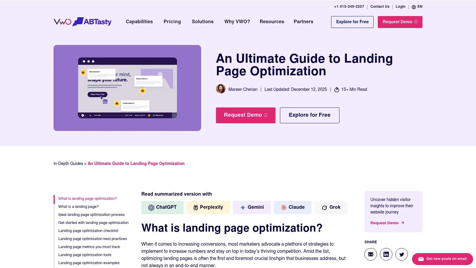
You pay for the click, the shopper lands, taps around for ten seconds, then disappears. On a lot of small-store landing pages, the problem is not the product. It is the path to buy.
Cold traffic needs direction. New dropshippers and lean DTC teams usually do better with one clear buying route than with a page full of options that look "complete" but slow the decision down.
Remove Exit Ramps and Extra Decisions
A paid-traffic landing page should guide one action. Buy the product. Anything that competes with that action needs a hard review.
For budget-conscious brands, the lowest-cost fix is often the most profitable one. Strip out the top navigation on ad landing pages. Cut the footer links down to the basics. Do not send people to your blog, size guide hub, quiz, collection page, and Instagram from the same session unless one of those links is required to complete the purchase.
This is the trade-off. A page with fewer links can feel less polished to the store owner. It usually feels easier to buy from for a first-time visitor.
If the offer is a bundle, sell the bundle. If the hero pushes one SKU, do not place three other products above the add-to-cart button. Mixed intent kills momentum.
Make the Buy Action Obvious on Every Screen
The buy button should be easy to spot without hunting for it, especially on mobile. Repeat the primary CTA at natural decision points. Keep button copy specific. "Add to Cart" or "Get My Bundle" usually works better than vague labels.
Sticky add-to-cart bars can help when the main product form drops out of view. Express checkout buttons can help too, but only if they do not crowd the main CTA or create confusion about the next step. On lower-ticket products, Shop Pay or Apple Pay often reduce friction. On products that need variant selection, pushing express checkout too early can create errors and abandoned sessions.
That is why clarity matters more than adding every checkout option your theme allows. Good marketing copy that reduces buying hesitation often does more for conversion than another app.
Cut Form Friction Before You Buy More Tools
A surprising number of small stores lose sales in the cart or checkout because they ask for too much, too early.
Use guest checkout. Keep form fields to what you need. Let address autofill work. Make discount code fields less distracting if coupons are not part of your strategy. If shipping costs are high, surface that early so the cart does not become the first place shoppers feel misled.
A simple audit helps here:
- Is account creation optional?
- Are variant selections clear before checkout starts?
- Can a shopper reach checkout without opening multiple drawers or pop-ups?
- Are shipping, delivery timing, and return terms visible before payment?
Fix those basics first. They are cheap to change, and they remove the kind of friction that erodes ad spend.
5. 5. Create a Low Friction Path to Checkout
A lot of stores work hard to earn the click, then sabotage the purchase path with extra decisions. Navigation menus. Multiple offers. Surprise pop-ups. Mandatory account creation. Long forms.
Every added step gives cold traffic another reason to delay.
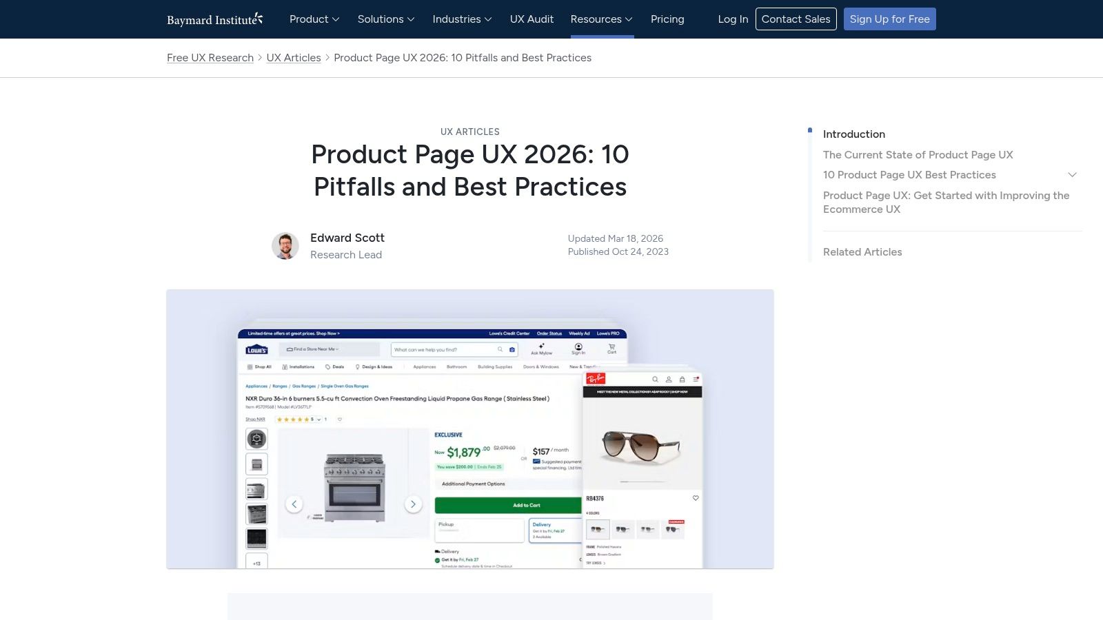
Remove Exit Ramps and Extra Decisions
A focused landing page should feel like one guided path, not a mini homepage. That's one reason single-offer pages still outperform cluttered layouts.
According to Involve.me's data on landing page performance, pages with a single primary CTA convert at an average of 13.5%, compared with around 10.5% for pages with five or more links. The same source reports that shorter landing pages with a singular message outperform longer, text-heavy versions by roughly 13% to 15%.
For a budget-conscious store, the practical move is simple. Remove the top navigation on paid traffic pages. Keep one offer. Keep one main action. If you're selling a bundle, don't also push a quiz, blog, collection page, and newsletter sign-up in the same session.
Make the Buy Action Obvious on Every Screen
Sticky Add to Cart bars and express checkout options earn their keep. On mobile, visible buy controls reduce the need to scroll back up. On checkout, Shop Pay, Apple Pay, Google Pay, and PayPal help buyers skip the slowest part, which is typing.
A good friction audit asks basic questions:
- Can the buyer purchase without creating an account?
- Can they see shipping and returns before checkout?
- Is the main CTA visible after they read key proof sections?
- Are you asking for any field you don't absolutely need?
A page can be visually attractive and still feel tiring to buy from. New brands should optimize for easy, not impressive.
7. 7. Start Simple A B Testing Even on a Budget
A new dropshipper often burns a week rewriting half a product page, then has no idea which edit helped or hurt. The cheaper approach is tighter. Change one thing that shapes buying intent, send comparable traffic, and log the result.
Small brands do not need a formal CRO program. They need a repeatable testing habit that fits low traffic, small budgets, and limited time.
Test the First Thing a Buyer Uses to Judge the Offer
Start with elements that change perception fast. For most stores, that means the headline, hero image, offer framing, or primary CTA copy. A full layout test sounds productive, but it usually creates noise unless you already have strong traffic volume.
A simple example works better. If you sell a castor oil wrap, test one headline focused on comfort against another focused on daily routine support. Keep the price, images, reviews, and button placement the same. That way, if add-to-cart rate changes, you can tie the result to the message instead of guessing.
Good first tests for budget brands include:
- Headline angle: outcome-focused vs problem-focused
- Hero image: clean product shot vs in-use lifestyle image
- Offer framing: percent-off discount vs bundle savings
- CTA copy: “Get My Wrap” vs “Buy Now”
Use a Cheap Testing Log and One Clear Success Metric
I usually tell new founders to keep this boring. Boring wins here. A Google Sheet with five columns is enough: date, page URL, traffic source, what changed, and result.
Pick one primary metric per test. For paid traffic, purchase rate or add-to-cart rate is usually more useful than scroll depth. For warmer retargeting traffic, click-through to checkout can be a better read. Supporting metrics help, but one main number keeps you from rationalizing weak tests.
Work Within the Limits of Low Traffic
Low-budget stores rarely have enough sessions for fancy multivariate tests. That is fine. Run cleaner tests for longer instead of stacking changes and declaring a winner after two days.
There is a trade-off here. Testing slowly feels frustrating, especially when ad spend is live. Random edits feel faster, but they create false positives and send you in circles. A slower process with clearer notes usually saves money by month two.
If traffic is too low for a true split test, use a structured before-and-after test on the same traffic source and keep everything else stable. It is less precise, but still useful if you document it properly.
Budget testing rule: If you change the headline, do not also change the offer, image, and CTA in the same round.
The goal is not to look data-driven. The goal is to learn which page elements change buyer behavior so each next edit has a better chance of raising conversion.
7. 7. Start Simple A B Testing Even on a Budget
You don't need a complex testing program to improve a landing page. You need a habit of changing one meaningful thing at a time and paying attention.
Small brands often overcomplicate this. They install too many apps, test too many variables at once, and end up learning nothing.
Test One High Impact Variable at a Time
Start with the headline, hero image, or primary CTA. Those are easier to change than your whole layout, and they tend to shape first impressions most.
For example, if you sell a castor oil wrap, test two headline angles:
- Angle A: Comfort and ease of use
- Angle B: Daily routine and targeted support
Leave the rest of the page alone. Watch add-to-cart behavior, scroll behavior, and purchase intent from the same traffic source. Don't test headline, image, price, and offer all together unless you're fine learning nothing specific.
Build a Small Testing Habit, Not a Fancy Program
The most practical testing cadence for a solo founder is one change per cycle. Keep a simple log in Notion or Google Sheets. Record the date, the page version, the traffic source, and what changed.
There's another reason to build multiple versions over time. Involve.me's landing page statistics report that companies with 10 to 15 distinct landing pages generate 55% more leads than those with fewer than 10 pages. For a small ecommerce brand, that doesn't mean creating a giant funnel map on day one. It means building separate pages or page variants for different ad angles, different hooks, and different buyer objections instead of forcing every campaign into one generic PDP.
A single “master page” usually underperforms because it tries to speak to everyone. Your ad about gifting, your ad about pain relief, and your ad about portability probably shouldn't all land on the exact same message.
7-Point Comparison: Ecommerce Landing Page Best Practices
| Item | Implementation Complexity 🔄 | Resource Requirements 💡 | Expected Outcomes ⭐📊 | Ideal Use Cases | Key Advantages ⚡ |
|---|---|---|---|---|---|
| 1. Nail the "Above the Fold" Trinity | Medium, layout + creative tweaks | High‑quality headline, subhead, hero image/video, design time | ⭐ Clear immediate value; 📊 higher click‑through from ads | Ad-driven landing pages, product launches | ⚡ Fast attention gains; reduces bounce |
| 2. Build Unshakable Trust with Proof & Guarantees | Low–Medium, content placement & sourcing | Reviews/UGC, guarantee copy, badge assets, moderation | ⭐ Increased buyer confidence; 📊 lower cart abandonment | New brands, high‑ticket items, skeptical audiences | ⚡ Strong trust lift with modest effort |
| 3. Optimize Product Details for Scanners | Low, copy & layout edits | Benefit‑focused bullets, accordions/tabs, short copy | ⭐ Better comprehension; 📊 higher add‑to‑cart from scanners | Complex products, mobile shoppers, info‑dense SKUs | ⚡ Improves clarity quickly; eases decision making |
| 4. Implement Ruthless Mobile‑First Speed Fixes | Medium–High, technical optimization | Dev time, image compression tools, performance audits | ⭐ Faster load & UX on mobile; 📊 lower bounce, higher conversions | Mobile‑heavy traffic stores, slow/image‑heavy sites | ⚡ Biggest long‑term lift in conversion velocity |
| 5. Create a Low‑Friction Path to Checkout | Medium, UX & integrations | Sticky CTA, express payment integrations, checkout tuning | ⭐ Reduced checkout dropoff; 📊 higher conversion rate | Mobile shoppers, repeat buyers, high cart abandonment | ⚡ Shortens purchase funnel; boosts completion rates |
| 6. Use "Paste‑In" Copy Fixes to Boost Clarity | Low, copy swaps only | Copy templates, basic CRO guidance or audit | ⭐ Clearer messaging; 📊 measurable conversion uplift | Small teams, pre‑launch stores, budget optimizations | ⚡ High impact with minimal effort |
| 7. Start Simple A/B Testing (Even on a Budget) | Medium, planning + analysis | A/B tool or theme split, traffic, time for results | ⭐ Data‑driven wins over time; 📊 incremental conversion gains | Growing stores with steady traffic, iterative optimization | ⚡ Low‑risk experiments that scale learnings |
From Page to Profit Your Action Plan
Good ecommerce landing page best practices aren't complicated. They're disciplined.
New store owners often lose sales because they try to solve conversion problems with more. More apps, more sections, more design, more claims, more pop-ups. In most cases, the page needs less. Less confusion, less delay, less doubt. The strongest pages feel obvious. The product is clear, the benefit is immediate, the proof is visible, and the next step is easy.
If you're fixing a page this week, start in this order. Tighten the headline so it matches the ad click. Replace vague hero creative with a product-in-use image or short demo. Add trust near the buy button, especially reviews, payment icons, and a clear guarantee. Then open the page on your own phone and be ruthless. If it loads slowly, if the CTA is awkward to tap, or if the description reads like a supplier sheet, clean it up.
Don't wait for a perfect redesign. Most budget brands improve faster by making focused edits to the page they already have. A stronger headline can help immediately. Cleaner bullets can help immediately. Compressing oversized images can help immediately. Removing navigation from a paid traffic page can help immediately.
That's the part many beginners miss. Conversion gains often come from basic execution, not advanced tactics.
Keep your standard simple. Every paid click should land on a page that does four things well. It confirms the promise, explains the value, proves the product, and makes checkout feel safe. If your page fails one of those, fix that before increasing spend.
Use this list as a pre-launch filter before every campaign. Check the first screen. Check the proof. Check the speed. Check the path to purchase. Then test one angle at a time and keep what improves results. That's how small brands get sharper without burning budget.
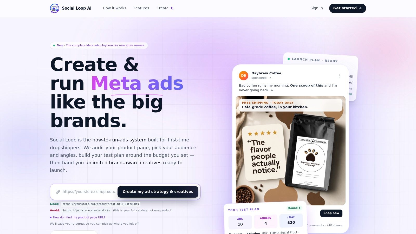
If you want help turning a product page into a better-converting ad and landing page system, Social Loop AI is built for that exact stage. It audits your page, helps you pick proven ad angles, generates brand-aware creatives, and surfaces paste-in copy fixes so you can launch faster without hiring an agency.