Blog
High-Converting Facebook Ads Landing Page in 2026
Published May 27, 2026
A lot of new Facebook advertisers build a landing page before they answer the first question that matters. Does this offer even need one?
If you are running a simple product with a clear benefit, a clean product page often beats a custom landing page, especially when your budget is tight and speed matters. If the click needs more education, more trust, or a tighter message match than your store can give on a standard product page, then a landing page starts to earn its keep.
That decision changes everything. New dropshippers often waste time tweaking audiences and creatives when the core problem is the destination. Sending paid traffic to the wrong page usually creates one of two outcomes. Either the visitor does not understand why they should buy, or they understand it but hit friction before they can act.
The goal is not to build the fanciest page in your stack. The goal is to send each click to the page most likely to convert for that specific offer, with the least amount of work and the fewest ways to lose money.
That is the filter for this guide. Start by choosing the right destination. Then improve the page elements that move conversion rate on a small budget.
Table of Contents
- Landing Page or Product Page? Your First Smart Decision
- Anatomy of a High-Converting Ad Landing Page
- Writing Copy That Connects and Converts
- Mastering Mobile-First Design and Blazing-Fast Speed
- Setting Up Tracking and Attribution for Clear Results
- Your Pre-Launch Checklist and Simple A-B Test Plan
Landing Page or Product Page? Your First Smart Decision
If you're getting clicks but no sales, don't build a custom page by default. Start by asking a better question. Does this offer need one?
A lot of Facebook ads landing page advice skips that step. It assumes a custom page is always better. But the key decision is often between a cleaned-up product page, a dedicated landing page, or in some cases a homepage, depending on the campaign goal and the offer. That gap matters most for first-time advertisers, especially when a single-product offer may perform better with fewer distractions and less pre-sell, as discussed in Lebesgue's guide to landing page optimization for Facebook ads.
Use the product page when the offer is already simple
If you sell one obvious product with one clear benefit, an optimized product page is often the fastest and smartest starting point.
That usually means:
- One hero product: The ad clicks through to the exact product being promoted.
- Low explanation needed: The product solves a problem people understand fast.
- One main action: Buy now, add to cart, or start checkout.
- Minimal clutter: No giant menu, no unrelated collections, no pop-up chaos.
A product page works best when your ad already does the pre-selling. For example, if your ad demonstrates a cleaning tool, a posture gadget, or a pet accessory in use, the click often just needs confirmation, not a whole extra story.
Practical rule: If a shopper can understand the product, price, and next step within a few seconds, start with the product page and strip friction out of it.
What to remove first:
- Top navigation links: Keep people focused on the offer.
- Competing upsells: Don't show five bundles before they understand the core product.
- Long brand storytelling: Put the essentials first.
- Weak image order: Lead with the visual that matches the ad creative.
Use a landing page when the click needs extra persuasion
Some products need more work after the click. That's when a dedicated Facebook ads landing page earns its keep.
Use one when:
- The product is unfamiliar: You need to teach the category.
- The ad angle is specific: The page needs to continue that exact promise.
- The audience is colder: They need proof, context, and objection handling.
- The offer is a bundle or promo: You need to frame the deal cleanly.
Here's the simple comparison:
| Situation | Better starting point |
|---|---|
| Single hero product, obvious use case | Optimized product page |
| New concept that needs explanation | Dedicated landing page |
| Promo tied to one ad angle | Dedicated landing page |
| Catalog-style store with many paths | Usually not the homepage |
| Short-budget test with one SKU | Optimized product page first |
Most paid social traffic still needs a dedicated destination to convert efficiently. But “dedicated” doesn't always mean “build from scratch.” Sometimes it means taking your product page and turning it into a focused, single-offer sales page.
The mistake isn't choosing a product page. The mistake is sending paid traffic to a messy page that behaves like a browsing experience instead of a buying experience.
Anatomy of a High-Converting Ad Landing Page
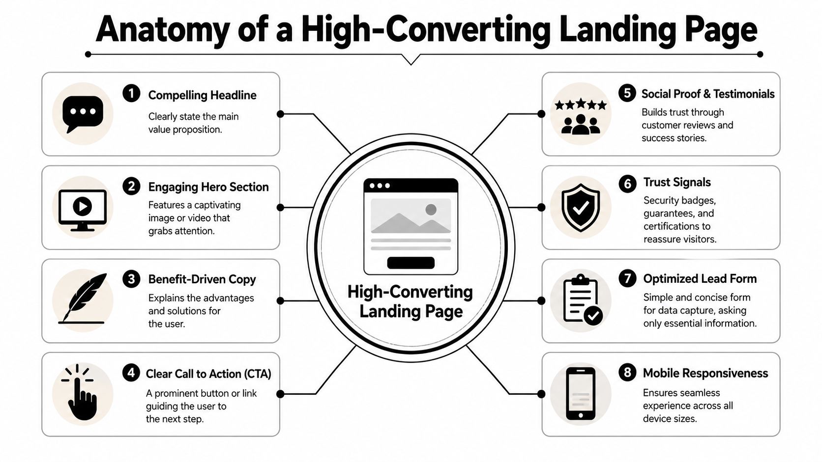
A strong Facebook ads landing page isn't clever. It's clear. It gives the visitor one path, one promise, and one action.
A practical method is to build a single-intent page with one audience, one offer, and one primary CTA. The ad message and landing-page headline should tightly match, navigation should be removed, the form should stay short, and the CTA should appear above the fold, especially for mobile traffic, according to Kit's landing page guidance for Facebook ads.
The five zones that do the heavy lifting
You do not need twenty sections. You need the right five.
1. Hero section
This is the first screen. It must answer three things fast:
- What is this?
- Why should I care?
- What do I do next?
Good: a headline that mirrors the ad, one supporting line, one image or short demo, one CTA.
Bad: a vague slogan, auto-rotating slider, three buttons, and a menu bar.
Example:
- Weak headline: Upgrade your lifestyle
- Better headline: Clean pet hair from couches and car seats in minutes
2. Problem to solution bridge
The visitor clicked because of a problem, desire, or curiosity. Continue that thread.
Use a short block that says:
- what usually goes wrong
- why your product fixes it
- what result they should expect
Here, you make the page feel like a continuation of the ad, not a bait-and-switch.
If the ad says “stop wasting time scrubbing,” the page shouldn't open with “welcome to our store.”
3. Social proof section
Proof lowers resistance. For a new store, this can be customer reviews, creator-style feedback, product use photos, or screenshots of common praise if you have permission to use them.
Keep this section specific. Generic praise like “Amazing product” doesn't do much. What helps is proof tied to actual buying objections:
- easy to use
- works faster than expected
- good for small spaces
- feels sturdy
- arrived as described
4. Offer and benefits block
On this page, you turn interest into buying logic.
A clean benefits block usually works better than a giant paragraph. Focus on outcomes, not features alone.
- Feature: rechargeable battery
- Benefit: use it without being stuck near an outlet
- Feature: compact design
- Benefit: fits in a drawer instead of taking over the counter
5. Closing CTA
Don't end weak. Bring the visitor back to the offer with one final action.
This section should restate:
- the main outcome
- the core reassurance
- the CTA
A pasteable layout you can build today
Use this as a starting wireframe:
- Headline
- Subheadline
- Hero image or short demo
- Primary CTA button
- Three benefit bullets
- Problem to solution copy
- Social proof
- Offer details
- FAQ for objections
- Final CTA
A simple above-the-fold example:
Headline
Remove stubborn pet hair without damaging fabricSubheadline
A reusable tool designed for couches, rugs, car seats, and everyday messesCTA
Shop the remover
And one rule matters more than the rest. Every section should support the same conversion. If your page tries to educate, entertain, collect emails, push bundles, and promote your Instagram all at once, it will usually do none of them well.
Writing Copy That Connects and Converts
Design gets the click to stay. Copy gets the click to act.
Most beginner pages fail because the writing turns generic right after the ad. The ad says one thing, the page says another, and the visitor feels the disconnect immediately. That break is expensive because Facebook traffic is impulse-heavy. You don't have much patience to work with.
Match the ad before you try to persuade
The headline is not the place to get creative. It's the place to confirm the click.
If your ad angle is:
- a problem-solution hook
- a UGC-style “I tried this” angle
- a social proof angle
- a discount or bundle angle
Then the top of the page should continue that exact frame.
Here's a simple message-match check:
| Ad angle | Bad landing headline | Better landing headline |
|---|---|---|
| Problem-solution | Welcome to [Brand] | Stop [specific pain] without [common frustration] |
| UGC | Premium innovation for modern homes | Why customers keep using this every day |
| Offer-led | Our bestselling products | Get the bundle built for [specific use case] |
A quick filter helps. Read your ad headline and landing headline back to back. If they sound like two different campaigns, rewrite the page first.
Your visitor should feel, “Yes, this is exactly what I clicked for.”
Pasteable copy templates for common ad angles
You don't need perfect copy. You need clear copy with a strong hook, believable promise, and direct CTA.
Problem-solution template
Headline
Stop [pain/problem] without [annoying alternative]
Subheadline
[Product name] helps [audience] [desired outcome] with less hassle, less mess, or less time wasted.
CTA
Get [desired outcome]
Example:
- Stop tangled charging cords without replacing your setup
- A magnetic cable organizer keeps your desk clean and your cables easy to grab
- Organize my desk
UGC-style template
Headline
Why people keep reordering this for [use case]
Subheadline
Built for [specific situation], easy to use, and simple enough to fit into a normal routine.
CTA
Try it now
This angle works when the ad feels like a real person recommendation. The page should keep that tone. Less polished brand jargon. More straightforward explanation.
Offer-led template
Headline
Get [product or bundle] for [specific use case]
Subheadline
Everything you need to [outcome] in one order, without piecing it together yourself.
CTA
Claim the offer
Objection-handling bullets
Under the hero, add three short bullets that answer the silent doubts:
- Easy to use: No setup headache
- Built for daily use: Designed for real routines, not one-time novelty
- Clear next step: Order today and put it to work right away
Good copy feels specific without sounding inflated. If a sentence could apply to any Shopify store on earth, cut it.
Mastering Mobile-First Design and Blazing-Fast Speed
A new advertiser launches their first Facebook campaign, gets cheap clicks, and still sees weak sales. A lot of the loss happens before the offer even gets judged. The page opens slowly, the layout feels cramped on a phone, and the visitor leaves.
For paid social, mobile performance is part of conversion rate, not a separate design task. Involve.me's landing page statistics roundup notes that faster pages convert better, slower pages lose conversions, about 1 in 5 ad clicks never become a page load, and shorter pages often outperform longer ones in the right context (Involve.me landing page statistics summary).
Why mobile friction kills Facebook traffic
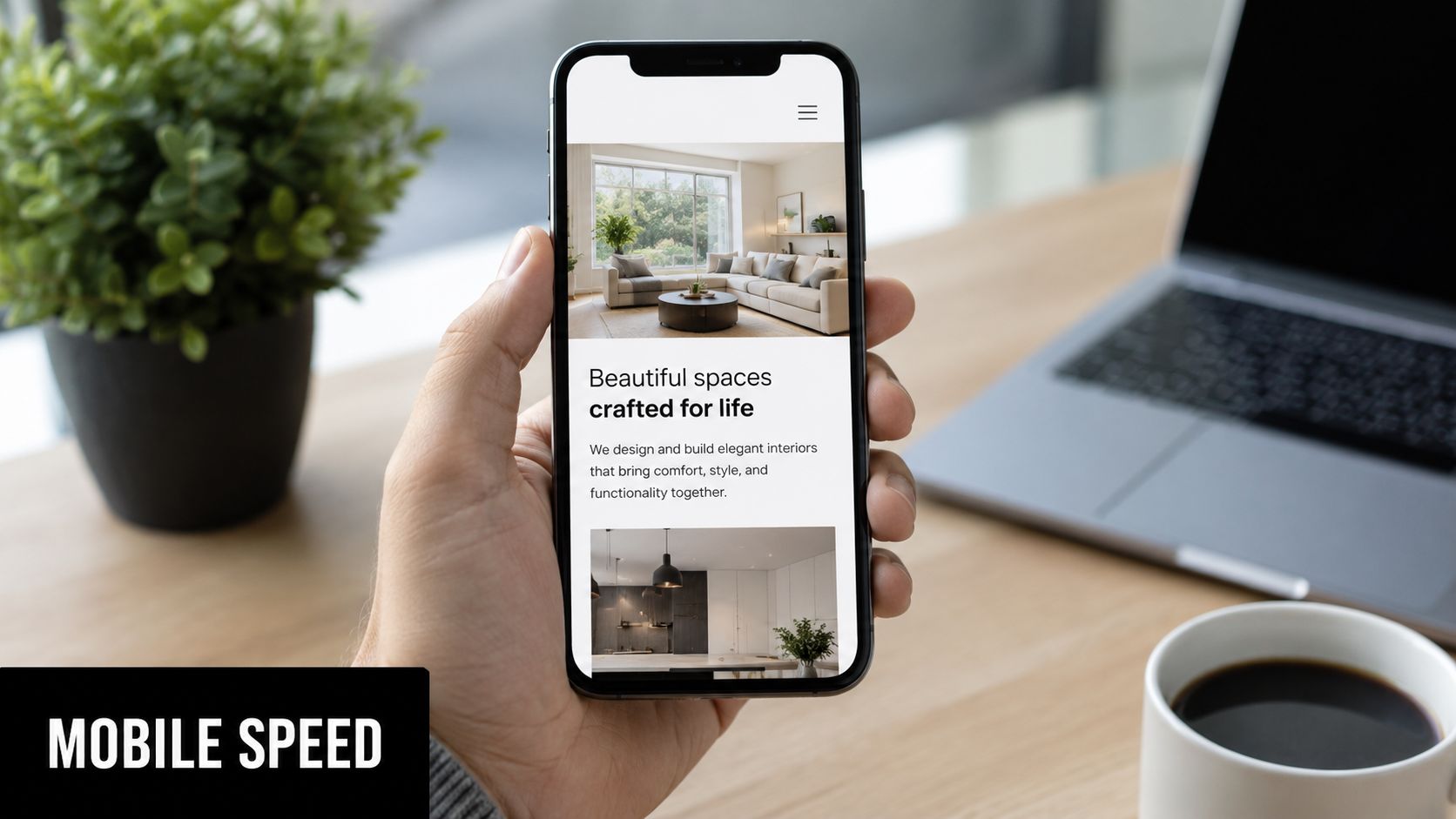
Facebook and Instagram traffic is impatient traffic. People tap from the feed while standing in line, half-watching TV, or comparing three stores at once. If your page asks them to zoom, hunt for the CTA, or wait on oversized images, you lose the click.
This also ties back to the bigger decision in this guide. If you do not need a custom landing page yet, an optimized product page is often the better starting point because it is usually lighter, simpler, and faster to maintain. A custom page only helps if it keeps the same speed while improving message match with the ad.
The best small-budget pages usually follow a few simple rules:
- Single-column layout: One clear scroll path on mobile
- Large text: Easy to read without zooming
- Visible CTA early: The first button should show up fast
- Short sections: One idea per screen
- Hidden extras: Put detailed specs, shipping info, and edge-case questions in accordions or FAQs
A good mobile rule is simple. Each screen should answer one question.
Design for thumbs, not for desktop screenshots
A page can look clean on a laptop and still feel annoying on a phone. Build for the phone first.
Use this order near the top of the page:
- Product image or demo
- Headline
- Price or offer
- Primary CTA
- Three short proof or objection bullets
That order works because it matches how paid traffic behaves. Visitors want to know what it is, why it matters, what it costs, and what to do next. Everything else can sit lower on the page.
If the page keeps growing, cut before you decorate. New dropshippers usually add too much. More icons, more badges, more sliders, more “brand story.” None of that helps if the page feels heavy and the buying path gets buried.
Low-tech speed fixes that usually matter most
You do not need a developer for the first round of speed improvements. The easy wins handle a lot of the problem.
- Compress hero images: Your first image should load fast and still look sharp on mobile
- Remove app bloat: Unused Shopify apps often add scripts across the whole page
- Limit fonts: One font family is fine. Two is usually the max
- Cut autoplay video and heavy effects: Motion is nice until it delays the page
- Trim weak sections: Sliders, social feeds, and popups often cost more than they add
Here is a practical mobile checklist:
| Check | What you want |
|---|---|
| Hero loads fast | Product visible immediately |
| CTA button | Easy to tap with one thumb |
| Text | Readable without zooming |
| Images | Compressed and relevant |
| Form | Short and painless |
One more trade-off matters here. If your product needs education, do not force the page under some arbitrary word count. Keep the words that reduce doubt and remove the words that only try to sound persuasive. Shorter usually wins on cold traffic, but clear beats clever every time.
Test the page like a customer, not like the store owner. Open it on your own phone, turn off Wi-Fi, tap through from the ad, and try to reach checkout with one hand. That quick test catches more real problems than another round of theme tweaks.
This short walkthrough is worth watching before you launch:
Setting Up Tracking and Attribution for Clear Results
A page can look clean and still lose money. Another page can look ugly and still print results. That's why tracking matters. Without it, you're judging performance by vibes.
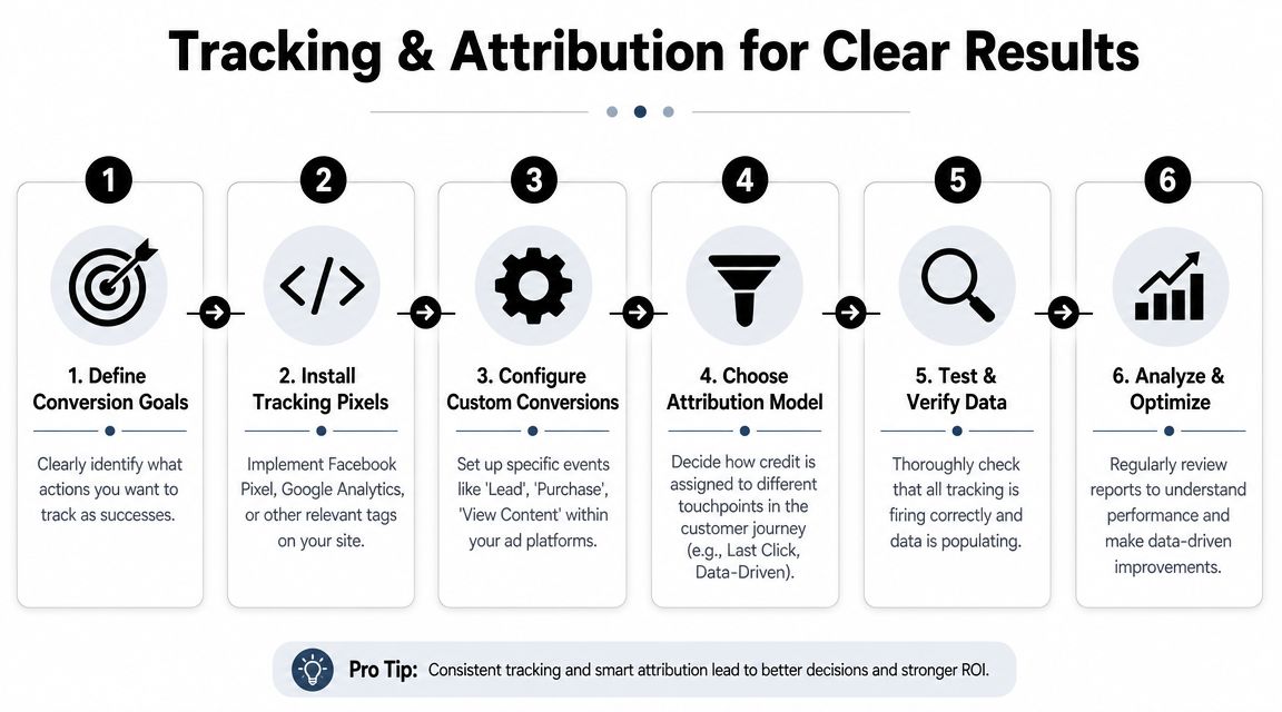
The bigger issue today isn't just installing the Meta Pixel. It's knowing whether the data is trustworthy when missing events, pixel firing issues, and attribution breaks can distort what you see. That practical problem is called out in Perspective's article on Facebook landing pages and tracking issues.
The basic setup that keeps you from guessing
For ecommerce, your setup should answer three questions:
- Are people reaching the page and engaging?
- Are they moving through the funnel?
- Are purchases being attributed cleanly enough to trust the trend?
At minimum, check these pieces:
- Meta Pixel installed: Your store needs the base pixel loaded correctly.
- Standard ecommerce events: ViewContent, AddToCart, InitiateCheckout, and Purchase should fire in the right places.
- UTM parameters on ads: This helps you inspect campaign traffic in analytics tools outside Meta.
- Test purchase flow: Go through the journey yourself and confirm events trigger in sequence.
A simple UTM naming style keeps things readable:
- utm_source: facebook
- utm_medium: paid-social
- utm_campaign: product-angle-audience
- utm_content: creative-name
That naming discipline matters when you start comparing multiple creatives, angles, and destinations. If your campaign names are messy, your analysis will be messy too.
Reality check: A missing purchase event can make a decent page look broken. A duplicated event can make a weak page look better than it is.
How to tell a bad page from bad measurement
In this context, beginners often make the wrong call. They kill a page that had a tracking problem, or keep a page alive because the platform over-reported a few actions.
Work through it in this order.
First, verify the mechanics
Open the page and test:
- every CTA button
- every form field
- every product variant selector
- every checkout step
- every thank-you or confirmation page
If one step fails, your conversion data won't tell the truth.
Next, compare platform signals with on-site behavior
Use your store platform and analytics setup as a second opinion. If Meta says traffic is landing but your on-page behavior looks unusually thin, investigate page load issues, redirects, or broken tracking before rewriting the offer.
Then, look at funnel shape
You're not hunting for perfect numbers. You're checking for a believable pattern.
Examples:
- Plenty of clicks, almost no landing behavior. This often points to load or tracking issues.
- People view content but rarely add to cart. The offer or page likely needs work.
- Adds to cart happen, then checkout drops hard. Shipping surprise, trust concerns, or checkout friction may be the bigger issue.
Keep a small tracking audit note for each campaign. Write down what's confirmed, what's questionable, and what changed. That habit saves money because it stops random edits driven by bad data.
Your Pre-Launch Checklist and Simple A-B Test Plan
You launch the campaign, Meta starts spending, clicks come in, and by the end of the day you have nothing useful to show for it. That usually is not an advanced optimization problem. It is a basic setup problem.
Before you spend another dollar, make one call first. Does this offer even need a dedicated landing page? If the ad speaks to a broad product angle, the product page is already clean on mobile, and the product can be understood in a few seconds, send traffic there first. If the ad makes a specific promise, targets a narrow pain point, or needs more education before the click earns an add to cart, use a landing page. A weak custom page loses money faster than a solid product page.
Pre-launch checks that prevent dumb mistakes
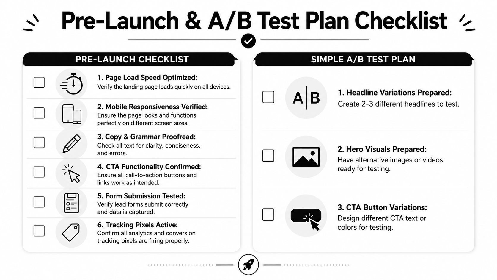
Run this before every campaign goes live. It takes 10 to 15 minutes and catches the stuff that burns a beginner budget.
- Page choice is correct: You picked product page or landing page based on the offer, not because landing pages sound more advanced.
- Headline match: The first line on the page continues the promise made in the ad.
- Primary action is obvious: One main CTA gets the click. Everything else supports it.
- Mobile scan test: On your phone, you can see the product, the benefit, the price or offer, and the CTA without hunting.
- Load test: The page opens fast enough on mobile data and the hero section does not stall.
- Proofread pass: Price, shipping details, variants, bundle contents, and button copy all match what the ad implies.
- CTA check: Every button goes to the right place.
- Form check: If you are collecting leads, submit a real test entry and confirm it lands where it should.
- Checkout path works: Add to cart, cart, checkout, and confirmation pages all work on mobile.
- Tracking check: Your events fire once, in the right order, with no duplicate purchases or missing add-to-carts.
- Distraction cleanup: Remove menu links, popups, chat nags, and anything else that pulls attention off the main action.
A simple standard works here. If you would hesitate to watch a friend use that page on their phone, do not buy traffic yet.
A beginner-friendly test plan that won't waste traffic
Small budgets get wrecked by messy tests. One campaign tests a new headline, a new image, a new audience, and a new offer at the same time. Then nothing is clear.
Start with one variable only. Keep the audience, offer, price, and page structure the same. Change one element that can shift conversion rate.
Best first tests:
-
Headline vs headline
Test one clear benefit headline against one pain-driven headline. -
Hero image vs short demo
Use this when the product needs a fast visual explanation. -
CTA text
Test plain copy against intent-based copy.
Use this basic grid:
| Test | Version A | Version B |
|---|---|---|
| Headline | Get pain relief in minutes | Stop waking up sore |
| Hero media | Static product image | 10-second product demo |
| CTA text | Shop now | Get yours |
Skip tiny tests at the start. Button color, icon style, and corner radius rarely fix a weak offer, a weak page choice, or a weak headline match.
What to judge after launch
Give the page enough traffic to show a pattern, then read the results in order.
- Clicks are coming, but people bounce fast: The page is slow, confusing, or mismatched to the ad.
- People stay, but few add to cart: The offer, pricing, or product explanation needs work.
- Adds to cart happen, but checkout dies: Shipping, trust, payment options, or total cost is the problem.
- The landing page struggles, but the product page worked before: Go back to the product page and simplify. A custom page is not helping.
That last point matters. New dropshippers often assume a landing page is the upgrade. Sometimes the smarter move is an optimized product page with better hero copy, cleaner benefits, and fewer distractions.
If you want a faster way to go from product link to ad-ready launch plan, Social Loop AI helps first-time dropshippers turn a product URL into buyer angles, Meta creatives, budget-aware test plans, and pasteable landing-page fixes before spend goes live. It's built for beginners who want structure without hiring an agency.