Blog
How to Improve Click Through Rates on Ads and Pages
Published May 28, 2026
You launch your first Meta campaign, watch impressions climb, and then open Ads Manager expecting momentum. The click through rate is weak. A few people click, most don't, and now you're stuck wondering whether the problem is the ad, the product page, or the offer itself.
For most new ecommerce owners, it's all three working together.
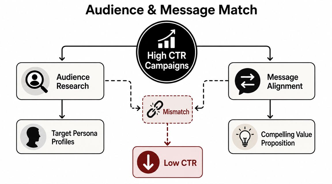
That's the part most CTR advice misses. It treats ad CTR and page CTR like separate problems. In practice, they're one chain. If the ad promises one thing and the landing page shows another, you lose the click twice. First when people ignore the ad, then again when they bounce before they ever reach Add to Cart. If you want to learn how to improve click through rates, think in one continuous flow from impression to product page action.
Table of Contents
- Why Your Click Through Rate Is Low and How to Think About It
- Nail Your Audience and Message Match First
- Develop Ad Creatives That Stop the Scroll
- Write Ad Copy That Demands a Click
- Fix Your Landing Page to Convert the Click
- Test and Measure Your Way to Higher CTR
Why Your Click Through Rate Is Low and How to Think About It
Low CTR usually isn't the disease. It's the symptom.
A new advertiser often assumes the fix is a louder headline, a brighter image, or a more aggressive discount. Sometimes that helps. More often, it just gets more of the wrong people to click or makes the right people distrust the ad.
That's why chasing CTR alone can backfire. Analytics-oriented guidance on monitoring click behavior alongside impressions and downstream performance points out a simple risk: click-first tactics can pull in low-intent traffic that won't convert on the landing page. For a small ecommerce budget, those are expensive clicks.
Practical rule: A better click is one that still makes sense after the page loads.
Think about your campaign in two stages. Stage one is whether the right person clicks. Stage two is whether the page confirms they made the right choice. If either stage breaks, your click through rate problem won't stay contained. It spreads into poor session quality, weak add-to-cart behavior, and wasted spend.
A healthier way to judge performance is to ask three questions:
- Who is seeing this ad: If the audience is broad, generic messaging usually follows.
- What promise is the ad making: If the promise is vague or exaggerated, curiosity clicks won't turn into buying behavior.
- What does the page say immediately after the click: If the page doesn't continue the same message, people leave.
If you need a better framework for reading these signals together, this guide to ad performance metrics helps put CTR in context instead of treating it like the only number that matters.
The fix starts with relevance, not tricks. Better click through rates come from a tighter match between audience, message, creative, and page.
Nail Your Audience and Message Match First
Most weak campaigns start with a targeting problem disguised as a creative problem. The ad isn't getting ignored because the button color is wrong. It's getting ignored because the message doesn't feel specific to the person seeing it.
Practical guidance on segmenting audiences and rewriting creatives to mirror intent is right to put this step first. Broad targeting tends to depress CTR. Relevance drives clicks.
Start with a narrow buyer slice
Don't begin with “women 25 to 44 interested in skincare” or “men who like fitness.” That's too loose to write sharp ads.
Start with one buyer slice that has one clear reason to care. Examples:
- New dog owner with a shedding problem
- Desk worker with afternoon back discomfort
- Parent buying a spill-proof bottle for school
- Runner who wants a cleaner post-workout routine
Each of those buyers clicks for a different reason. If you mash them together, you get flat copy like “High quality bottle for everyday use.” Nobody feels seen by that.
A simple way to define the segment is to write down:
- The job they want done
- The frustration they already feel
- The objection they'll have before clicking
- The proof they need to believe you
That last point matters. A first-time buyer doesn't just ask “what is this?” They ask “is this for someone like me?”
Pick one angle, not five
A strong ad usually pushes one core angle. New advertisers often stack every angle at once. Premium quality. Fast shipping. Viral product. Best gift. Limited stock. Trusted by customers. That creates blur, not clarity.
Choose the one angle that best matches the buyer slice:
| Angle | When it works | Example direction |
|---|---|---|
| Problem to solution | The pain is obvious | “Tired of pet hair on every black shirt?” |
| Social proof | The buyer needs reassurance | “Why owners keep this by the front door” |
| Identity | The product signals belonging | “For runners who hate bulky gear” |
| Comparison | The market is crowded | “Less mess than standard squeeze bottles” |
| Outcome | The result is visual or immediate | “A cleaner sink area in one simple swap” |
If the audience is specific enough, the headline almost writes itself.
Tools offer assistance, but only if they support the strategy instead of replacing it. For example, Social Loop AI turns a product URL into audience profiles, angle options, creatives, and landing-page fixes, which is useful when you need structured testing ideas without hiring a strategist. But even with a tool, the decision still comes down to focus. One segment. One angle. One promise.
The fastest CTR gains often come from this upstream work. Once the message fits the audience, everything downstream gets easier.
Develop Ad Creatives That Stop the Scroll
Creative has one job at first. It needs to make the right person pause long enough to register the message.
That doesn't mean every ad needs heavy editing, polished studio video, or trendy motion graphics. In ecommerce, simple usually wins when it makes the product, the use case, and the outcome obvious.

Choose creative format based on the angle
The biggest creative mistake I see is format mismatch. The brand picks a visual style because it looks good, not because it fits the selling angle.
A few practical pairings work well:
- Problem to solution: Before-and-after image, pain-state visual, or short demo clip
- Social proof: UGC-style talking video, selfie testimonial, review-led carousel
- Identity: Lifestyle image that reflects the buyer's self-image
- Comparison: Side-by-side visual or quick demonstration
- Outcome: Product in use with the result clearly visible
If your angle is “this solves a daily annoyance,” a cinematic brand film is usually the wrong asset. If your angle is “people like you already use this,” polished packshots alone won't carry it.
Proven Creative Angles for Meta Ads
| Angle | Core Idea | Best For |
|---|---|---|
| Problem to solution | Show the pain, then show the product removing it | Utility products, cleaners, organizers, accessories |
| UGC reaction | A real-person style reaction creates trust fast | Beauty, wellness, impulse-buy ecommerce |
| Product demo | Let the product explain itself in use | Gadgets, kitchen tools, household products |
| Before and after | Visual contrast does the selling | Transformation-driven products |
| Social proof | Show reviews, customer language, or buyer behavior | New brands that need credibility |
| Founder or maker story | Explain why the product exists | Niche brands and mission-led products |
| Us vs them | Clarify the difference from common alternatives | Crowded categories with lookalike products |
You don't need ten concepts on day one. Three strong ideas tied to three distinct angles are enough to start.
After you've mapped those concepts, review how quickly the ad communicates the point. Many low-CTR creatives fail in the first second because the product appears too late, the text overlay is too abstract, or the image asks the viewer to work too hard.
Here's a useful walkthrough on visual ad thinking:
What weak creatives usually get wrong
Weak ecommerce creatives usually share a few patterns:
- They hide the product: If people can't identify what's being sold immediately, scroll behavior wins.
- They lead with brand language: Buyers care about themselves first. Brand story can come later.
- They show the item, not the use case: A product floating on a background can work, but only if the offer is already obvious.
- They cram in too many claims: One visual should support one central thought.
A creative doesn't need to impress a designer. It needs to make a shopper care.
When you're figuring out how to improve click through rates, creative should never drift away from the audience-message fit you established earlier. The visual is not decoration. It's the fastest delivery system for the promise.
Write Ad Copy That Demands a Click
Good ad copy doesn't explain everything. It creates enough clarity and enough tension that clicking feels like the natural next step.
Most first-time advertisers write copy the way they'd describe the product to a friend. That usually produces soft lines like “We're excited to share our new bottle designed with quality materials.” It's polite. It's also easy to ignore.
The hook earns the first second
Your opening line has to stop the scroll or sharpen attention. It should call out the person, the problem, or the desired result.
Three hook styles are reliable:
- Direct audience callout: “Desk workers dealing with lower back fatigue”
- Problem-first line: “Still cleaning up leaks after every gym session?”
- Curiosity with specificity: “The tiny switch that made our sink area less messy”
A hook should feel like it belongs to one buyer segment. If anyone could read it and think it applies to them, it's probably too broad.
The body makes the promise believable
After the hook, the body has to answer one question fast: why should this person care?
Translate features into outcomes. Don't write “double-wall stainless steel.” Write what that means in real use. Cleaner bag, easier school drop-off, less spill risk, less hassle after workouts. The product spec matters only when it supports the result.
A simple body formula works well:
- State the problem or desired outcome
- Introduce the product as the mechanism
- Remove one objection
- Point toward the next action
Example:
“If your kid's water bottle keeps leaking in their backpack, this design fixes the part that usually fails. It's simple to open, easy to carry, and built for everyday school use.”
That copy doesn't try to say everything. It says enough to earn the click from the right buyer.
The CTA should reduce friction
Many new brands use “Shop Now” everywhere because the platform suggests it. That's fine when the audience is warm or the product is straightforward. It's weaker when the buyer still needs context.
In colder traffic, lower-friction CTAs often work better because they ask for less commitment. If you want ideas beyond generic button text, this list of call to action phrases is useful for matching CTA style to user intent.
A few practical CTA choices:
- Learn More works when the product needs explanation.
- See Why works when social proof or differentiation is the angle.
- Shop Now fits when the ad already did the heavy lifting.
- Take the Quiz fits guided-selling offers with multiple variants.
Copy and CTA should feel like one motion. If the hook says “Solve this annoying daily problem,” the CTA shouldn't suddenly sound formal or generic.
Here's the real test: remove the brand name and ask whether the copy still makes a clear promise to a specific person. If it doesn't, the ad probably won't earn many qualified clicks.
Fix Your Landing Page to Convert the Click
A click is only valuable if the page confirms the promise that earned it.
Many campaigns leak money. The ad is specific, but the landing page resets the conversation. New headline. Different image style. Competing buttons. Generic hero copy. The buyer has to re-orient themselves, and that moment of friction is often enough to kill intent.
Audit the first screen first
Start with what shows before scrolling.
Ask these questions:
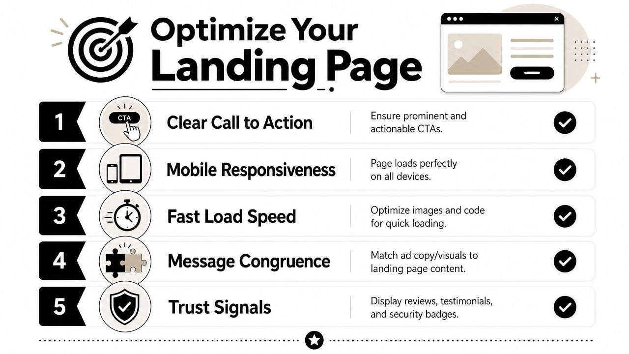
- Does the headline mirror the ad promise
- Does the hero image feel like the same campaign
- Can I see the primary CTA immediately
- Is the page easy to use on a phone
Technical design choices affect click behavior more than many founders expect. One expert source notes a 15% higher CTR when pages are mobile-friendly and says a single prominent CTA can increase clicks by up to 371%, while also recommending touch targets of at least 44 x 44 pixels to align with Apple guidance in this review of mobile-friendly page and CTA design benchmarks.
That doesn't mean every store should expect the same lift. It means mobile usability and button clarity are not cosmetic details. They directly affect whether someone continues.
Use one clear path to action
Many product pages bury the main action under distractions. Sticky announcement bars, multiple popups, chat widgets, upsells, and too many navigation options all compete with the one behavior you want.
A cleaner first-screen structure usually looks like this:
| Page element | What it should do |
|---|---|
| Headline | Repeat the core promise from the ad |
| Hero image | Confirm the product and use case |
| Primary CTA | Stand out visually and stay easy to tap |
| Price and key info | Remove basic uncertainty fast |
| Short support copy | Clarify who it's for and why it matters |
For practical examples of page structure and conversion flow, this guide on landing page best practices is a useful reference.
If the ad says “less mess after workouts,” the landing page shouldn't open with “Welcome to our store.”
Add trust where hesitation happens
Trust signals work best when they appear near moments of doubt, not buried at the bottom.
Use them where people hesitate:
- Near price: Reviews, guarantees, or clear shipping info
- Near CTA: Payment reassurance or return clarity
- Near product claims: Customer photos, plain-language proof, or FAQ answers
- On mobile layouts: Keep trust details visible without forcing long hunts
You don't need a redesign to improve this. In many stores, one hour of cleanup does the job. Tighten the headline. Make the button obvious. Reduce clutter. Bring shipping, reviews, and reassurance closer to the decision.
That's how ad CTR and landing-page click behavior start working together instead of canceling each other out.
Test and Measure Your Way to Higher CTR
Once the basics are in place, improvement becomes a testing discipline.
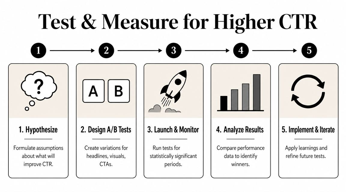
This is not optional. Semrush recommends running A/B tests to statistical significance and using a practical floor of 100 observations per variation before drawing conclusions in its guide to CTR testing and significance. It also stresses that the most reliable gains come from testing one variable at a time.
Run small clean tests
If you change the audience, image, headline, and CTA all at once, you won't know what caused the result.
Keep the test narrow:
- Write a hypothesis: “UGC-style demo will beat studio product shot.”
- Change one variable: Only the creative, only the hook, or only the CTA.
- Let each version gather enough data: Don't kill a variation too early.
- Keep a note of what changed: Memory gets messy fast once multiple rounds start.
That approach matters even more when your budget is limited. False positives are expensive. A random fluctuation can trick you into scaling the wrong angle.
Measure the whole journey
CTR is important, but it's only one part of the chain.
Track performance across the flow:
- Ad-level CTR: Did the right people respond?
- Landing-page behavior: Did the page continue the same message?
- Add-to-cart movement: Did the click show buying intent?
- Cost efficiency: Did better clicks also stay economically sensible?
The winning ad isn't the one with the loudest click rate. It's the one that keeps working after the click.
A simple operating loop works well for first-time advertisers: hypothesize, test, measure, keep the winner, then test the next variable. Do that consistently and your click through rates improve for the right reason. Not because you got better at baiting clicks, but because you got better at matching message, audience, and page.
If you want a faster way to put this into practice, Social Loop AI helps first-time ecommerce owners turn a product URL into a Meta ads launch plan, creative angles, and landing-page fixes so you can test message match from ad click to Add to Cart without building the whole system from scratch.