Blog
How to Reduce Bounce Rate: An Ecommerce CRO Playbook
Published June 16, 2026
You launch a Meta campaign for a product you're excited about. The ad gets clicks. The cost per click looks survivable. Then you open Shopify, GA4, or your session recordings and see the ugly part: people land, look for a second, and disappear.
That's the kind of bounce rate problem that drains a new store's budget fast. Not because bounce rate is some vanity metric, but because every bounced paid visitor is a visitor you already paid for and didn't get a second chance to educate, reassure, or convert. For first-time dropshippers and new ecommerce owners, this usually isn't a branding problem. It's a broken handoff between the ad and the page.
Most guides on how to reduce bounce rate stop at generic advice like “improve design” or “write better copy.” That's incomplete. If your traffic comes from Meta Ads, the core work starts before the page loads. The ad sets an expectation. The landing page either confirms it or breaks trust.
Table of Contents
- Why High Bounce Rate Kills Your Meta Ad ROI
- How to Audit Your Bounce Causes Like a Pro
- Quick Wins for Immediate Bounce Rate Reduction
- The Critical Link Aligning Meta Ads with Landing Pages
- Redesigning Page Layouts for Engagement and Trust
- Your 30-60-90 Day Bounce Rate Reduction Plan
Why High Bounce Rate Kills Your Meta Ad ROI
Meta traffic is impatient traffic. People aren't searching with a keyboard and carefully comparing tabs. They're scrolling, tapping, and deciding in seconds whether your store feels relevant enough to keep exploring.
That's why a high bounce rate hits paid traffic harder than organic traffic. A bounced blog visitor might cost you nothing directly. A bounced ad click is immediate wasted spend. It also weakens the rest of the funnel, because you can't improve add-to-cart rate, checkout rate, or repeat purchase rate if people never make it past the first screen.
For a new store owner, this usually shows up as a confusing pattern. Ads get some traction. CTR might look decent. But the store still doesn't convert. In many cases, the leak sits between the ad promise and the landing page experience. You sold the click, then lost the visitor.
A simple way to consider it:
- Ad problem: People don't click.
- Landing page problem: People click, then leave.
- Funnel problem: People stay, but don't progress.
Bounce rate lives in the middle. It tells you whether your page gave the visitor enough confidence to take one more step.
Practical rule: If a Meta campaign gets clicks but not meaningful on-site engagement, inspect the landing page before rewriting the ad.
This is why bounce rate belongs inside your profitability math, not in a side dashboard no one checks. If you care about return on ad spend and what it actually means for a new store, you also need to care about the point where ad spend turns into lost attention.
For new ecommerce stores, the biggest mistake isn't ugly design. It's assuming the click means the hard part is over. It isn't. The click only buys you a brief window to prove the page matches the promise.
How to Audit Your Bounce Causes Like a Pro
A bounce audit starts by ignoring the sitewide average. Sitewide bounce rate hides the useful truth. You need to know which traffic source, which device, and which landing page create the leak.
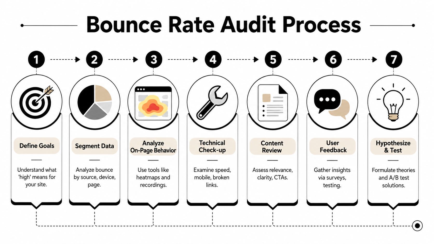
Start with segments, not sitewide averages
Open GA4 and look at landing pages by source and medium, then split again by device category. Meta mobile traffic often behaves very differently from desktop traffic or email traffic. If you blend them together, you'll make the wrong fix.
Semrush's bounce rate guidance notes that many websites target a bounce rate of around 40% or lower, while 60% or higher is often treated as problematic depending on page type and traffic source. The same source also emphasizes the biggest levers as Confirmation, Credibility, and Clear instructions. That's a practical filter for your audit. Ask whether the page instantly confirms relevance, shows trust, and tells people what to do next.
Use a short audit table like this:
| Segment | What to check | What it usually means |
|---|---|---|
| Meta + mobile | High bounce on product or advertorial page | Slow load, poor mobile layout, weak first-screen match |
| Meta + desktop | Better engagement than mobile | Mobile-specific friction, not offer failure |
| Specific ad set | Bounce spikes on one landing page only | Message mismatch or wrong audience promise |
| Product page vs homepage | Homepage bounces more | Generic destination instead of focused page |
Watch what visitors actually do
Numbers tell you where to look. Heatmaps and session recordings tell you why people left.
Watch a sample of sessions from paid landing pages and look for repeated patterns:
- Fast exits before scroll means the first screen didn't confirm the click.
- Rage taps on images or badges often means visitors think something should be clickable.
- Long pauses near price or shipping details usually signal uncertainty, not curiosity.
- Repeated back-button behavior suggests the page feels off from the ad they clicked.
Don't just watch random recordings. Filter for Meta landing pages and short sessions. That's where you'll find the most obvious leaks.
If several visitors hesitate in the same place, treat that as a page problem, not a user problem.
Turn observations into testable problems
A useful audit ends with hypotheses, not vague notes. “Improve page” isn't a hypothesis. “The hero doesn't match the ad angle” is.
Write findings in this format:
- Observed issue: Visitors bounce before scrolling on the landing page.
- Likely cause: Headline doesn't reflect the ad promise or featured product.
- Proposed fix: Rewrite headline and hero text to mirror the ad angle.
- How to validate: Run one controlled test and compare outcomes.
When you start testing, keep the discipline tight. A more technical workflow for how to reduce bounce rate is to test one variable at a time and let the experiment run long enough to become reliable. One source recommends aiming for at least 100 conversions per variation before calling a winner because smaller samples can mislead, as explained in this guide on what statistical significance means in practical testing.
That standard matters because new store owners often call winners too early, especially after a few promising sessions. Early signals are useful. Final decisions need patience.
Quick Wins for Immediate Bounce Rate Reduction
Most new stores don't need a redesign first. They need to remove obvious friction. That's good news, because the fastest bounce rate wins are usually cheap.
Fix the technical friction first
Speed matters most when the visitor came from a paid click. Mailchimp's guidance on reducing bounce rate notes that the probability of bounce increases as page load time moves from 1 second to 3 seconds. It also points to performance targets around 2.5 seconds for load time. For Meta traffic, that first impression often decides whether the visitor even sees your offer.
A simple speed cleanup checklist:
- Compress large images so the hero section loads quickly on mobile data.
- Trim heavy apps on Shopify if they inject scripts you don't need.
- Minimize pop-ups that load before the visitor even understands the product.
- Reduce layout instability so buttons and text don't jump while the page loads.
- Check broken assets such as missing images, dead buttons, or malformed variant selectors.
If you're dropshipping, product pages often get bloated by imported reviews widgets, urgency apps, sticky banners, and upsell scripts. Each one sounds helpful in isolation. Together they can make the page feel cheap, slow, and chaotic.
Tighten the first-screen copy
After speed, fix the hero. The first screen should answer three questions fast:
- What is this product?
- Why should I care?
- What should I do next?
If your ad sells a posture corrector for desk workers, the page shouldn't open with a vague brand slogan. It should say what the item is, who it helps, and why this version is worth attention.
Good first-screen copy usually has:
- A headline with direct relevance instead of a clever phrase
- A subhead with practical value such as comfort, convenience, or problem relief
- A visible CTA that doesn't hide below clutter
- A product image that matches the ad creative
Here's a useful walkthrough on what clean landing page optimization looks like in practice:
Cut distractions that interrupt intent
New store owners often add too much because they're worried the page feels empty. The result is usually the opposite of persuasive.
Remove or delay anything that interrupts the first decision:
- Auto-play media if it pushes content downward or slows the page
- Instant discount pop-ups before the user has seen the offer
- Too many announcement bars competing with the main CTA
- Navigation clutter that sends paid visitors everywhere except the buying path
A page that asks for less attention usually earns more of it.
If you want to know how to reduce bounce rate quickly, start with what confuses, delays, or distracts. That tends to matter more than visual polish.
The Critical Link Aligning Meta Ads with Landing Pages
High bounce from Meta traffic usually means one thing. The page didn't continue the conversation the ad started.
That disconnect is easy to miss when you're close to your own brand. You know what you meant. The visitor only knows what they clicked on. If the ad promised one thing and the page opens with something broader, different, or less specific, trust drops immediately.
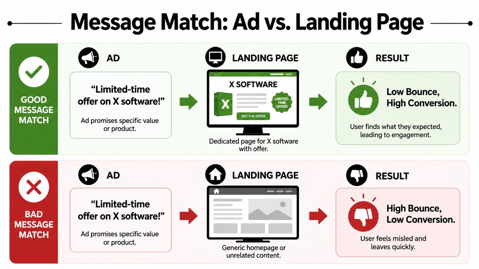
Where message match breaks
A lot of stores send all paid traffic to the homepage. That's usually the first mistake.
If your ad features a specific neck fan, the click should land on that product or a page built around that exact angle. Not a collection page. Not a generic “summer essentials” page. Not the homepage with a rotating banner.
Nielsen Norman Group's guidance on reducing bounce rates emphasizes three practical requirements: test with representative users, expose a next step, and state the solution explicitly. That fits Meta traffic perfectly. The paid visitor needs confirmation right away, plus a clear path forward.
Common mismatch examples in ecommerce:
| Ad promise | What the visitor expects | What breaks trust |
|---|---|---|
| Discount-focused ad | Discount visible on landing | Offer hidden below the fold |
| Product demo video | Same product and use case | Generic category page |
| UGC angle about one problem | Page addresses that problem first | Product page leads with generic features |
| Specific color or variation | Matching image and variant selected | Default variant is different |
What strong ad scent looks like
Good message match is simple. The page should feel like a continuation of the ad, not a separate experience.
If the ad says “Cooling pet bed for hot summer nights,” the page should repeat that core idea in the headline, imagery, and opening copy. If the ad uses a creator-style UGC angle, the page should still feel natural and direct. Don't switch into stiff catalog language the second they land.
A practical review process helps:
- Open the ad in Ads Manager preview.
- Write down the exact promise in plain language.
- Click through to the landing page on your phone.
- Check the first screen only.
- Ask whether the page confirms the ad within seconds.
If the answer is “sort of,” it's not good enough.
The visitor shouldn't have to infer relevance. The page should state it.
For dropshipping stores, this matters even more because trust is already fragile. Buyers don't know your brand yet. Consistency between ad and landing page does part of the trust-building work for you. It tells the shopper they landed in the right place, on the right item, with the right offer.
When people ask how to reduce bounce rate from Meta traffic, this is often the most effective answer. Make the destination look like the click was a good decision.
Redesigning Page Layouts for Engagement and Trust
Once the obvious leaks are fixed, layout becomes the lever. Not for decoration. For sequence.
A strong ecommerce landing page doesn't just “look clean.” It answers the buyer's questions in the order they naturally arise. Relevance first. Then proof. Then friction reducers. Then action.
Build the mobile first-screen properly
Most new store owners design on a laptop and hope mobile works out. Paid social traffic punishes that mistake.
Your mobile first-screen should usually include:
- A product image or media frame that clearly shows the item
- A headline that names the benefit or problem solved
- Price or offer clarity if that was part of the click promise
- One obvious CTA
- Immediate trust support such as reviews, shipping reassurance, or guarantee cues
The biggest layout issue I see on newer stores is stacked clutter. Huge announcement bars, oversized logos, multiple badges, and accordion sections push the core selling message too far down. A visitor from Meta shouldn't need to scroll just to understand what you sell.
Use layout to answer objections in order
After the first screen, think in buying objections, not website sections.
A practical sequence looks like this:
- What is it and why do I care
- How does it work
- Can I trust this store
- Will it suit me
- What should I do next
That means your page can often improve without a rebuild. Reorder blocks. Pull stronger reviews upward. Move FAQs that answer shipping, sizing, or use-case concerns closer to the CTA. Show lifestyle imagery after the core promise, not before it.
If you're revisiting page structure, this guide to landing page conversion optimization for ecommerce teams is a useful companion to bounce-rate work because both depend on reducing friction in the decision path.
A few layout changes usually outperform cosmetic redesigns:
- Bring reviews closer to the hero if trust is weak
- Add product-in-use visuals if the item is hard to understand quickly
- Place sticky mobile CTAs carefully so they help, not obstruct
- Use short content blocks instead of giant walls of copy
- Group trust elements near decision points instead of scattering them
Know when bounce rate is not the real problem
Often, many store owners overcorrect. They see a high bounce rate and assume the page itself failed. Sometimes it did. Sometimes the issue is traffic quality or traffic expectation.
Nielsen Norman Group argues that teams should use bounce rate as a red flag and optimize for deeper engagement and return visits instead of chasing the metric alone. For ecommerce, that means a product page can show a “bad” bounce rate even when it answers intent reasonably well. If the ad targeted the wrong audience or overpromised, the page may be doing its job and still get blamed.
Use this sanity check:
- If visitors bounce instantly, suspect message match or speed.
- If they scroll, read, and hesitate, suspect trust or offer friction.
- If they engage but don't buy, suspect pricing, shipping, or checkout issues.
That distinction matters. Otherwise you'll keep redesigning pages when the fix belongs in audience targeting, creative angle, or offer framing.
Your 30-60-90 Day Bounce Rate Reduction Plan
Store owners usually lose momentum because they try to fix everything at once. A better approach is to work in rounds. First remove obvious friction. Then test the handoff between ad and page. Then scale what proves itself.
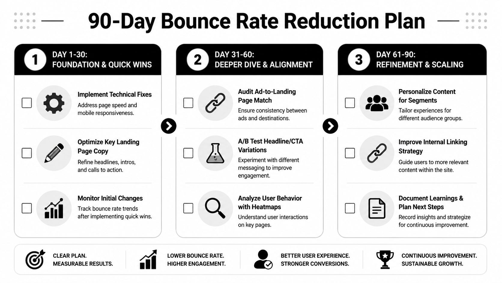
Days 1 to 30
Use the first month to establish control over the basics. Don't redesign the whole store yet.
Focus on:
- Cleaning up page speed issues on the main paid landing pages
- Rewriting the headline and hero copy for clearer relevance
- Removing intrusive pop-ups and visual clutter
- Checking mobile presentation on actual phones, not just browser preview
- Segmenting bounce data by Meta traffic, landing page, and device
Track changes in a simple sheet. Log what you changed, when you changed it, and which page it affected. Most beginners skip this and then can't tell which edits helped.
Small documented improvements beat random big overhauls.
Days 31 to 60
This is the testing window. Keep the setup disciplined.
A more reliable bounce-rate optimization workflow involves testing one variable at a time and running the test long enough to reach confidence. That same source advises aiming for at least 100 conversions per variation before concluding a winner, because smaller samples can produce unreliable conclusions.
That doesn't mean you need complex testing software from day one. It means you shouldn't change the headline, CTA, image, offer framing, and page layout all in one pass and then pretend you learned something.
Good variables to test in this phase:
| Element | Why test it | Example change |
|---|---|---|
| Headline | It controls first-screen confirmation | Generic benefit to specific use-case |
| Hero image | It shapes instant recognition | Studio shot to product-in-use |
| CTA copy | It influences commitment level | “Buy Now” to “See Options” |
| Offer framing | It affects perceived relevance | Bundle-first to single-product-first |
Also revisit the ad-to-page relationship. If one ad angle brings weaker traffic quality, don't force the page to compensate for a click that was won on the wrong promise.
Days 61 to 90
By this stage, you should have a clearer view of what kind of visitor your page handles well and where trust breaks down.
Use the next month to:
- Scale winning page variations to more ad sets or adjacent products
- Refine internal links and product discovery paths so visitors have an obvious second step
- Improve segment-specific relevance for different audiences or creative angles
- Document what your best traffic responded to in terms of wording, visuals, and proof
This phase matters because bounce-rate work shouldn't end with one “fixed” page. It should turn into operating discipline. Every new ad concept should carry its own landing-page check. Every landing page should have a clear first-screen promise, visible trust support, and a next action that feels natural.
If you keep asking the same three questions, your pages will keep improving:
- Does the page confirm the click?
- Does the visitor trust what they see?
- Do they know what to do next?
That's the playbook for how to reduce bounce rate on a new ecommerce store. Not tricks. Not vanity edits. Better handoffs, cleaner pages, and more disciplined testing.
If you want help tightening the Meta Ads to landing page handoff before you spend, Social Loop AI is built for exactly that. It helps first-time dropshippers and new ecommerce owners turn a product URL into a practical Meta launch plan, ad creative angles, and landing-page readiness feedback with pasteable copy fixes, so you can catch bounce-rate problems before they waste budget.