Blog
How to Write Ad Copy: Boost Meta Ad Conversions
Published June 3, 2026
You're probably staring at a product page, a blank Meta ad draft, and a budget that feels too small to waste. That's where most first-time ecommerce founders get stuck. They know they need ad copy, but every guide gives them formulas, swipe lines, or vague advice like “speak to pain points” without telling them what to launch on day one.
Good ad copy isn't about sounding clever. It's about making the right person stop, care, click, and then see the same promise carried through on the product page. On a small budget, you can't afford random testing. You need a simple system that turns product-page information into a few strong, distinct copy angles, then tests them in a way that gives you useful signal instead of noise.
Table of Contents
- Start With Your Buyer Not Your Product
- Choose a Powerful Angle of Attack
- The Anatomy of High-Converting Meta Ad Copy
- Format Your Copy to Be Scannable Not Skippable
- Your First Ad Copy A/B Testing Plan
- Connect Your Ad Copy to Your Landing Page
Start With Your Buyer Not Your Product
Most beginners write ads the way they describe their product to a friend. They lead with features, materials, bundle details, shipping perks, or how long it took to build. Buyers don't start there. They start with their own situation.
That's why copy built only from product features often feels flat. It may be accurate, but it doesn't connect. A founder writes “ceramic coating, double-wall insulation, leak-resistant lid.” A buyer thinks “I'm tired of coffee going cold during my commute.”
The direct-response benchmark worth keeping in mind is the 40/40/20 rule. Roughly 40% of campaign performance comes from the audience, 40% from the offer, and only 20% from the creative layer, which includes copy, design, and format, as explained in Very Good Copy's breakdown of the 40/40/20 rule. Strong copy still matters, but weak targeting or a vague offer can cap performance before your headline gets a fair shot.
Why feature-first copy usually fails
A DTC skincare founder might say, “Niacinamide serum with lightweight texture and clean formula.” That's product language.
The buyer is more likely thinking one of these:
- Frustration: My skin looks uneven and tired.
- Desire: I want to look fresher without a full routine.
- Doubt: I've already tried products that sounded the same.
Those are ad-copy inputs. Features support the sale later. They rarely create the click on their own.
Practical rule: Write the ad from the customer's current problem to desired outcome. Use product features only when they help prove the promise.
Use your product page, reviews, DMs, comments, and competitor reviews to build a quick buyer profile. If your page already has a clear promise, sharpen it further with examples like these value proposition examples for ecommerce brands.
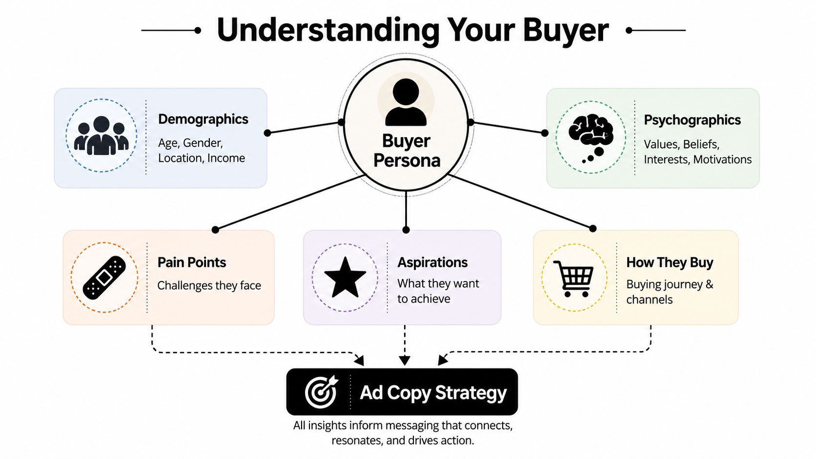
Build a usable buyer profile in three questions
You don't need a giant persona document. You need three answers you can use in ads.
-
What is their real problem
Not the product category problem. The lived problem.
A posture corrector doesn't solve “poor posture.” It speaks to “my back feels tight after sitting all day and I look slouched on Zoom.” -
What transformation do they want
Buyers usually want a simpler, more visible outcome.
A hair tool isn't just “ceramic styling technology.” It's “get polished hair fast before work.” -
What false belief or hesitation is blocking them
Many ads miss this point.
People think “this probably won't work for me,” “I've tried similar products,” or “it looks good in ads but cheap in real life.”
Turn those answers into a mini persona like this:
- Buyer snapshot: Busy professional woman shopping on Instagram after work
- Problem: Her coffee gets cold during the commute and first hour at the desk
- Desired outcome: Hot coffee that lasts without carrying a bulky tumbler
- Main hesitation: Most insulated mugs leak or feel oversized
That gives you much better copy territory:
- “Still reheating your coffee at 9 a.m.?”
- “Keeps your morning coffee hot without the oversized tumbler feel.”
- “Leak-resistant for commutes, clean desk setups, and one-handed carry.”
That's how to write ad copy that feels relevant fast. Start with the buyer's internal conversation, not your product spec sheet.
Choose a Powerful Angle of Attack
A weak ad often isn't weak because the writing is terrible. It's weak because the ad tries to say everything at once. Price, quality, convenience, community, gifting, ingredients, founder story. The result feels mushy.
You need an angle. An angle is the lens that decides what this ad is about. It gives your test structure. Instead of making three slightly different versions of the same message, you create distinct reasons to care.
One of the most overlooked issues in ad-copy advice is beginner testing discipline. Many guides explain hooks and pain points, but they don't answer the practical question of how to choose starting variations on a tight budget. That gap is called out in this beginner-focused discussion on operational testing for ad copy.
Five angles that actually give you different tests
Here are five useful starting angles for DTC brands.
Problem and solution
Use this when the pain is obvious and easy to dramatize.
Good for posture products, cleaning tools, storage solutions, pet hair removers, sleep products.
Example hook: “Tired of dog hair stuck to every black shirt you own?”
Social proof
Use this when buyers need reassurance more than education.
Good for products in crowded categories like skincare, supplements, basics, and beauty.
Example hook: “Why are so many repeat customers replacing their old cleanser with this one?”
UGC-style relatability
Use this when the product sells best through lived experience and informal language.
Good for beauty, apparel, gadgets, kitchen tools, and problem-solving impulse buys.
If you need inspiration for what this can look like, these UGC ad examples for ecommerce are useful for studying tone and structure.
Scarcity and urgency
Use this when there's a real reason to act now, such as a launch drop, seasonal relevance, or limited stock.
Good for collections, gifts, trend products, and time-sensitive offers.
Example hook: “The colorway everyone wants is back, but not for long.”
Identity
Use this when the product says something about the buyer.
Good for niche apparel, wellness brands, productivity tools, outdoor products, and founder-led brands.
Example hook: “For runners who care more about consistency than flashy gear.”
If your product solves an annoying daily problem, start with problem and solution. If the category is skeptical or crowded, start with social proof or UGC.
Comparison of Common Ad Copy Angles
| Angle | Primary Goal | Best For... | Example Hook |
|---|---|---|---|
| Problem and Solution | Make the pain feel immediate and solvable | Utility products, home problem-solvers, pain-relief adjacent products | “Still waking up with tangled charging cables all over your nightstand?” |
| Social Proof | Reduce skepticism | Crowded categories, beauty, wellness, skincare, apparel staples | “The set customers keep coming back for.” |
| UGC | Make the ad feel native and believable | Demonstration products, impulse buys, TikTok-style creative | “I didn't think this would matter, but now I use it every day.” |
| Scarcity | Create urgency | Drops, seasonal offers, limited releases, gifting moments | “Back in stock, and this batch won't sit long.” |
| Identity | Help buyers see themselves in the product | Lifestyle brands, niche communities, values-led products | “Made for people who want their gym bag to look as sharp as their outfit.” |
Don't launch all five at once if your budget is tight. Pick two or three that are meaningfully different. That's enough to learn whether buyers respond more to pain, proof, or identity.
The Anatomy of High-Converting Meta Ad Copy
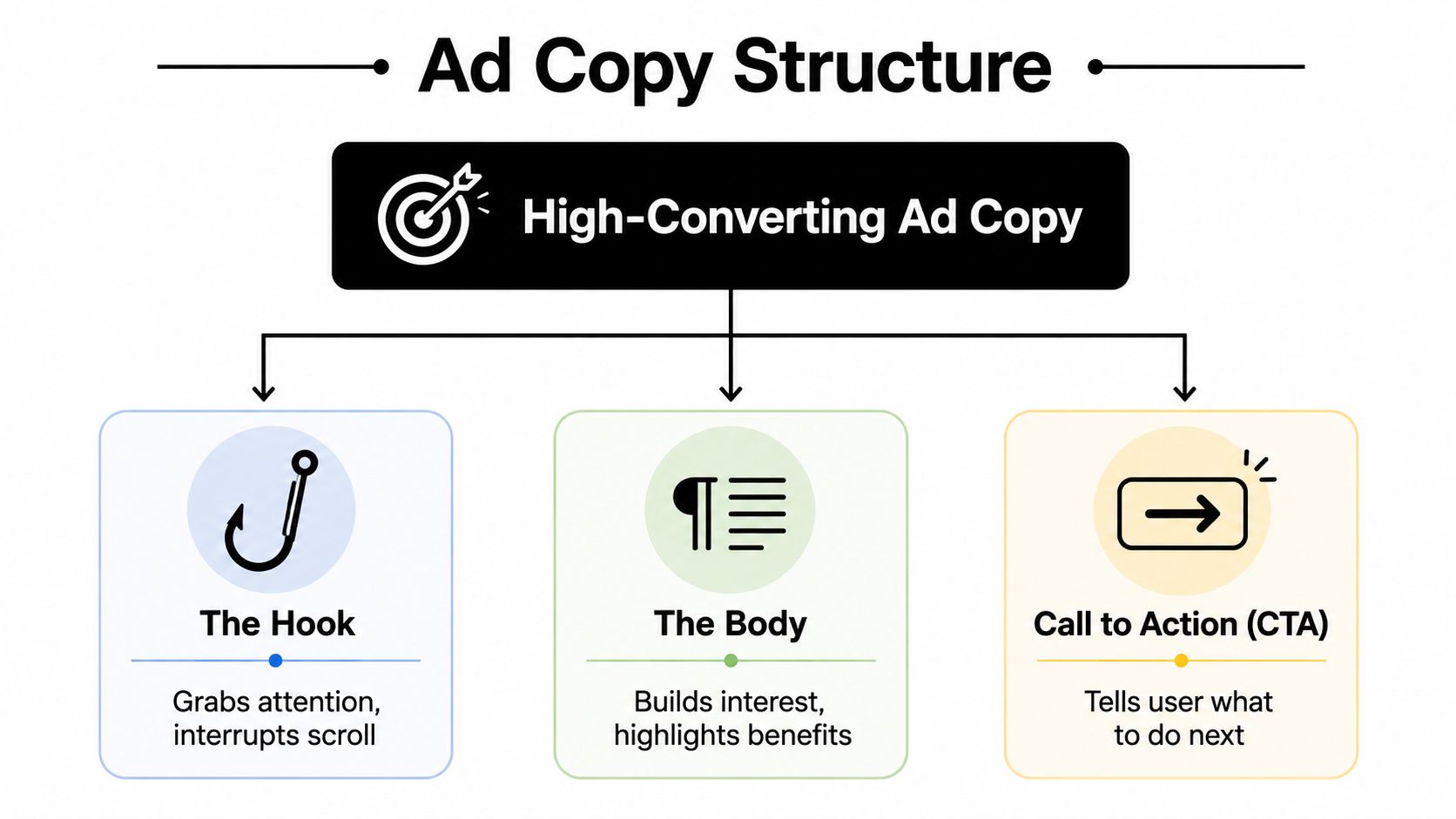
Most Meta ads that convert follow a simple structure. Hook. Body. CTA. When founders struggle with copy, it's usually because one of those pieces is doing the wrong job.
The hook is trying to explain too much. The body is listing features instead of building desire. The CTA is generic and disconnected from the message.
A foundational ad-copy principle is that 80% of people read the headline, but only 20% read the rest, which is why the headline carries most of the burden for stopping the scroll, as noted in this ad copy guidance on headline importance.
Here's the structure in one glance.
The hook earns attention
The hook has one job. Get the right person to give you a few more seconds.
For Meta, that usually means one of these:
- Call out the problem: “Still scrubbing pans longer than you cooked?”
- Name the buyer: “For side sleepers who wake up with neck tension”
- Introduce curiosity: “The small desk upgrade I didn't expect to care about”
- Lead with a benefit: “Hot coffee through your whole commute”
A hook fails when it's broad, abstract, or self-centered.
“We're excited to introduce...” is weak.
“Our mission is to redefine...” is weaker.
For a DTC example, imagine a Shopify brand selling a compact garment steamer.
Weak hook: “Premium Portable Steamer for Modern Lifestyles”
Better hook: “Wrinkled shirt five minutes before work?”
The second one enters the buyer's day. That's what stops the scroll.
Here's a useful walkthrough on video if you want to see ad structure explained visually.
The body turns interest into intent
Once the hook works, the body has to carry the same idea forward. Don't switch topics. Don't dump every feature. Expand the promise.
A simple way to do this is a light PAS flow:
- Problem: What's frustrating now
- Agitate: Why it keeps bothering them
- Solve: How your product removes that friction
For the garment steamer:
- Hook: “Wrinkled shirt five minutes before work?”
- Body: “Skip the ironing board. This compact steamer heats fast, fits in a small bathroom drawer, and helps you clean up shirts, dresses, and last-minute outfits without turning your morning into a chore.”
- CTA: “See how it works.”
The body should convert features into lived benefits:
- Fast heat-up becomes less morning friction
- Compact design becomes easy storage
- Fabric-safe use becomes less hesitation before buying
Great body copy answers the unspoken question: “Why should I care right now?”
The CTA finishes the thought
“Shop Now” isn't wrong. It's just often lazy.
A strong CTA matches the awareness level of the buyer and the promise of the ad:
- If the ad demonstrates the product, use See It in Action
- If the product needs explanation, use Learn More
- If the ad pushes a clear offer, use Claim the Offer
- If the ad is built around a product category pain point, use Find Your Fit or Try It Today
For a first-time ecommerce founder, the safest rule is this: your CTA should feel like the natural next step, not a hard pivot.
If your ad says “Stop reheating your coffee every morning,” a better CTA is “See the mug” or “Pick your color” than “Buy now.” The buyer hasn't earned that leap yet.
Format Your Copy to Be Scannable Not Skippable
A lot of decent ad copy loses because it looks annoying to read. On Meta, formatting shapes whether people even attempt the first line. If your primary text appears as a dense block, many users will skip it before deciding whether the message is good.
That matters even more on mobile. Feed users scan fast. Story and Reel users move faster. A readable ad feels lower effort. A wall of text feels expensive.
Why readability changes performance
Scannable copy does three things well.
- It controls pace: Short lines slow the eye in a good way.
- It highlights the core claim: The buyer sees the benefit before the details.
- It reduces effort: A clean layout feels easier to consume.
This doesn't mean every ad should be tiny. Some products need more explanation. But even longer copy should be visually light.
Use:
- Short opening lines
- Single-line paragraphs
- Line breaks around the main promise
- Bullets for features or outcomes
- Occasional emojis if they fit the brand
Avoid:
- Long unbroken paragraphs
- Multiple claims stacked in one sentence
- Corporate wording
- Front-loading too much setup before the benefit
A simple before-and-after example
Before
Our portable blender is designed with convenience and performance in mind, allowing customers to make smoothies, protein shakes, and other blended beverages at home or on the go with a rechargeable design, sleek form factor, durable blades, and easy-to-clean cup attachment.
That sounds like catalog copy.
After
Busy morning?
Blend your shake at home, at work, or in the car between stops.
- Rechargeable design
- Easy-clean cup
- Compact enough for your bag
Tap to see it in action.
The product didn't change. The readability did.
If the copy looks like work, people treat it like work.
One practical habit helps a lot. Preview your ad on your phone before launch. If the first few lines don't read cleanly in-feed, rewrite them until they do.
Your First Ad Copy A/B Testing Plan
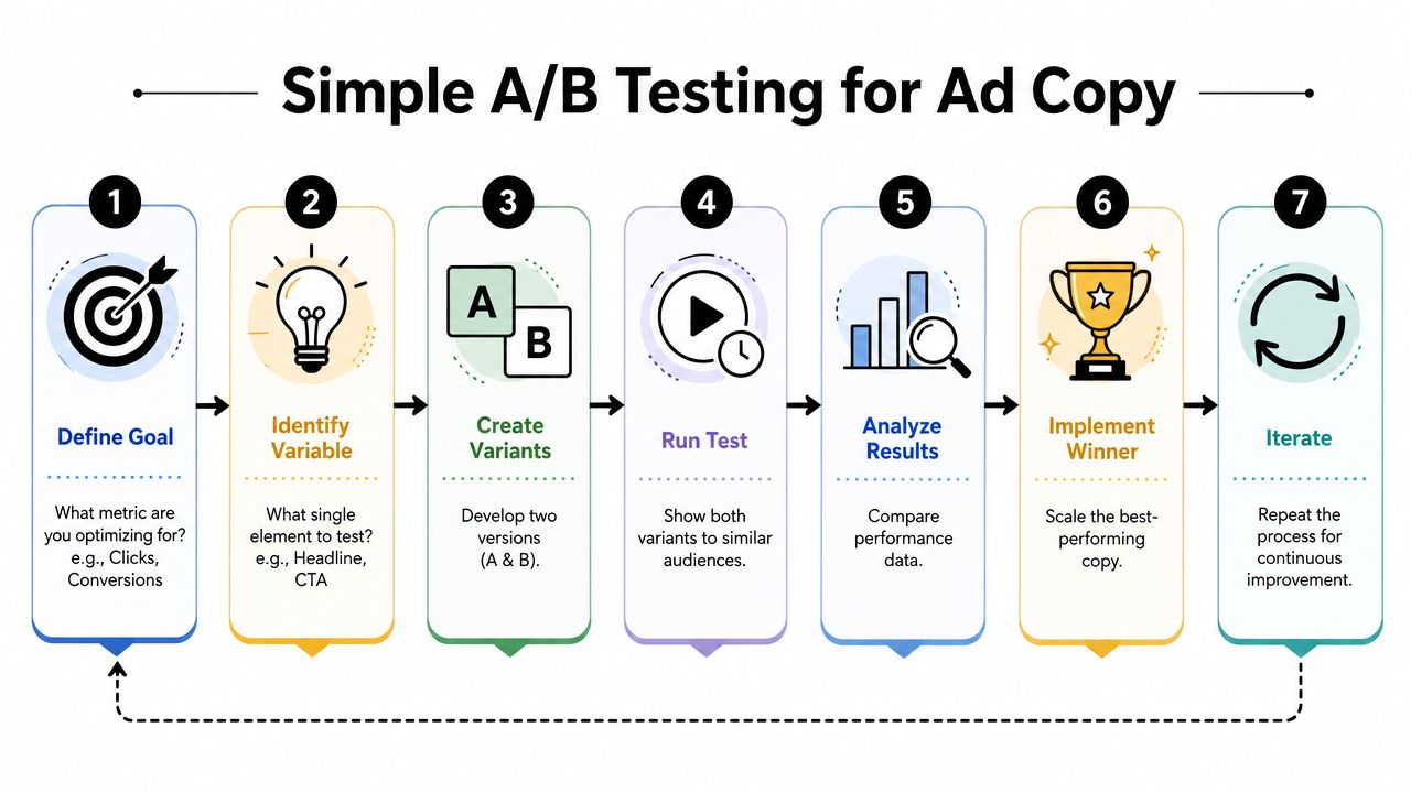
Beginners usually make one of two mistakes. They test too many tiny variables at once, or they make one ad, run it for a couple of days, and start rewriting everything before the platform has enough signal.
A more disciplined approach is to test a few high-impact ideas first. The headline, the core angle, and the offer matter far more than punctuation tweaks or button wording.
For ad copy testing, a rigorous benchmark is to wait for at least 100 conversions per variant over one to two weeks before deciding a winner, according to this guide on ad copy testing benchmarks. That same guidance also recommends testing high-impact elements first, such as the headline and offer.
What to test first on a small budget
If you don't have enough budget to generate that level of conversion volume quickly, don't pretend your early data is conclusive. Use it directionally.
Your first testing priority should be:
- Angle
- Hook
- Offer framing
- CTA
Don't start with:
- button color
- punctuation style
- one-word headline swaps
- tiny formatting experiments while the message itself is still unclear
Here's the simplest way to think about it. Test messages, not trivia.
A beginner launch recipe
For a small-budget first campaign, launch with two or three ads that are clearly different in message. That's enough range to learn something without spreading your spend too thin.
A good setup looks like this:
-
Ad A uses a problem-solution angle
Hook: “Still reheating your coffee at work?”
Body: Focus on the daily annoyance and the practical fix. -
Ad B uses social proof
Hook: “The mug commuters keep reaching for”
Body: Focus on reassurance, quality feel, and routine fit. -
Ad C uses identity or UGC tone
Hook: “For people who take their morning coffee seriously”
Body: Focus on lifestyle fit, design, and habit.
Keep the visual reasonably consistent if you want to isolate copy better. If you change copy, format, concept, and visual style all at once, it becomes harder to know what caused the response.
Use a simple review process:
- Check click-through rate to judge whether the message earns attention
- Check conversion rate to see whether post-click behavior holds up
- Check return on ad spend to evaluate whether the ad is commercially useful
Those are the core metrics large ad platforms and ad-copy workflows use when iterating performance. If you want a more structured workflow than a spreadsheet, some founders use planning tools such as multivariate testing workflows for ad experiments, while others stay inside Meta and track changes manually.
A practical weekly rhythm:
- Let the ads gather enough data to avoid knee-jerk edits
- Pause obvious non-starters if one message is clearly mismatched
- Keep the winner's angle
- Write the next round by changing one major element, usually the hook or offer framing
Early testing is for learning what message the market responds to. Scaling comes after that.
Connect Your Ad Copy to Your Landing Page
A lot of ad copy gets blamed for problems that happen after the click. The ad promises one thing. The landing page opens with something else. The buyer loses confidence in seconds.
Many first campaigns leak money when the founder finally writes a solid ad, but the product page headline is generic, the first image doesn't reinforce the angle, and the page buries the exact benefit that got the click.
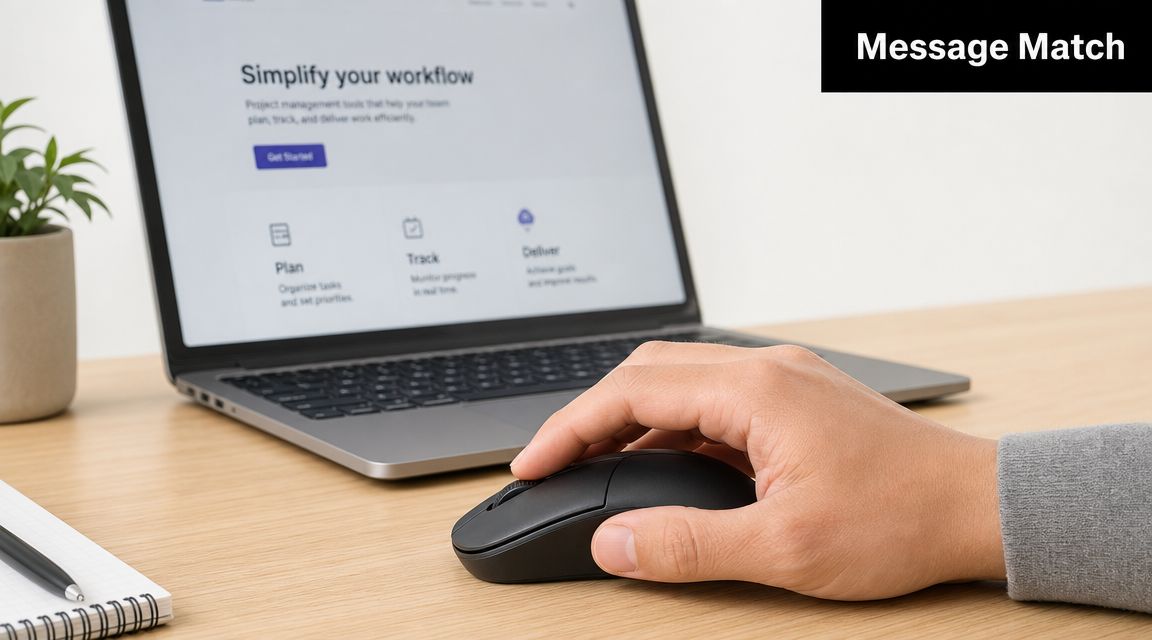
Message match is where wasted spend starts or stops
If your ad says “Stop reheating your coffee every morning,” the landing page shouldn't greet the user with “The Ultimate Stainless Steel Beverage Solution.” That sounds like a different conversation.
The page needs to continue the exact story:
- ad hook names the problem
- page headline restates the benefit
- images support the same use case
- proof elements answer the same hesitation
Modern ad platforms reinforce this iterative loop. Google Ads, for example, recommends using campaign-level asset reporting to identify the best-performing headlines and descriptions, replacing “Low” performers with new variants based on the stronger ones, as described in Google Ads asset reporting guidance. That same mindset should apply after the click. When one message wins in ads, your page should reflect it more clearly.
A pre-launch landing page check
Before you spend on traffic, check these five things.
- Headline match: Does the page headline echo the ad's main promise?
- Benefit visibility: Can a visitor understand the core value without scrolling much?
- Proof alignment: Do reviews, testimonials, or visuals support the exact claim made in the ad?
- Objection handling: Does the page answer the hesitation that the ad surfaced?
- CTA continuity: Does the page make the next step obvious?
Here's a simple example.
If the ad angle is convenience:
- Ad hook: “Wrinkled shirt five minutes before work?”
- Page headline: “Look put together fast with a compact steamer built for busy mornings”
- Proof: short demo, close-up shots, setup simplicity, customer comments about ease and speed
If the ad angle is identity:
- Ad hook: “For runners who want gear that looks clean and works hard”
- Page headline: “Minimal running essentials built for daily use”
- Proof: lifestyle images, material details, fit notes, customer language that reflects the same self-image
One useful option for beginners is Social Loop AI, which turns a product URL into a Meta ads launch plan, generates angle-based creative variations, and scores landing-page readiness so founders can spot message-match issues before launch.
When you learn how to write ad copy, you're not just learning how to fill the text fields in Ads Manager. You're learning how to create one clear promise, test it with discipline, and carry it all the way from scroll stop to product page.
If you're launching your first product and want help turning a product page into a practical Meta ads test plan, Social Loop AI is built for that workflow. It helps first-time ecommerce founders define a buyer profile, choose clear ad angles, generate brand-aware creatives, and tighten landing-page message match before spending on traffic.