Blog
Landing Page Conversion Optimization: Turn Clicks to Sales
Published June 15, 2026
You launched ads, the clicks are coming in, and nothing happens after the landing. No sales. No real add-to-cart momentum. Just spend.
For new ecommerce owners, that usually feels like an ad problem. Sometimes it is. More often, the ad did its job and the page didn't. The visitor clicked because they expected one thing, landed on something else, got confused, hesitated, and left.
That's why landing page conversion optimization matters so much before you scale paid traffic. It isn't a bag of tricks. It's a system for reducing confusion, matching intent, and making the next action feel obvious. Across industries, landing pages often average about 2.35% to 6.6%, while top performers get past 10%, according to Involve.me's landing page statistics roundup. The gap is rarely explained by luck. It's usually explained by message clarity, focus, and friction.
If you're a beginner running Meta ads to a Shopify or WooCommerce store, the fastest wins usually happen before launch. Fix the page first. Then buy traffic.
Table of Contents
- Why Your Clicks Aren't Turning Into Customers
- Your Pre-Launch Landing Page Audit Checklist
- High-Impact Fixes Copy Layout and CTA
- Building Trust and Removing Friction
- Your First A/B Test A Simple Hypothesis-Driven Approach
- Quick Wins for Paid Ad Traffic and Message Match
Why Your Clicks Aren't Turning Into Customers
A shopper taps your ad on Instagram during a lunch break. The ad promises one clear outcome. They land on your page and have to decode the product, hunt for the benefit, dodge a popup, and decide which button matters. That click cost money, but the page is asking for patience.
Many new Shopify stores lose sales here. Not because the product is bad, and not because the ad platform is broken. The page makes a cold visitor work too hard before they can feel confident enough to buy.
For beginners running paid traffic, landing page conversion optimization starts with message match and focus. The ad sets an expectation. The page has to confirm it fast. If the ad sells relief for back pain, better sleep, cleaner counters, or easier meal prep, the first screen should echo that promise in plain language and show the product in context.
A lot of store owners treat conversion problems like a pile of separate tasks. Change the button color. Add an app. Try a countdown timer. Rewrite a sentence. That approach wastes time because conversion is a system. A click turns into a customer when four things work together at the same time:
- The offer is clear: The visitor can tell what the product is, who it helps, and why it matters within seconds.
- The page matches the click: The promise in the ad appears again on the page instead of getting replaced by a brand slogan.
- The next step feels easy: One primary action stands out, and the page does not compete with itself.
- Belief comes quickly: The shopper sees enough proof to trust the claim and enough clarity to keep moving.
Paid traffic exposes weak pages fast.
Beginners usually send ad traffic to a standard product or home page packed with navigation, category links, chat widgets, popups, subscription boxes, review apps, and multiple calls to action. Each element may look harmless on its own. Together, they split attention and create hesitation.
Practical rule: If a first-time visitor cannot tell what you sell, why it helps, and what to do next within a few seconds, the page is not ready for paid traffic.
In practice, weak landing pages tend to break in four predictable places:
- The promise is vague: The ad leads with a specific outcome, but the page opens with broad branding.
- The page is crowded: Too many links, offers, and visual priorities pull the eye in different directions.
- Trust is too thin: The page makes claims without enough proof, detail, or context to support them.
- Friction shows up early: Mobile layout issues, slow media, awkward forms, sticky bars, or clutter interrupt momentum.
These are not random leaks. They stack. When the message is slightly off, trust is light, and the page is busy, paid traffic becomes expensive feedback. Fix those basics before launch, and you give your ads a fair chance to work.
Your Pre-Launch Landing Page Audit Checklist
Before you spend on Meta, TikTok, or Google Ads, audit the page like you're checking a plane before takeoff. If the basics aren't working now, paid traffic won't fix them. It will just reveal them faster.
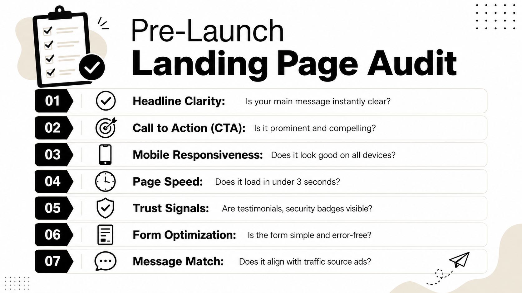
Clarity comes first
Open your page on mobile and ask one question: can a cold visitor understand the offer immediately?
Check these first:
- Headline clarity: Does the first line say what the product is and why someone should care?
- Visual relevance: Does the hero image show the actual product in a believable use case?
- Offer visibility: Is the main value clear without scrolling?
- CTA prominence: Can the visitor tell what action you want next?
If your hero section looks clever but not obvious, rewrite it.
A beginner mistake is writing copy from the brand's point of view. Visitors don't care that the product is premium or thoughtfully designed. They care whether it solves the problem that made them click.
Check relevance before design polish
A page can look polished and still fail because the message doesn't line up with the traffic source. If your ad mentions a skin-friendly fabric, a mess-free kitchen tool, or a posture benefit, that exact promise should appear near the top of the page.
Use this quick relevance check:
| Audit question | What good looks like |
|---|---|
| Does the headline echo the ad promise? | Same benefit, same angle, same level of specificity |
| Does the hero image feel familiar? | Similar product view or use-case as the ad creative |
| Does the CTA fit the visitor stage? | Low-friction if traffic is cold, stronger buy intent if traffic is warm |
A page doesn't need to say more. It needs to say the right thing sooner.
Friction hides in small details
Early ad budgets typically leak at this stage.
Look for practical blockers:
- Mobile layout issues: Buttons too small, text too dense, sticky bars covering content.
- Page speed concerns: Heavy media, autoplay elements, and too many apps slow the first impression.
- Form or cart friction: Extra fields, confusing variant selectors, vague shipping info.
- Trust gaps: No visible reviews, unclear return policy, weak product explanation, no contact path.
For beginners, I like a simple four-part audit lens:
-
Clarity
Can I understand the product fast? -
Value
Is the benefit stronger than the effort or risk? -
Relevance
Does this feel like the page I expected after the click? -
Friction
What could stop me from acting right now?
Write down the top three failures, not every flaw. That's your pre-launch fix list.
High-Impact Fixes Copy Layout and CTA
If the page is underperforming, start above the fold. That's where first impressions are formed and where most beginners either earn the scroll or lose the click.
Rewrite the headline for the outcome
Weak headlines describe the product. Strong headlines connect the product to the outcome.
Compare the difference:
-
Weak: Premium Orthopedic Pillow
-
Stronger: Sleep with better neck support without changing your nightly routine
-
Weak: Portable Blender for Busy Lifestyles
-
Stronger: Blend a quick smoothie anywhere without dragging out kitchen gear
The better version doesn't rely on hype. It answers the buyer's real question: what's in it for me?
A good ecommerce headline usually does three things:
- Names the result: What improves?
- Hints at the pain removed: What gets easier?
- Keeps the wording concrete: No vague slogans
If your ad angle is already working, don't invent a new story on the page. Carry the same promise forward.
Fix the hero section before anything lower on the page
Your hero section should do one job. Confirm the click and move the visitor toward the next action.
A simple structure works well:
- Headline with the core benefit
- Short supporting line that removes doubt
- Product visual that matches the ad
- Primary CTA
- One immediate trust cue
That trust cue could be review context, shipping clarity, or a concise policy note. Keep it short. The goal isn't to dump information. It's to reduce hesitation.
Here's a practical comparison:
| Element | Weak version | Better version |
|---|---|---|
| Headline | Stylish Everyday Bottle | Keep drinks cold through your full workday |
| Subtext | Designed for modern living | Leak-resistant, easy to carry, and simple to clean |
| CTA | Buy Now | Get Yours Today |
| Trust cue | None | Easy returns and clear delivery info |
The right layout makes the next action feel natural. The wrong layout forces the visitor to investigate.
Make the CTA specific and low resistance
Generic CTAs often underperform because they don't reflect user intent. "Buy Now" can work for warm traffic, but it's often too abrupt for cold social clicks.
Instead, match the CTA to the buying temperature:
- Cold traffic: Shop the collection, See how it works, Choose your bundle
- Warmer product-aware traffic: Get yours today, Add to cart, Start your order
If you want more examples, this guide on call-to-action phrases that fit buyer intent is useful for tightening button copy.
What works: One clear button that completes the thought started by the headline.
What doesn't: A page with three different CTAs asking the visitor to compare, subscribe, and buy at once.
Also check placement. On mobile, the CTA shouldn't hide below a tall image, a review app block, or a giant announcement bar. If the page asks for a purchase, the action needs to appear early and reappear naturally as the person scrolls.
Building Trust and Removing Friction
A landing page can have strong copy and still lose sales because the visitor doesn't quite believe you, or because using the page feels harder than it should. Trust and friction usually show up together.
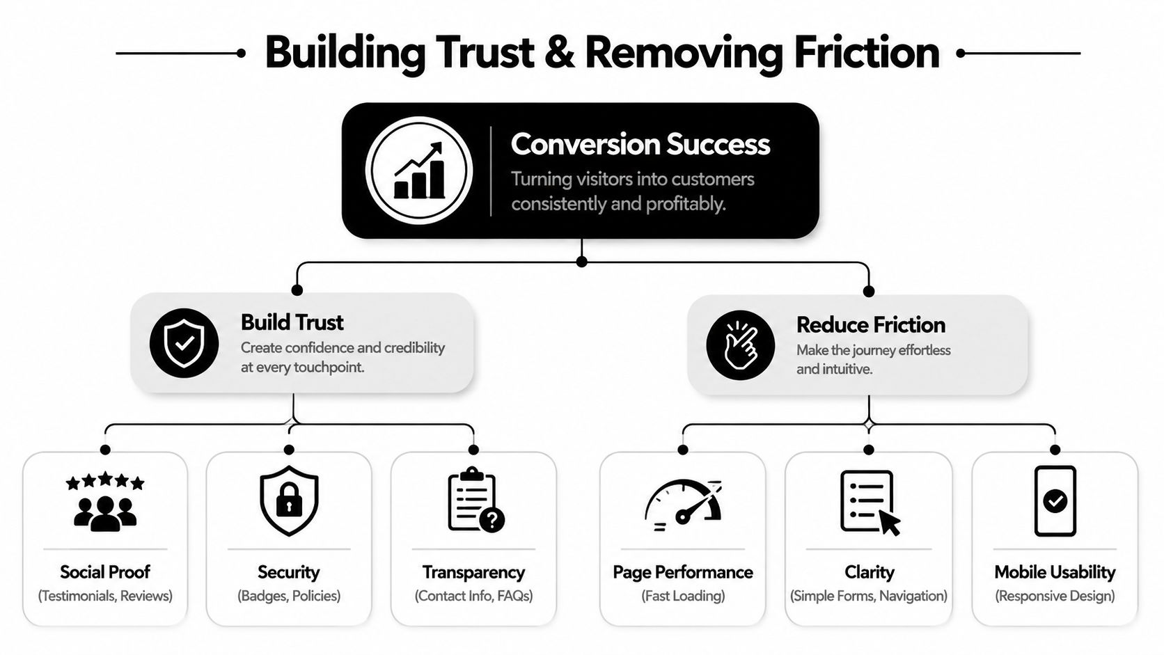
Use the proof that answers the real objection
Many store owners react to low conversion by piling on more testimonials. That can backfire. The issue often isn't quantity. It's proof format.
As Dynamic Yield's guidance on landing page design points out, better optimization comes from trust calibration and diagnostic measurement, including things like form abandonment and CTA click-to-submit ratios. The useful question isn't whether you have enough proof. It's which proof removes the audience's biggest objection right now.
That means different pages need different proof:
- Unknown brand selling a physical product: Reviews, visible policies, and real product photos in use usually matter more than polished brand claims.
- Higher-consideration item: FAQs, shipping clarity, return details, and transparent product specs carry more weight.
- Social-driven impulse offer: Short review snippets, creator-style visuals, and immediate reassurance near the CTA often work better than long blocks of praise.
If visitors engage with the page but stop at the form or cart step, the problem might not be trust at all. It might be request size. Too many fields, unclear shipping, or a messy mobile interaction can kill intent that was already there.
Speed and mobile shape trust more than people admit
When a page feels slow, cluttered, or awkward on a phone, visitors read that as risk. They may not say, "I don't trust this store." They just leave.
Common friction points I see on beginner stores:
- Heavy hero images: Large files make the first screen feel sluggish.
- Popup collisions: Email popups, discount wheels, and chat widgets compete for the same small space.
- Tiny mobile text: Visitors have to pinch, zoom, or reread.
- Stacked app elements: Review widgets, sticky bars, and badges create visual noise.
A clean mobile page feels more trustworthy because it feels maintained. That matters for paid social traffic, where many visitors arrive on a phone and decide quickly whether the store feels legitimate.
Use a simple decision rule:
| If you see this | Fix this first |
|---|---|
| Visitors click CTA but don't complete | Reduce friction in form, cart, or checkout flow |
| Visitors bounce early | Improve message alignment and first-screen trust |
| Visitors scroll but hesitate | Add proof that answers the specific objection |
Trust isn't built by adding everything. It's built by removing the doubt that matters most.
Your First A/B Test A Simple Hypothesis-Driven Approach
Once the page is conversion-ready, testing becomes useful. Before that, testing just formalizes confusion.
A good beginner workflow is staged. Swell Country's landing page optimization guide recommends starting with Weeks 1 to 2 for audit and tracking, Weeks 3 to 4 for quick wins, then moving into A/B testing. That same guide also warns against trusting the page-wide average because performance can vary sharply by segment. In its example, mobile Google Ads traffic converts near 1% while desktop Facebook traffic reaches 7%.
That one point saves beginners from a common mistake. They test the page as if all visitors behave the same. They don't.
Start with a clean testing sequence
Don't test five things at once. Don't redesign the whole page and call it an experiment. Start with the elements that shape interpretation first.
Test in this order:
- Headline
- Hero image or video
- Primary CTA text
These are highly impactful because they affect what the visitor thinks the page is about before anything else.
Testing rule: If you can't explain why the new version should win, you don't have a hypothesis. You have a preference.
A simple hypothesis recipe
Use this formula:
If we change [element] from [current version] to [new version], then [metric] should improve because [buyer reasoning].
Example:
- If we change the headline from a product description to an outcome-focused promise, then more visitors should click through because cold traffic usually cares about the result first.
- If we change the CTA from "Buy Now" to "See Your Options," then more visitors should continue because the page is reaching early-stage traffic from social ads.
- If we replace a studio image with a use-case image that matches the ad, then more visitors should stay because the page will feel more consistent with the click they just made.
Track the result by source and device, not just in aggregate. If you need a practical primer on when a result is meaningful, this explanation of statistical significance for marketers is a good starting point.
The first three tests worth running
The most useful first tests for a beginner store are usually these:
- Headline angle test: Feature-first versus result-first
- CTA intent test: Direct purchase language versus softer exploration language
- Hero creative test: Clean product image versus in-use lifestyle visual
After you've run a few simple tests, watch this walkthrough for a more practical feel for how landing page testing works in context.
The goal isn't to become a testing expert overnight. The goal is to replace random edits with a repeatable learning loop.
Quick Wins for Paid Ad Traffic and Message Match
If you're buying traffic, message match is the first thing to inspect. It's often the biggest lever on the page.
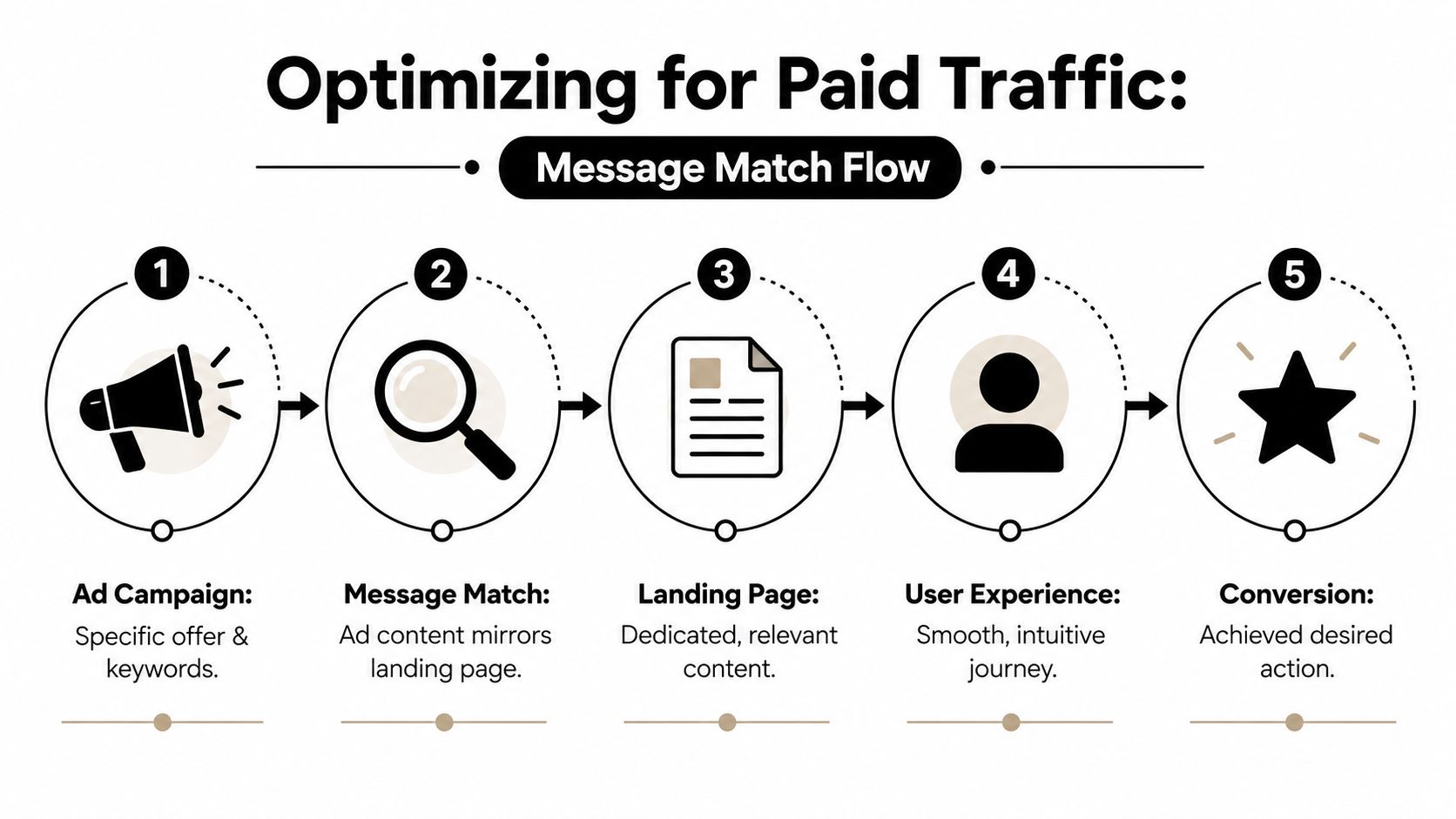
CXL's landing page optimization guidance makes this point clearly. The biggest conversion lift often comes from reducing intent mismatch, not from minor visual tweaks. It recommends dedicated landing pages for campaigns and aligning the page to what the visitor already expects from the ad or prior content.
The ad sets the expectation
Paid traffic isn't neutral. A Meta ad creates a promise before the visitor arrives. That promise can be emotional, practical, or curiosity-driven, but it sets the frame.
If the ad says:
- solve a problem faster,
- avoid a common frustration,
- get a specific result,
- or look a certain way,
the landing page should open with that same thread.
Weak message match looks like this:
| Ad promise | Landing page problem |
|---|---|
| Shows a travel-friendly organizer | Page opens with a broad brand slogan |
| Highlights a pain-point solution | Page starts with generic product features |
| Uses creator-style visual proof | Page switches to sterile catalog imagery |
Strong message match doesn't mean copying the ad word for word. It means the visitor feels they've landed in the right place.
A simple message-match check
Use this before every launch:
- Headline check: Does the top line echo the promise from the ad?
- Visual check: Does the first image feel like the same campaign?
- Offer check: Is the product, bundle, or benefit consistent?
- Intent check: Does the CTA fit where this traffic is in the buying journey?
If your click-through rate is decent but the page stalls, the issue may not be the audience. It may be the handoff. For ad teams trying to tighten that handoff, these ideas on how to improve click-through rates without breaking message consistency are useful.
A beginner doesn't need more hacks. They need better alignment. Paid ads work best when the click feels like the start of a straight line, not a hard turn into a different message.
If you're launching your first product and want help fixing the page before ad spend starts leaking, Social Loop AI gives you a practical pre-launch system. It audits landing-page readiness, sharpens buyer messaging, and turns your product URL into a structured Meta ads plan with creatives built around real angles and objections.