Blog
7 Top Landing Page Examples to Inspire Your 2026 Store
Published July 27, 2026
Stop Wasting Ad Spend on Leaky Landing Pages. You've built the Meta ad, chosen the product, and maybe even found a decent angle, but the click still lands on a page that makes people hesitate. That's where most dropshipping campaigns leak money. A high-converting page isn't about fancy effects, it's about message match, single-offer focus, and low friction, which is why landing pages built around one goal keep showing up in benchmark data and expert teardown libraries (KlientBoost landing page statistics, Unbounce's landing page examples).
The fastest way to think like a conversion strategist is to stop treating landing page examples like a gallery and start scoring them like a buyer would. If the headline doesn't land in seconds, if the offer feels fuzzy, if the page buries trust signals, or if the CTA competes with noise, the page is working against you. Tools like Social Loop AI focus on that pre-launch audit mindset because first-time sellers need a way to spot weak points before they spend on traffic.
Table of Contents
- 2. Unbounce's Library The Why Behind the Design
- 2. Unbounce's Library The Why Behind the Design
- 3. Land-book Nailing Specific Page Sections
- 4. Lapa Ninja Finding Creative and UGC-First Layouts
- 5. Landing Page Gallery Mastering Urgency and Scarcity
- 6. One Page Love Building Hype for a New Product
- 7. Landingfolio Learning from Modern DTC Brands
- 8. SaaS Landing Page Examples Communicating Benefits
- 8 Landing Page Examples Comparison
- From Inspiration to Conversion: Your Action Plan
2. Unbounce's Library The Why Behind the Design
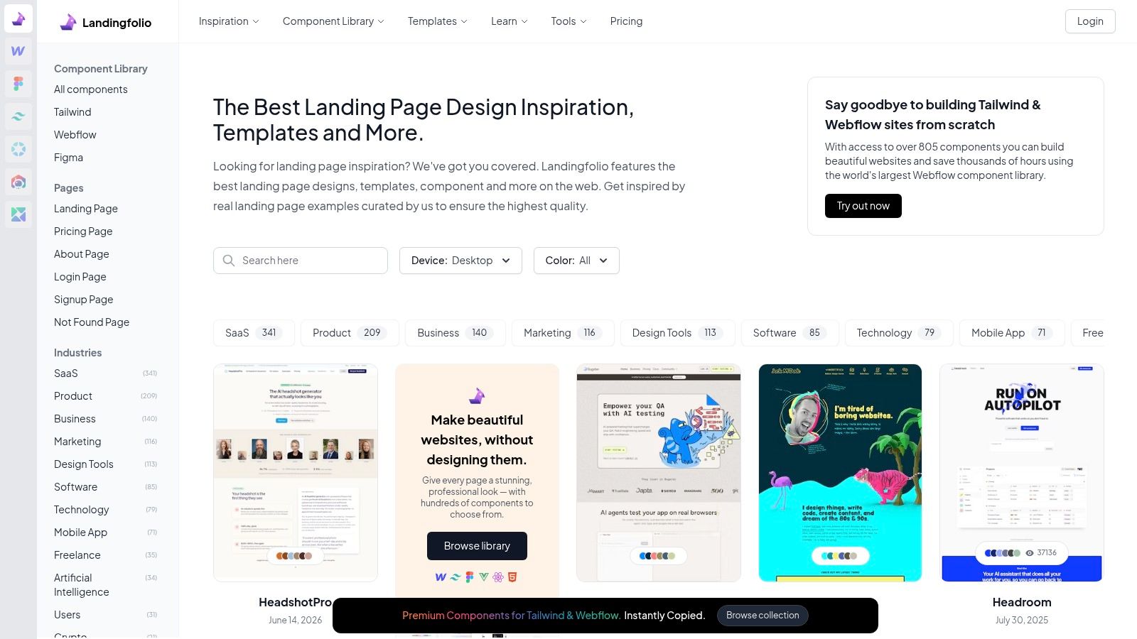
Unbounce works because it shows the page and explains the decision-making behind it. Its landing page examples collection pairs real pages with editorial commentary, so you can see why a headline works, why a proof block sits where it does, and why a CTA earns the main visual position instead of copying a screenshot without context. That makes it useful for a new dropshipper who needs to understand the structure behind conversion, not just collect pretty references. The library is worth bookmarking at Unbounce's landing page examples library.
The strongest part of Unbounce's approach is the psychology. When a page makes the value obvious, removes extra navigation, and keeps the CTA visually dominant, it holds the visitor inside the buying decision instead of sending them toward unrelated clicks. That matters even more for cold traffic, because a first-time visitor needs fast orientation, not a long brand story.
What to copy and what to ignore
Copy the reasoning, not the surface style. Calm spacing and one persuasive promise are useful signals, but that does not mean your store should imitate the same colors, fonts, or visual mood. The part worth borrowing is the structure, a focused hero, proof that lowers risk, and a CTA that does not compete with side offers or decorative links.
Unbounce's limits are useful too. The library is narrower than large pure galleries, and it leans toward the Unbounce ecosystem, so it works better for pattern study than for endless browsing. That makes it a strong place to train your eye on what a converting page is doing, then move that insight into your own product page with a tighter headline, clearer proof, and a cleaner action path.
2. Unbounce's Library The Why Behind the Design
Unbounce is useful because it doesn't just show pages, it explains the logic behind them. Its landing page examples collection mixes real pages with editorial commentary, so you can see why a headline, proof block, or CTA position works instead of copying a screenshot blindly. The platform's own examples also lean into the same conversion pattern you want for dropshipping, clear purpose, visible CTA, and clean hierarchy, which is why the site is worth bookmarking at Unbounce's landing page examples library.
The strongest part of Unbounce's approach is the psychology. When a page makes the value obvious, removes extra navigation, and keeps the CTA visually dominant, it helps the visitor stay inside the buying decision instead of wandering. That matters even more for a new store because cold traffic needs fast orientation, not a brand essay.
What to copy and what to ignore
Copy the reasoning, not the brand styling. If a page uses calm spacing and one persuasive promise, that doesn't mean your store should mimic its colors or fonts. What matters is the structure, a focused hero, proof that lowers risk, and a CTA that doesn't compete with side offers or decorative links.
Unbounce's weakness is also useful. The library is narrower than giant pure galleries, and it leans toward the Unbounce ecosystem, so it's better for pattern study than for endless scrolling. That said, a beginner doesn't need 200 pages, they need a repeatable lens for reading any page.
A practical move today is to take one store page and compare it against a strong Unbounce example. Note where the hero promise is weak, where proof appears too late, and whether the CTA says what happens next in plain language. If the page can't pass that comparison, it's not ready for paid traffic yet.
3. Land-book Nailing Specific Page Sections
Land-book is the place to go when a page is close, but one section feels off. Its library is big, and the value is the ability to browse by sections like hero, pricing, or footer instead of treating every page as one giant screenshot. That makes it especially helpful when you're trying to frame a dropshipping bundle, a discount ladder, or a premium offer in a way that feels more valuable, with the site itself available at Land-book.
The section-level view matters because dropshippers often don't need a full redesign, they need one stronger block. A pricing area can make a bundle feel like a better deal, while a testimonial section can move doubt out of the way right before checkout. The trick is to stop asking, “Is this page pretty?” and start asking, “Which block does the heavy lifting?”
Find the one section that changes the decision
The best use case here is tactical. If your product needs higher perceived value, study pricing blocks that make bundles feel obvious. If your audience is skeptical, look at testimonial layouts that place customer voices near the exact moment of hesitation. If your offer is too abstract, look for section patterns that translate features into outcomes.
Land-book's downside is that not every entry is a pure landing page, so filtering matters. But that's part of the value for a practitioner, because real research is messy and you'll face the same problem when you're building your own swipe file. Use it to collect one hero that clarifies the offer, one proof section that feels believable, and one pricing layout that makes your bundle easier to justify.
A useful rule for a new store is this: don't copy a full page if one section solves the core problem. If your CTA is weak, study CTA placement. If your offer is vague, study pricing hierarchy. If your page feels unfinished, study the section that gives the most confidence per pixel.
4. Lapa Ninja Finding Creative and UGC-First Layouts
Lapa Ninja is the best place to browse a large volume of current layouts without overthinking the starting point. The catalog is broad, updated often, and useful when you need fresh hero structures, proof rows, or pricing ideas from a site that's easy to skim at Lapa Ninja. For dropshippers, that breadth matters because the product isn't usually the problem, the framing is.
This is also the gallery where you're most likely to spot UGC-first layouts that put real people, customer reactions, or creator-style visuals near the top. That style can work because it lowers skepticism faster than polished brand copy, especially for products that need trust before they need explanation. When the page feels like a recommendation rather than a corporate brochure, visitors often stay engaged longer.
Use UGC to make the product feel already validated
The strongest move is to turn customer proof into the main story, not the side note. A product page that opens with customer photos, short reactions, or creator-style clips can make the offer feel lived-in and social. That's why the internal guide on how to make UGC for Social Loop AI is relevant here, because the page and the ad should speak the same visual language.
Lapa Ninja's trade-off is curation depth. With a massive library, some entries are better than others, so you need your own filter. Look for layouts where the hero tells the story, the proof feels native, and the CTA doesn't interrupt the flow. Ignore pages that look clever but leave the buyer wondering what the product does.
For a new dropshipping store, the takeaway is simple. Don't treat UGC as a decoration layer. Use it to answer the question, “Would a stranger trust this enough to click?” If the answer is no, the page needs better proof, not more polish.
5. Landing Page Gallery Mastering Urgency and Scarcity
Landing Page Gallery is the practical choice when you want quick visual inspiration for urgency, scarcity, and ecommerce-style conversion blocks. It has a large screenshot library, element tags, and enough filtering to help you find countdown timers, pricing sections, or product-page patterns without wasting time, and it's available at Landing Page Gallery. That makes it handy for launch pages, promo pages, and DTC-style offer tests.
The primary value here is speed. You can jump straight to pages that show how other brands frame urgency without forcing every tactic into every layout. That matters because urgency only works when it feels earned. If you spray countdown timers everywhere, the page starts to look fake.
Scarcity should feel like a decision boundary, not a gimmick.
Test urgency without turning the page into a gimmick
A good urgency block tells the visitor why action matters now. A weak one just shouts. If the offer is time-sensitive, the timer should sit near the decision point and support the CTA, not distract from it. If the product is limited, the message should explain the constraint clearly enough that the visitor understands the reason.
The gallery's trade-off is commentary depth. You get a lot of visual patterning and less hand-holding on why a layout converts. That's fine if you already know the basics, because you're not looking for theory, you're looking for tactical comparison. Study how other stores position scarcity next to price, shipping, or bonus offers, then decide whether the tactic fits your product truthfully.
For dropshipping, the action step is to test one urgency element at a time. Try countdown placement, then wording, then proximity to CTA. If the page feels pushy, reduce the pressure and strengthen the offer instead.
6. One Page Love Building Hype for a New Product
One Page Love is useful when you're launching lean and need the page to do a single job well. It's a deep archive of one-page inspiration across industries, and it's especially strong for waitlist, pre-order, and single-scroll launch pages, which you can browse at One Page Love. For a new dropshipping product, that makes it a good model for testing demand before you overbuild.
The best launch pages don't try to explain everything. They make the promise obvious, give visitors one clear action, and build enough anticipation to capture a lead or a pre-order. That's useful when you don't have inventory certainty or you're still validating the angle. A good page can help you learn whether the story is strong enough before you commit deeper ad spend.
Use the page to collect intent, not just clicks
A waitlist page works when it frames the product as something worth being early for. That usually means a sharp hero, a concise benefit statement, and one CTA that asks for an email or interest signal. The more you load onto it, the more you dilute the early-market excitement.
One Page Love isn't automatically conversion-optimized, so the discipline is on you. Don't copy a beautiful page just because it feels modern. Ask whether it would still make sense if the product shipped next month, or if the goal was only to validate demand today. The best pages in this space are lean because lean is the point.
A strong next step is to use the archive to compare your product launch page against three different models, one hype-driven, one proof-driven, and one minimal. Then decide which one matches your traffic source. Cold traffic usually needs more clarity, while warmer traffic can handle more anticipation.
7. Landingfolio Learning from Modern DTC Brands
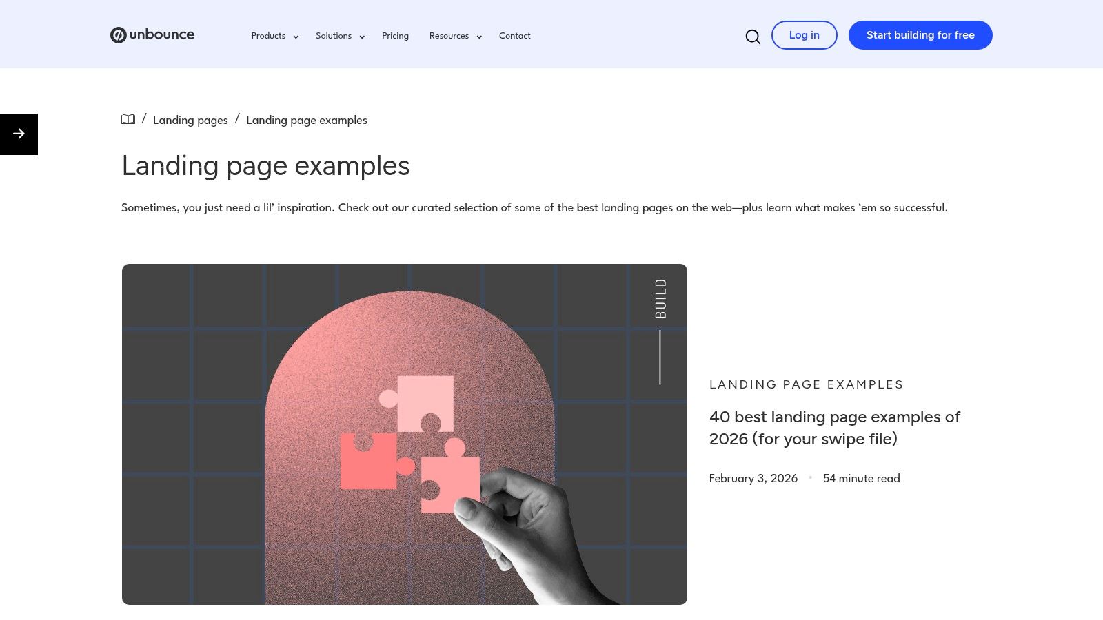
Landingfolio keeps modern DTC and SaaS patterns feeling current rather than dated. The gallery gets updated often, and the component library helps when you need to move from inspiration to a rough mockup without wasting time. If your store is starting to look generic, browse it at Landingfolio.
What makes Landingfolio useful for dropshipping is its focus on what brands are doing now. A lot of galleries feature pages that already feel a few design cycles old. Landingfolio makes it easier to spot the visual choices recent brands are using, which matters when you want your ad creative and landing page to feel like they belong together. If the page looks behind the market, buyers notice that gap fast.
Pattern-match the hierarchy, not the whole layout
Modern DTC pages often work because the hierarchy is clear. The headline tells the story, the hero image supports the claim, and the primary CTA is easy to find without hunting for it. That is not flashy, but it gives first-time buyers the clarity they need to decide whether the product feels real, relevant, and worth a click.
The component library is the part that saves time. If you are a solo founder or building in Shopify, reusable blocks cut the distance between finding a strong reference and drafting a usable page. The trade-off is that the platform leans toward tech and SaaS, so ecommerce hunters need to filter with care and focus on structure rather than category labels.
Use Landingfolio to pull together a modern hero, a clear benefit section, and a CTA treatment that feels clean. Then adapt those blocks to the product truth you are selling. If the layout makes the offer feel current and credible, you are on the right track. If it only looks stylish, keep looking and compare it against a clearer value proposition example like this Social Loop AI breakdown.
8. SaaS Landing Page Examples Communicating Benefits
SaaS-focused galleries are still valuable for ecommerce because they're often better at translating features into outcomes. The pages in this category usually don't sell a physical product, but they do a strong job of showing how to move from “what it is” to “why it matters,” and you can browse the collection at SaaS Landing Page Examples. That's especially helpful when your product has technical specs that mean little to a first-time buyer.
The best pages in this space take product details and turn them into benefits. Instead of listing what the thing does, they show the result the visitor wants. That framing works for dropshipping too, because a buyer doesn't care about a material, mechanism, or feature unless it solves a pain or delivers a feeling.
Turn specs into outcomes the buyer can feel
If your product has a long feature list, start by translating each major point into a visible payoff. A control button becomes convenience. A durable material becomes confidence. A complicated system becomes simplicity. That doesn't mean you exaggerate, it means you lead with the outcome a shopper wants.
The downside is variety. The gallery is mostly SaaS, so it's less useful for visual merchandising or direct ecommerce proof patterns. Still, it's excellent training for headline discipline and benefit-led copy. Use it when your own product page feels too technical, too feature-heavy, or too proud of the engineering and not proud enough of the result.
The internal value proposition guide at Social Loop AI's value proposition examples fits this mindset well, because the product page and the ad should promise the same outcome in different formats. If the buyer can't connect the promise to the payoff, the page is doing too little work.
8 Landing Page Examples Comparison
| Resource / Example | Complexity 🔄 | Resources & Speed ⚡ | Expected Impact 📊 ⭐ | Ideal Use Cases 💡 | Key Advantages ⭐ |
|---|---|---|---|---|---|
| The 5-Point Dropshipping Landing Page Checklist | Low, checklist workflow | Very low, quick to run | ⭐⭐⭐⭐, clearer audits & fast fixes | Quick pre-launch audits & scorecards | Actionable, mobile-first, focused on core CRO points |
| Unbounce's Library: The 'Why' Behind the Design | Medium, requires reading teardowns | Medium, time + possible Unbounce subscription | ⭐⭐⭐⭐, conversion-focused insights | Teams wanting expert rationale & editable templates | Expert commentary + direct template path |
| Land-book: Nailing Specific Page Sections | Low–Medium, section-level study | Low–Medium, free browsing; PRO speeds workflow | ⭐⭐⭐, improved component-level design | Designing pricing, hero, or testimonial sections | Deep section granularity and strong filters |
| Lapa Ninja: Finding Creative & UGC-First Layouts | Low, browse large catalog | Low, free; PRO optional for organization | ⭐⭐⭐, creative layout & UGC inspiration | Brainstorming creative or UGC-first pages | Large, frequently updated catalog for hero/proof ideas |
| Landing Page Gallery: Mastering Urgency & Scarcity | Low, visual-first exploration | Low–Medium, browsing; paid revamp service | ⭐⭐⭐, practical urgency/scarcity patterns | E‑commerce promo pages using timers/bundles | Element tags for urgency, cross‑industry examples |
| One Page Love: Building Hype for a New Product | Low, single-scroll focus | Low, fast mockups; templates available | ⭐⭐⭐⭐, effective for lead capture & hype | Waitlists, pre-orders, MVP launch landing pages | Ideal for lean launch pages and focused funnels |
| Landingfolio: Learning from Modern DTC Brands | Medium, component-driven work | Medium, components may be paid; up-to-date feeds | ⭐⭐⭐⭐, current DTC patterns that convert | Small teams building modern DTC/SaaS pages | Current examples + component library to speed builds |
| SaaS Landing Page Examples: Communicating Benefits | Low–Medium, adapt SaaS patterns | Low, browsing; few written teardowns | ⭐⭐⭐, strong feature→benefit copy frameworks | Adapting Problem→Solution layouts to products | Clear benefit-focused copy templates and element tags |
From Inspiration to Conversion: Your Action Plan
Great landing page examples are useful only if they change how you build. Start with the 5-point checklist and score your own product page before you put budget behind it. If the headline is vague, fix the promise. If the offer is confusing, simplify the structure. If the proof is weak, move reviews and UGC closer to the decision point.
The benchmark numbers make the opportunity obvious. Landing pages can convert at double-digit rates in strong conditions, but the gap between average and strong pages is still about execution, not decoration (KlientBoost landing page statistics). That means your job is to make the page clearer, faster, and more aligned with the traffic source than the page you're copying.
Use the galleries as input, not as a crutch. Unbounce is good for the “why,” Land-book is useful for specific sections, Lapa Ninja is strong for creative density, Landing Page Gallery helps with urgency blocks, One Page Love is solid for lean launch pages, Landingfolio keeps you current, and SaaS Landing Page Examples is great for turning features into benefits. Each one helps you build a different part of the conversion instinct you need as a new dropshipper.
The next move is simple. Pick one product page, score it objectively, and change the weakest block first. Don't redesign the whole store before you fix the part that's leaking trust.
If you want a faster way to do that audit, Social Loop AI can score your landing page readiness, suggest pasteable copy fixes, and turn a product URL into a practical Meta ads launch plan. It's built for first-time dropshippers who need landing page feedback tied to ad angles, buyer intent, and launch readiness.