Blog
8 Meta Advertising Examples to Copy for Your Store (2026)
Published June 14, 2026
You've got a product, a fresh ad account, and maybe $50 to $100 a day to test. The first decision usually goes wrong. New store owners pick the format that looks polished, not the one that gives them the fastest read on message, offer, and product fit.
That mistake gets expensive fast. A weak ad can hide a strong product. A decent ad can send traffic to a page that kills conversion. If you do not know which variable you are testing, Meta will spend your budget teaching you nothing.
Meta is still one of the best places to pressure-test an offer because the platform gives new brands room to test multiple creative angles quickly. The catch is that competition is high, feedback is fast, and average creative gets filtered out early. Good advertisers do not win by making prettier ads. They win by choosing the right format for the job, then building that format around a clear buying trigger.
That is the point of this guide. These are not just meta advertising examples to save for later. They are working formats for new stores, broken down by what each ad is trying to prove, the benchmarks that usually tell you whether to keep spending, and the trade-offs to expect before you scale. Where it makes sense, I'll also show how to turn the structure into launch-ready creative with Social Loop AI instead of building every test from scratch.
If you want more static-first inspiration before you get into the full list, this breakdown of high-converting static ad examples is a useful companion.
Below, you'll see 8 formats worth copying, why they work, where they fail, and how to replicate each one in minutes instead of guessing your way through another test.
Table of Contents
- 1. Single Image Ads with Problem→Solution Copy
- 2. User-Generated Content Ads with Testimonial Video Stills
- 3. Carousel Ads with Multi-Angle Product Showcases
- 4. Reels Ads with Hook-First Storytelling
- 5. Lead Generation Ads with Instant Opt-In
- 6. Dynamic Product Ads with Catalog-Based Retargeting
- 7. Advantage Plus Shopping Campaigns
- 8. Collection Ads with an Immersive Storefront Feel
- Meta Ad Formats, 8-Example Comparison
- From Examples to Execution Your Launch Plan
1. Single Image Ads with Problem→Solution Copy
You launch a new store, put three videos into Meta, and spend a few days waiting for a signal. Nothing separates the winner from the loser because every variable changed at once. A single image ad fixes that fast. It gives you the clearest read on whether the offer, angle, and audience have a shot before you spend time on edits, hooks, and creator briefs.

Why this format still wins
For new ecommerce accounts, simple often beats clever. One product image paired with clear problem→solution copy gives Meta a straightforward asset to test, and it gives you cleaner feedback on message fit. If click-through is weak, the angle is probably off. If clicks are fine but purchases lag, the landing page or offer usually needs work.
That is why I still use single image ads early, even in accounts that will eventually scale with video. They are fast to produce, cheap to iterate, and brutally honest. A lumbar pillow brand does not need a polished studio concept to prove demand. A clear product shot with copy like “Back pain halfway through the workday?” followed by a concrete benefit is enough to learn whether that pain point pulls.
One rule matters more than anything else. The image has to communicate the product in a glance.
How to build one that gives you signal
Start with the problem the buyer already knows they have. Then show the product as the answer, without making the reader work for it.
A basic structure looks like this:
- Hook with the pain: Name the friction point directly.
- Show the fix: Make the product benefit obvious in the image or first line.
- Keep copy tight: Two or three sentences is usually enough.
- Match the page: Repeat the same promise on the product page headline and hero section.
- Test angles before designs: Change the pain point first, not the layout.
That last point saves a lot of wasted effort. New advertisers often redesign the creative before they have learned which message matters. Keep the same image and rotate the angle instead. A kitchen organizer can test clutter, wasted drawer space, slow meal prep, or messy counters using the same base visual. That approach tells you what people respond to without muddying the test.
Here is the trade-off. Static image ads are great for message testing, but they do less heavy lifting when a product needs a demonstration. If the value only becomes obvious after seeing motion, setup, or before-and-after context, this format can underperform. But for products with an instantly clear use case, it is one of the fastest ways to get to a usable winner.
If you want more feed-ready references, Social Loop AI's guide to static ads examples shows the kinds of layouts that are easiest to adapt for launch.
What usually fails is broad brand copy like “Upgrade your workspace today.” It sounds clean and says nothing. Problem→solution copy works because it gives the scroll-stopper a reason to care now, and it gives a new store a repeatable format to build inside Social Loop AI in minutes.
2. User-Generated Content Ads with Testimonial Video Stills
UGC works because it lowers resistance. People don't scroll social apps looking for brand campaigns. They scroll for people, opinions, routines, and proof. The closer your ad feels to that behavior, the better your chances.
What makes UGC work on Meta
Meta's own inspiration guidance says lower-production-value videos produced significantly higher ad recall lift than high-production campaigns, and it recommends vertical filming, sound, and putting key information in the first 3 seconds within Meta's creative inspiration guidance. That matters because new stores usually assume better production equals better results. It often doesn't.
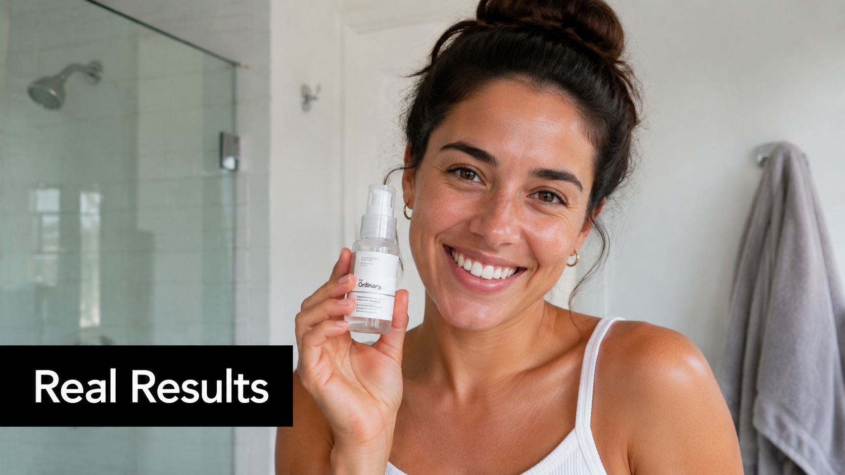
A skincare brand using a customer selfie, a bathroom mirror clip, or a testimonial still can outperform a glossy brand visual because it feels more believable. A pet brand can do the same with a customer video of a dog reacting to a toy. An apparel store can use a creator unboxing and first try-on instead of polished studio footage.
How to make it usable for a new store
Don't wait for hundreds of customers. Start with creators, micro-influencers, or even founder-shot customer-style footage. The ad needs a face, a product, and a specific reaction. “I didn't expect this to work for my morning routine” is stronger than generic praise.
Use these guardrails:
- Choose real moments: Hands opening the package, first use, visible reaction.
- Keep it vertical: UGC feels native when it matches how people already consume Stories and Reels.
- Use plainspoken copy: “See how Maya uses it” works because it doesn't over-sell.
- Refresh often: This format wears out when the same face shows up too often.
If you need a practical starting point, Social Loop AI's walkthrough on how to make UGC is geared toward turning rough creator-style input into usable ad creative.
What fails here is fake authenticity. Scripted lines, stiff eye contact, or overexplained product features kill the feed-native feel. UGC should sound like a recommendation, not a pitch deck.
3. Carousel Ads with Multi-Angle Product Showcases
Carousel ads are useful when one image can't carry the whole sale. That usually happens when the product solves several problems, has multiple use cases, or needs a quick visual explanation.
When carousel beats a single image
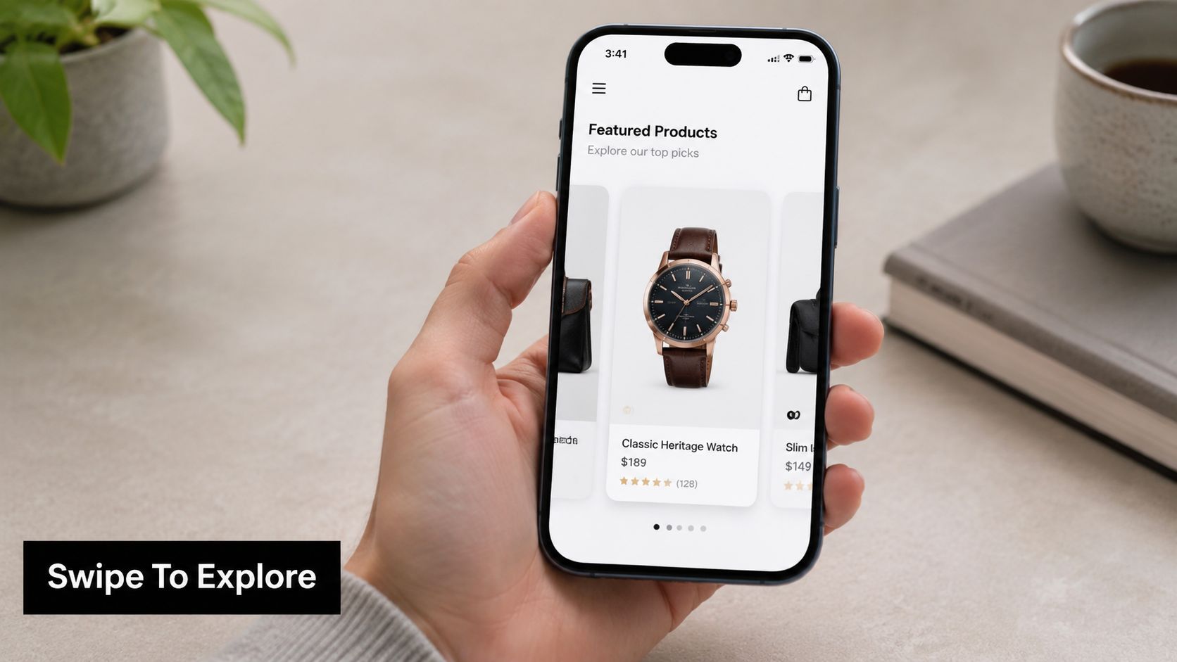
A kitchen gadget is a classic fit. Card one shows the finished outcome. Card two shows the problem it replaces. Card three shows how fast it works. Card four shows cleanup or storage. That sequence educates without forcing the user to read a wall of text.
Carousel also helps when your buyer objections are different. A beauty tool can show one card for dry skin, one for oily skin, and one for uneven texture. A pet product can rotate through fetch, travel, and comfort use cases. Each card becomes its own mini ad.
One strong card can earn the click. The rest of the carousel closes the gaps.
A simple structure that converts
The first card matters most. It should work as a standalone ad. If someone never swipes, they should still understand the product and the main payoff. New advertisers often make the opposite mistake and hide the good part on card three.
Use a structure like this:
- Card one shows the payoff: Lead with the clearest benefit, not the logo.
- Middle cards answer objections: Show fit, use case, ease, or versatility.
- Final card asks for action: End with the direct offer or shopping prompt.
- Keep the design consistent: Same visual language across cards makes the sequence feel intentional.
What doesn't work is treating carousel like a random product dump. If the cards don't connect, the ad feels messy. The best carousel examples behave like a short sales conversation. Each swipe answers the next obvious question.
4. Reels Ads with Hook-First Storytelling
A shopper is thumbing through Reels at full speed. You get about a second to earn the stop. If the product only makes sense after a long setup, the ad loses before the story starts.
Reels work best for products with a visible shift. Something looks messy, slow, awkward, or frustrating. Then the product changes that state fast. That is why this format keeps showing up in winning accounts for new stores. It gives you a clean way to prove the product, handle skepticism, and sell without looking like a polished brand commercial.
The mistake new advertisers make is treating Reels like organic content with a CTA tacked on at the end. Direct-response Reels need a tighter structure. The opening frame should carry the sale.
What a strong Reel actually does
Hook-first storytelling means the first beat shows the problem, the result, or the contrast. A cleaning product should open on the stain. A posture product should open on the bad fit. A kitchen tool should open on the slow manual version that people already recognize.
Then the product earns attention by resolving that tension quickly.
A simple flow that works:
- First second: Show the pain point, visual contrast, or surprising claim on screen.
- Next few seconds: Show the product in use from the clearest angle possible.
- Middle: Add one or two proof points, such as speed, ease, texture, or before-and-after context.
- Final beat: Close with the result and a direct shopping prompt.
This is not about making the ad feel cinematic. It is about making the outcome obvious before the viewer scrolls.
What I hand to a new creator
I usually give creators one rule first. Do not open with branding, introductions, or lifestyle filler. Open where the tension is highest.
For a meal prep product, start with the annoying prep step people already dislike. For shapewear, start with the outfit issue the buyer wants fixed. For skincare, start with the extra step your product removes or the visible finish it improves. If the viewer can label the problem in their own words, watch time improves and clicks get cheaper.
Keep the production simple:
- Use vertical framing built for mobile
- Put the key message in on-screen text
- Show hands, texture, motion, and outcome
- Trim every second that delays the payoff
Voiceover can help, but it should support the visual, not carry it. Many purchases happen because the demo is clear, not because the script is clever.
Why this format is useful for new stores
New stores usually do not have years of reviews, heavy brand search, or polished creative systems yet. Reels can close that gap because they let the product do the selling. One good demo gives you a launch asset, a retargeting asset, and often the raw material for cutdowns.
That is the strategic value here. These are not just pretty examples. They are repeatable formats. If you want to build the follow-up path after someone engages but does not buy, pair this with a simple lead capture flow and study how to generate leads on Facebook so your Reels traffic has somewhere useful to go.
How to replicate it fast with Social Loop AI
Start with one product, one problem, and one desired outcome. Feed those inputs into Social Loop AI, generate several hook angles, then choose the version with the clearest visual contrast. From there, build a short script in this order: problem, demo, proof, offer.
That process matters because speed alone is not the advantage. Structured testing is. If you can produce three hook variations in minutes, you can learn which opening earns the stop before you spend heavily on production.
The benchmark I use is simple. If the first frame does not make sense without audio, rework it. If the payoff does not show up fast, tighten it. Reels reward clarity, not extra explanation.
5. Lead Generation Ads with Instant Opt-In
Lead ads are underrated in ecommerce because beginners assume every ad must chase the purchase immediately. That's rarely the best move if your product needs education, comparison, or follow-up.
Where lead ads fit for ecommerce
Meta's in-app lead forms remove a step. That matters when the offer is something the user wants before buying. A skincare brand can offer a consultation or regimen guide. A pet brand can collect details about breed or age, then follow up with more relevant recommendations. A home brand can offer a style guide tied to a product category.
This format is also useful when your store isn't ready to convert cold traffic efficiently yet. If the landing page is weak, a lead capture step can still help you build an audience you can nurture with email and retargeting.
What usually goes wrong
Most lead ads fail because the offer is too weak. “Join our newsletter” doesn't create urgency. A useful tool, guide, consultation, or launch incentive does.
A few rules keep this format practical:
- Make the exchange obvious: The user should know exactly what they get after submitting.
- Keep the form short: Ask only for details you will use.
- Follow up quickly: A lead with no email flow behind it is wasted.
- Pair it with retargeting: The form captures interest. The next ad closes the sale.
For stores using Meta to build an owned audience first, Social Loop AI's article on generating leads on Facebook gives a good tactical baseline.
Lead gen is not the right answer when the product is cheap, impulse-friendly, and easy to understand. In that case, sending traffic straight to a purchase-focused page is often cleaner.
6. Dynamic Product Ads with Catalog-Based Retargeting
A lot of stores finally stop guessing. Dynamic product ads don't ask you to decide which exact product reminder to show. They use your catalog and behavior signals to match people with products they already touched.
Why DPA works better than generic reminders
Meta's business success materials consistently frame value-based lookalike audiences, Advantage+ shopping or catalog ads, and campaign optimization as performance levers tied to stronger return on ad spend and more efficient acquisition, as shown across Meta Business success stories. That makes sense in practice. Warm traffic doesn't need another broad brand message. They need the right product back in front of them.
The strongest use case is straightforward. Someone views a product, adds it to cart, or browses a category. Your dynamic ad brings back that exact item or a relevant related option. For fashion, that might mean the same product in another color. For furniture, it might mean a matching item. For beauty, it might mean the routine pair.
Here's a walkthrough that shows the format in action:
How to set expectations correctly
Dynamic ads are not a magic fix for weak stores. They work best when your pixel data is clean, your product feed is accurate, and your offer makes sense. If the product page is confusing, retargeting only sends people back to the same problem.
Warm audiences usually need less persuasion and more relevance.
A few practical uses stand out:
- Recover cart abandoners: Show the exact item they left behind.
- Retarget product viewers: Remind them of the product they considered.
- Upsell buyers: Feature complementary items after purchase.
- Keep feed data clean: Wrong titles, images, or variants break the whole experience.
What doesn't work is running dynamic ads too early with thin site activity and expecting miracles. Retargeting only works when there's meaningful traffic to retarget.
7. Advantage Plus Shopping Campaigns
Advantage+ can save time, but beginners often use it at the wrong stage. They turn it on before they know which message, product angle, or landing page promise resonates.
Where automation helps
Once you've got a product with some signal, automation becomes useful. Advantage+ shopping campaigns are built for advertisers who want Meta to do more of the placement, audience, and delivery work. Solo founders and lean teams benefit from that because they don't have time to micromanage every lever.
This format fits stores with a real catalog, multiple creatives, and a product that already has some proof of demand. It's less useful for first-touch validation when you still don't know whether people care more about convenience, price perception, identity, or a specific problem solved.
How to feed the system better inputs
Advantage+ works better when the inputs are varied and clear. Don't hand it five versions of the same ad and expect smart delivery. Give it distinct image styles, UGC, short-form video, and different copy angles.
If I were training a new media buyer, I'd tell them to watch for these issues:
- Weak creative variety: Similar assets limit what Meta can learn from.
- Bad product pages: Automation can scale traffic. It can't fix mismatch after the click.
- Unclear angle: If every ad says something different with no discipline, reporting gets muddy.
- Premature trust: Don't use automation as a substitute for basic offer validation.
The smart use of Advantage+ is as a multiplier. It's rarely the best first experiment, but it can be one of the better scaling formats after your message is clearer.
8. Collection Ads with an Immersive Storefront Feel
Collection ads work when one product isn't the whole story. They're useful for stores that sell a category, a look, or a bundle of complementary products.
When collection ads make sense
A fashion brand launching a seasonal drop can use a short lifestyle opener, then let shoppers browse matching pieces. A home store can group a living room setup. A beauty brand can split by category, such as routine products, color, or tools. This format feels less like a single ad and more like a compact storefront.
That's the point. Collection ads are best when discovery is part of the purchase path. If the shopper wants to compare, browse, or build a set, the format supports that naturally.
What to feature inside the collection
Start with aspiration. Show the result first, not a sterile lineup. If you sell home goods, open with a finished room. If you sell pet travel products, show the dog and owner using the setup. Then let the product tiles do the practical work.
This format is strong for browse-friendly stores, but there's a trade-off. It can dilute focus when the primary win is one hero SKU. In those cases, a direct single-product ad often closes better.
One real case study points to how important audience warmth can be here too. Cropink's write-up on Seltzer Goods reported that two Facebook ads drove a 785% increase in revenue in 30 days, with a 9.68% ROAS and about 50% of revenue attributed directly to Facebook Ads. The same case noted the ads were more effective for retargeting than cold acquisition. That's the lesson. Immersive formats and product discovery tools work best when they meet existing intent, not when they try to create all of it from scratch.
Meta Ad Formats, 8-Example Comparison
| Format | Implementation Complexity 🔄 | Resource Requirements ⚡ | Expected Outcomes ⭐ | Ideal Use Cases 💡 | Key Advantages 📊 |
|---|---|---|---|---|---|
| Single Image Ads (Problem→Solution) | Low, simple setup and copy pairing | Minimal, one polished image + short copy | Moderate, fast validation; lower CTR vs. video | Beginner testing, rapid angle validation | Fast to produce; low cost-per-creation; clear attribution |
| UGC Ads (Testimonial Stills) | Medium, sourcing and vetting creators/customers | Moderate, creator fees or customer assets + light editing | High, strong CTR and low CPC when authentic | Social proof, trust-building, high-engagement niches | Authenticity drives conversions; reduces ad fatigue |
| Carousel Ads (Multi-Angle Showcase) | Medium–High, multiple cards and sequencing | Higher, 2–10 assets, cohesive design | Higher engagement time; good for education & consideration | Multi-feature products, step-by-step demos, variety showcases | Tells a fuller narrative; efficient multi-angle testing |
| Reels Ads (Hook-First Short Video) | High, video production and trend execution | High, vertical video, editing, audio, creator work | Very high reach & engagement; viral potential | Demonstrations, transformations, Gen Z targeting | Algorithm-favored; lowest CPM for reach; strong engagement |
| Lead Generation Ads (In‑App Forms) | Medium, campaign + CRM/webhook integration | Moderate, offer asset + CRM/email workflow | High lead volume; requires nurture to convert to sales | List building, consults, high-touch offers | Highest form conversion; low friction auto-filled forms |
| Dynamic Product Ads (Catalog Retargeting) | High, pixel + catalog/feed integration | Technical, product feed, pixel events, inventory sync | Very high ROAS for warm audiences | Cart abandoners, product retargeting, upsells | Automated personalization; strong conversion lift |
| Advantage+ Shopping (Automated Bidding/Formats) | Low, simplified setup; algorithm-driven | Moderate, product feed + 3–5 quality assets + budget | Good ROAS after learning phase (14+ days) | Novice advertisers, scaling proven winners | Hands-off optimization; algorithm finds audiences/formats |
| Collection Ads (Full‑Screen Immersive) | High, assembly of collection + design work | High, lifestyle video/photo + product catalog | Strong discovery and brand lift; higher engagement | Brands with multiple products or seasonal drops | Immersive shopping; native checkout reduces friction |
From Examples to Execution Your Launch Plan
A new store usually loses money on Meta for a simple reason. The founder launches five ad types at once, mixes three offers, targets broad, and has no idea which message pulled the sale. The fix is a tighter launch plan, not prettier creative.
Start with one product and one clear offer. Then build three angles that are different enough to teach you something. A problem to solution angle tests urgency. A testimonial or UGC angle tests trust. A short video or carousel angle tests whether the product needs demonstration before the click. If you already have traffic but weak conversion, shift some attention to retargeting and catalog ads instead of forcing more cold spend.
Keep the first test small and structured.
For a new account, I like simple rules. One campaign objective. A small batch of creatives mapped to distinct angles. A landing page that matches the promise in the ad headline, first screen, and call to action. If the ad sells convenience, the page should show speed and ease immediately. If the ad sells transformation, the page should open with the outcome, not a wall of product specs.
That message match is where a lot of early spend gets wasted. Good ads can win the click. They cannot fix a confusing page, weak offer framing, or a checkout flow that asks for too much too soon.
The practical goal is learning velocity. You want clean signals fast. That means avoiding tiny variations that look different to you but feel identical to the buyer. Test distinct concepts first. Headline rewrites and color swaps come later, after you know which angle deserves more budget.
This section of the article has shown examples. The part that matters for a new store is replication. Social Loop AI is useful here because it turns a product URL into a launch plan you can run. It groups angles, drafts copy in the right format, generates creative batches, and checks whether the landing page supports the ad claim before you spend. That is far more useful than saving screenshots and hoping you can reverse engineer them later.
A solid launch usually looks like this. Choose one hero product. Write one offer. Build three angle-based creatives in two or three formats. Launch, watch for clear differences in click quality and conversion behavior, then cut the weak angle without hesitation.
Profitable Meta ads rarely come from one lucky winner. They come from a repeatable system that turns examples into tests, tests into decisions, and decisions into scaled spend.
If you want a faster way to turn these Meta advertising examples into actual campaigns, Social Loop AI helps you go from product URL to launch plan, ad angles, and ready-to-run creatives without needing an agency.