Blog
Mobile Landing Page Optimization That Converts in 2026
Published July 29, 2026
Your Meta spend is climbing, the product is good, and the mobile traffic is there. Yet the page still leaks buyers between the tap and the cart. That usually isn't a “mobile design” problem in the broad sense, it's one of three failures, attention, interaction, or latency, and if you don't isolate the layer first, you end up redesigning the wrong thing.
Mobile makes that mistake expensive because the traffic is already skewed to phones. One benchmark says 82.9% of landing-page visits come from mobile devices and mobile pages convert 8% lower than desktop on average, while another dataset puts mobile at 4.1% conversion versus 6.3% on desktop and mobile load times at 3.1 seconds versus 2.5 seconds on desktop, all from the same source family of industry reporting (landing-page optimization statistics). On top of that, Google-linked reporting cited there says a 1-second delay can reduce conversions by about 7%, and 53% of mobile visitors abandon pages taking more than 3 seconds to load. If you're paying Meta for clicks, that gap is the difference between scaling and subsidizing bad UX.
Table of Contents
- Why Mobile Landing Pages Lose Conversions
- Run a Mobile Readiness Audit Before You Touch Design
- Compress Speed Without Killing the Design
- Design for Thumbs, Not Just Above the Fold
- Match Your Ad Creative to the Mobile Page
- Track Mobile Events and Run Tests That Matter
- Pre-Launch Checklist and Quick Wins
Why Mobile Landing Pages Lose Conversions
A dropshipper watches Meta spend climb, checks the product page, and sees the same ugly pattern. Traffic lands, scroll depth dies at the hero, and add-to-cart stays flat. The instinct is to blame the button color or “make it prettier,” but that's the wrong diagnosis.
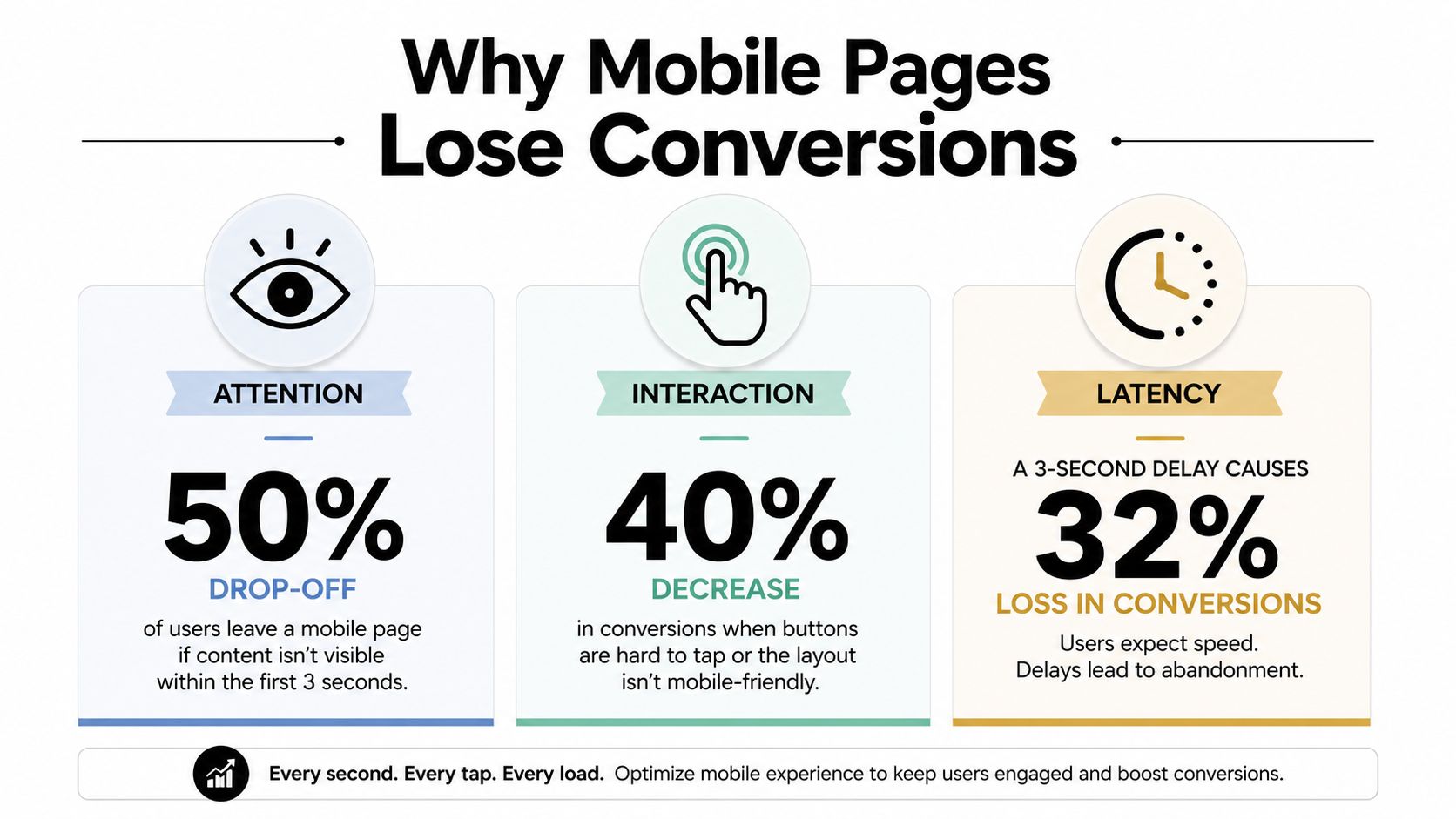
Mobile landing page optimization breaks into three layers. Attention is whether the page earns the first few seconds. Interaction is whether thumbs can tap, scroll, and submit without friction. Latency is whether the page loads fast enough that people stay long enough to care. Generic checklists mash those together and then tell you to “simplify the page,” which is lazy advice when the failure might be a slow hero image or a CTA that's buried below a false bottom.
The mobile gap is real, not theoretical
The point isn't that mobile users are worse buyers. The point is that they're making the same decision under worse conditions. Industry benchmarks show mobile dominates landing-page traffic, but conversion still trails desktop, and mobile load times are slower too (GTM 80/20). That combination makes every weak page look worse on mobile than it does on a laptop.
Practical rule: if mobile traffic is the majority and mobile conversion is trailing, stop asking whether the page is “mobile friendly.” Ask which layer is failing first.
The older “just put the CTA above the fold” advice misses the diagnosis. A CTA can be visible and still lose if the headline doesn't match the ad, the tap target is awkward, or the page stalls while images and scripts finish loading. Once you separate those layers, the fix gets obvious much faster.
For a broader behavioral lens on landing page friction, the landing-page optimization framework is useful because it starts with what visitors do, not what the page owner assumes.
The question that matters is simple. Is your page losing attention, losing taps, or losing time? Fix the first layer that breaks, not the prettiest one.
Run a Mobile Readiness Audit Before You Touch Design
Start with the phone viewport that will see the ad click. Desktop previews hide the failure points, so moving blocks around before you measure is the fastest way to waste time. If the page is too heavy, too awkward to tap, or too slow to render, prettier spacing will not save it.
Use the tools in the right order
Run PageSpeed Insights on the mobile URL first. Then check the mobile usability and experience signals in Search Console. After that, open a session-recording tool and read the scroll map and click map together. HubSpot's mobile checklist recommends PageSpeed Insights on the mobile URL to surface image and script bottlenecks, and it points to a practical target of keeping pages under roughly 20 KB for fast loads in its cited benchmark (HubSpot).
The maps tell you where the page fails.
- Hot scroll map ending at the second section: the copy or offer is not holding attention.
- Rage clicks on the CTA area: thumbs expect a different interaction, or the target is too small.
- Strong scroll but weak clicks: the layout is visible, but the offer is not strong enough to trigger action.
- Session exits right after load: latency is the problem, not persuasion.
Use a landing-page optimization framework that starts with behavior, not assumptions. Lucky Orange's guidance is clear on this point, mobile needs to be treated as a separate optimization problem, with device-segmented data and recordings used to find whether users never reach the CTA, miss tap targets, or leave because of viewport or rendering issues (Lucky Orange). That is the right read.
Read the behavior, not the surface. If mobile visitors never get to the CTA, changing the CTA copy is wasted effort.
Give the page a readiness score
Use a simple 0 to 100 readiness score so you stop debating the page by feel. Score mobile speed, thumb-friendly interaction, message match, and visible CTA placement. If any one of those is clearly broken, the page is not ready for spend, no matter how good it looks on desktop.
Do one last check on a real phone, not just simulator previews. Actual touch input, browser autofill, and connection quality change what users experience, and that is where the problem usually shows up.
Compress Speed Without Killing the Design
Speed work belongs near the top because it is usually the fastest win and the least likely to wreck the page visually. On Shopify and WooCommerce landers, I would rather ship image compression and script cleanup than waste time arguing over button copy while the page still drags. A heavy page gives the creative a bad chance from the start.
Fix the obvious weight first
Start with the hero image. Convert it to WebP or AVIF, size it for the mobile viewport, and stop sending desktop assets to a phone. Then lazy-load anything below the fold so the first screen can render without waiting for the full page. That alone usually removes the biggest drag.
Then audit JavaScript. Defer non-critical scripts, remove what you do not need, and cut third-party tags hard. Performance guidance from Lucky Orange points to third-party scripts, web fonts, oversized hero images, and even large JavaScript bundles as the kind of weight that slows mobile pages down. That is not a design issue, it is technical baggage.
Don't let fonts and video drag the page
Web fonts rarely repay the delay they create if mobile conversion is the goal. Self-host them if you need them, subset them if the family is heavy, and keep the number of variants low. If autoplay video is not doing real work on the first screen, do not load it until interaction. Mobile pages perform better when the browser spends less time doing everything except showing the offer.
Use PageSpeed Insights on the mobile URL and read the report like a marketer who cares about conversion, not like a designer chasing a score. Look for the actual blocking asset, not a vague “needs improvement” label. If the slowest element is the hero, a badge, an app, or a widget, remove it or delay it before you touch the layout.
For design examples that already make this trade-off well, the landing-page examples page is a useful reference because you can compare how clean pages keep the first screen light.
Speed rule: if a visual element does not help the first conversion decision, it does not deserve to slow the first load.
Design for Thumbs, Not Just Above the Fold
"Above the fold" is a desktop habit. On mobile, the key question is whether someone can act with one hand without hunting for the button. A CTA can look dominant in a screenshot and still sit outside the thumb zone, and that is where conversions die.
Build the layout around the thumb zone
Use a single-column flow. Keep the headline, primary CTA, and main visual together, and do not force users to decode side-by-side content on a narrow screen. A clean vertical path keeps attention on the offer instead of making people work to find it.
Tap targets matter just as much. Mobile guidance consistently points to 44×44 px touch targets for buttons and form inputs, with 48 px inputs also showing up in broader mobile best practices. If the button is tiny or crowded by other elements, people will miss it, and you will pay for that in lost taps.
Sticky CTA versus repeated CTA
I prefer a sticky CTA for a strong impulse buy, a simple offer, or a short decision cycle. Repeated CTAs work better when the page needs more persuasion and the reader may need a second or third reminder after social proof or objections. The trade-off is clear, a sticky bar can feel pushy on some offers, while repeated CTAs can disappear if the page runs too long.
Form fields need the right keyboard mode, too. If you ask for a phone number, the mobile keyboard should be numeric. If you ask for a date, reconsider whether you need it at all, because mobile date pickers are a nuisance when they are mandatory and not necessary.
The one-handed reach test still matters, and top-corner dependence is bad mobile design. For traffic that arrives on a stripped-down lander, this breakdown of Facebook ads and landing page alignment is a useful reminder that the page should match the intent, not just the layout. Some traffic wants a short, direct conversion path, not a full product page in miniature.
Match Your Ad Creative to the Mobile Page
I've seen this fail a hundred times. The ad is sharp, the page is generic, and the buyer bounces because the click promised one thing while the lander opened with another. Mobile makes the mismatch harsher because people don't read around the problem, they exit.
A real mismatch between a UGC ad and a Shopify page
Say you're running a UGC-style Problem→Solution ad for a posture corrector. The ad opens with pain, shows the product in use, and ends with a direct benefit. Then the click lands on a generic Shopify product page with a bland headline, a weak hero image, and a CTA that just says “Add to Cart.” That page is technically fine, but it doesn't carry the same promise.
The fix is not more design fluff. The hero should echo the ad hook, the headline should mirror the angle, and the CTA should match the emotional temperature of the creative. If the ad sells relief, the page should talk about relief immediately. If the ad sells a practical fix, the page should say that before it says anything about materials, specs, or background story.
Rewrite the first screen to echo the click
Before, the page might read like this.
- Headline: Generic posture support for everyday wear.
- Hero: Studio product shot on white.
- CTA: Add to Cart.
After, the page should reflect the ad's promise.
- Headline: Support your posture without changing your routine.
- Hero: The same style of image or UGC framing used in the ad.
- CTA: Get posture support now.
That's not creative indulgence, it's message match. The page should feel like the next step in the same conversation, not a different department's interpretation of the same product.
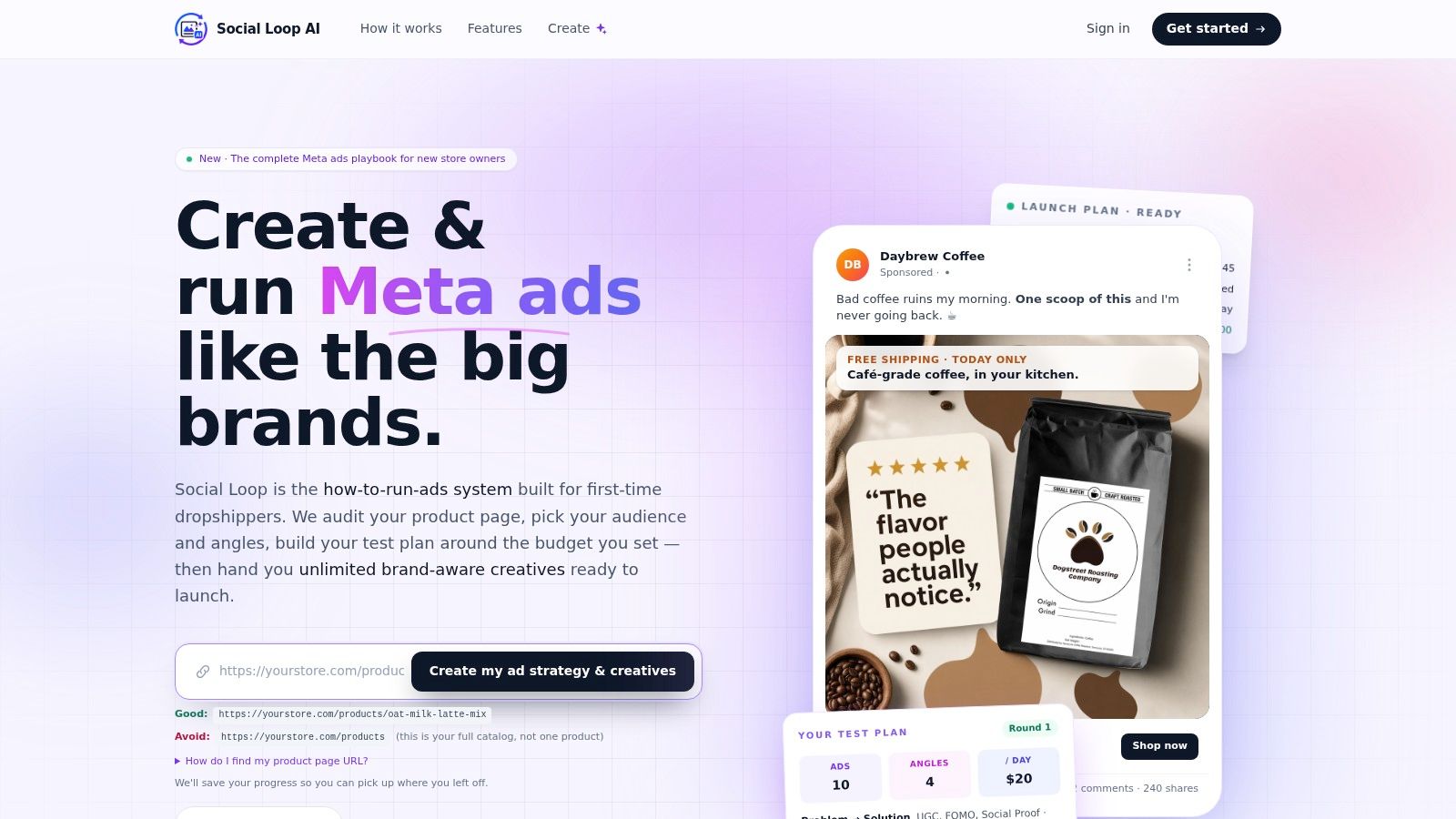
Social Loop AI fits into this problem as one practical option because it turns a product URL into Meta ad angles and pasteable copy fixes, including landing-page readiness scoring and mobile-specific guidance. It's useful when the page is technically live but the first screen doesn't match the ad that sent the traffic.
The same logic applies to CTA text. If the ad sells a problem solved, don't hide behind generic purchase language. Make the page carry the same promise, because the first scroll should confirm the click, not force the shopper to re-interpret it.
For ad-to-lander alignment in paid social, the Facebook ads landing page guidance is a useful companion reference.
Track Mobile Events and Run Tests That Matter
If you can't separate mobile behavior from blended totals, you're guessing. Meta Pixel and Conversions API should be wired for add-to-cart, checkout, and purchase, and your GA4 setup should use UTMs and mobile-specific events so you can see what the phone traffic is doing. If mobile is underperforming, you need mobile numbers, not a blended dashboard that hides the gap.
Measure the funnel in the same place people break
A clean setup lets you see where the leak is. If add-to-cart is healthy but checkout collapses, the problem is later in the flow. If the page gets views but no scroll depth or click movement, the problem is earlier. That's the point of event tracking, it turns an opinion into a traceable drop-off.
Keep the first tests simple. I'd run three before anything else, headline, CTA button color and copy, and hero image. Those three isolate the biggest mobile variables without turning the page into a science project. When budgets are tight, don't test six things at once and pretend the result tells you anything useful.
| First A/B Tests to Run on a Mobile Lander | |||
|---|---|---|---|
| Test | Variable Changed | Why It Matters on Mobile | Expected Resolution Time |
| Headline | Message match and promise | It decides whether the first screen feels relevant | Low to medium traffic pages need more time |
| CTA button | Color and copy | It affects thumb visibility and tap intent | Usually faster than deeper layout tests |
| Hero image | Product framing | It controls attention above the fold | Medium traffic pages can resolve sooner |
Read results without overreacting
When sample size is small, treat the test as directional, not final. If one version clearly improves the mobile funnel and the session recordings support it, keep the winner. If the numbers are noisy, don't force a conclusion just because you want one. Iterate again with a cleaner test or a more obvious friction point.
Testing rule: if the change fixes a confirmed problem, ship it. If it only “feels better,” keep testing.
A/B testing is valuable when it validates a real observation. It's a waste when it substitutes for diagnosis. The order matters, measure first, test second.
Pre-Launch Checklist and Quick Wins
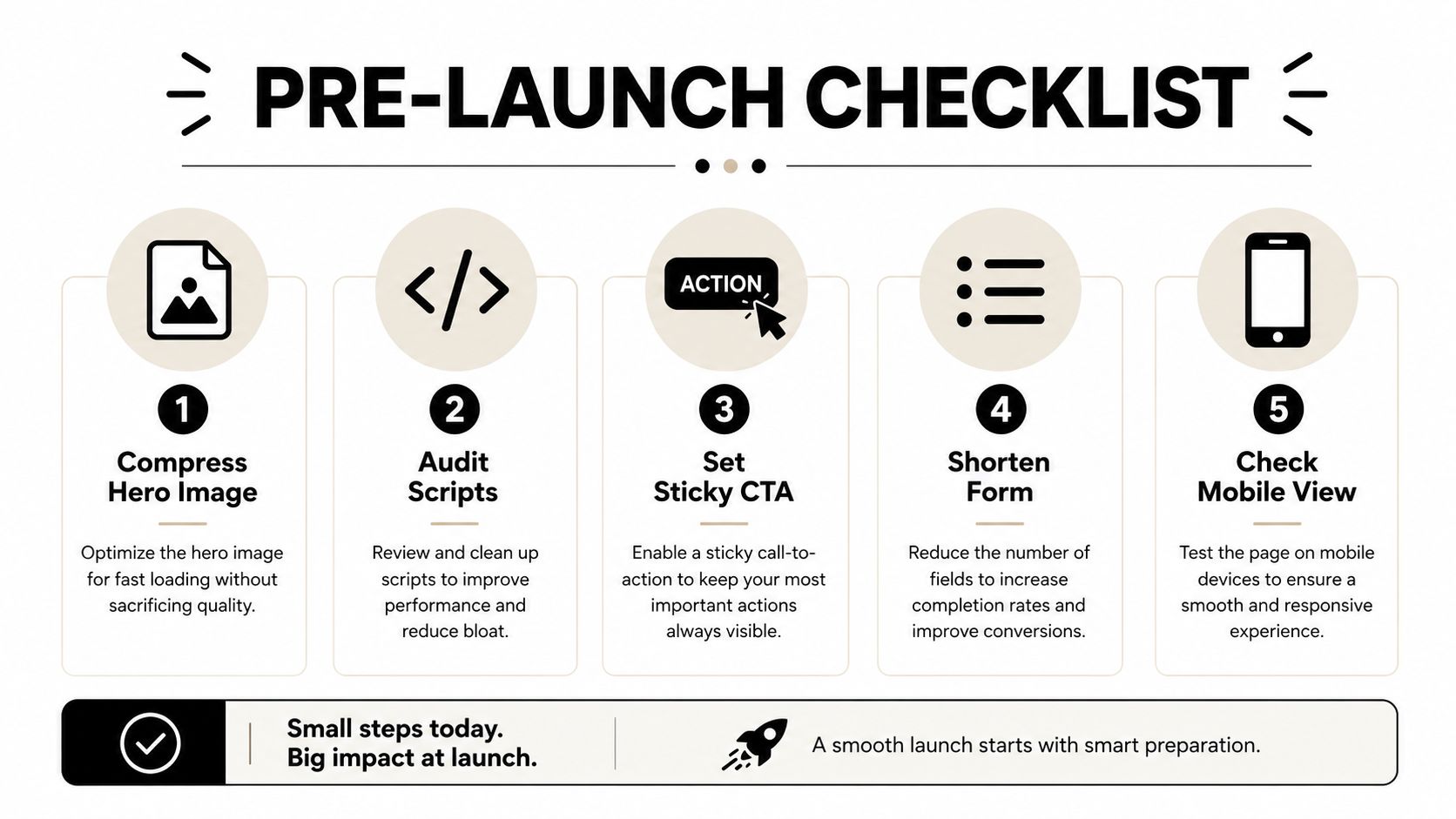
Before you spend on Meta, get the mobile page into a state where it can convert. The work below is the stuff I'd expect a first-time store owner to handle in an afternoon, because none of it requires a redesign from scratch. It just requires discipline.
Ship these today
- Compress the hero image. Convert it to WebP or AVIF, resize it for mobile, and stop shipping oversized files.
- Audit scripts. Remove anything nonessential, defer what you can, and don't let a widget decide your load time.
- Set a sticky CTA. Keep the primary action within thumb reach instead of hoping users scroll back up.
- Shorten the form. Ask only for what you need right now, and make every input easy to complete on a phone.
- Add scroll depth tracking. If you don't know where people stop, you're optimizing blind.
- Rewrite the headline to mirror the ad. Message match beats generic polish every time.
Ship these this week
Some fixes need a little more thought. Split mobile traffic into a stripped-down lander if the full page is too heavy. Rework the hero if it's stealing attention from the CTA. Test form fields on a real phone, not just in a desktop browser. Then compare what changed after a week of live traffic, because mobile optimization is iterative, not a one-time cleanup.
If you want a faster way to get from product page to a mobile-ready Meta plan, Social Loop AI turns a product URL into ad angles, creative direction, and landing-page readiness checks that fit this workflow. Visit Social Loop AI to audit your page, tighten the copy, and launch with a mobile-first setup instead of burning spend on a lander that isn't ready.