Blog
Problem Solution Ads: A Beginner's Guide for 2026
Published July 16, 2026
You launched your first Meta campaign. The product page looks decent, the store is live, and you set a budget you can afford to lose if things go sideways. Then the ads go out with a headline like “New Arrival” or “50% Off Today,” and nothing happens except a slow drain on your card.
That usually isn't a targeting problem first. It's a messaging problem. New stores don't get the benefit of trust, brand recognition, or patience. If your ad doesn't make a shopper feel understood in the first few seconds, they keep scrolling.
That's why problem solution ads are so useful for first-time ecommerce owners. They don't ask cold traffic to care about your product on faith. They start where the buyer already is: annoyed, inconvenienced, embarrassed, frustrated, or trying to avoid some small daily hassle.
Table of Contents
- Why Problem Solution Ads Are a Beginner's Best Friend
- The Blueprint of a Winning Problem Solution Ad
- Writing Copy That Turns Pain Into Purchase
- Designing Creatives That Complete the Story
- A Simple Test and Scale Plan for Small Budgets
- Your Pre-Launch Checklist for Higher Conversions
Why Problem Solution Ads Are a Beginner's Best Friend
If you're spending around $50 a day, you don't have room for vague ads. Brand-heavy creative can work for established companies, but a new store needs a faster path to relevance. Problem solution ads do that because they give the shopper a reason to stop, and that reason isn't “look at my product.” It's “this might help with the thing that's bugging me.”
The performance gap is hard to ignore. Jon Loomer's Meta ads performance checklist notes that ads built around a clear problem to solution structure achieve click-through rates that are about 2.5 times higher, with 3.2% CTR compared to 1.3% for standard product showcases. For a beginner, that matters because more qualified clicks usually mean you learn faster from the same budget.
A generic product ad often forces the shopper to do too much mental work. They have to figure out what the item does, why it matters, and whether it fits their life. A problem solution ad handles that work for them. It says, in plain language, “Dealing with this? Here's the fix.”
Why this format works for cold traffic
Cold traffic doesn't know your store. It doesn't care about your logo, your founder story, or your product features unless those features solve something specific.
Problem solution ads work because they line up with the way people buy online:
- They create instant relevance. The shopper sees their own frustration reflected back to them.
- They reduce confusion. The ad makes the use case obvious.
- They build trust faster. Understanding the problem makes your offer feel less random.
- They filter better. People who don't have the problem move on, which is fine. You want the ones who do.
Practical rule: If a stranger can't tell what problem your product solves within a few seconds, the ad is probably too weak for a new account.
There's also a second benefit beginners miss. This format makes your testing cleaner. When one ad speaks to one pain point, you can tell whether the angle itself resonates. That's much harder when you're running soft, feature-led creative with broad promises.
If you want another angle on why buyers respond to credibility signals once the message matches the pain point, these social proof ad examples are a useful complement. Social proof works best after the core problem is already clear.
The Blueprint of a Winning Problem Solution Ad
Most weak ads don't fail because the product is terrible. They fail because the message skips steps. The ad jumps from “buy this” to “limited offer” without making the shopper feel the problem, believe the fix, or trust the claim.
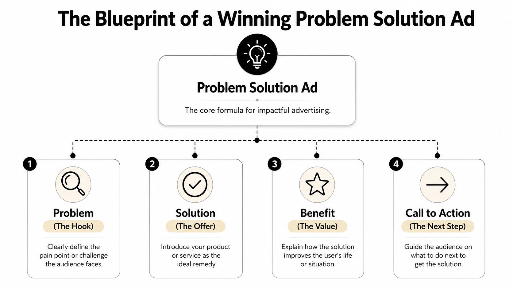
A strong problem solution ad has four jobs. Not seven. Not twelve. Four.
What each part has to do
Problem is the hook. It names the pain, friction, or annoyance. This is what earns the stop. A good problem line feels specific enough that the right person thinks, “Yep, that's me.”
Agitate makes the problem feel real. This doesn't mean being dramatic. It means showing the cost of leaving the problem unsolved. A kitchen gadget ad might show messy spills, wasted prep time, or the extra cleanup that turns a quick meal into a chore.
Solution introduces the product as the fix. Beginners often overexplain features at this point. Don't. Lead with the mechanism that removes the pain. The feature matters only if it helps the buyer picture relief.
Proof answers the silent question: why should I believe you? Proof can come from a demo, a clear before-and-after, a strong visual explanation, or a believable use case. It doesn't need to be fancy. It needs to feel concrete.
What beginners usually get wrong
A lot of first-time store owners write ads in the wrong order. They start with the product name, then list features, then tack on a discount. That's backwards for cold traffic.
What tends to work better is this sequence:
- Lead with the problem
- Show what that problem looks like in real life
- Reveal the product as the practical fix
- Give one reason to trust it
- Ask for the click
Most ads don't need more persuasion. They need a clearer chain of logic.
One more correction. The visual plan notes for this article mention “benefit” and “call to action” in the diagram. In practice, those are still useful. I just treat them as part of the final two jobs. The benefit belongs inside the solution, and the call to action belongs after proof. If you separate them too rigidly, beginners tend to write robotic ads that read like worksheets.
For swipeable structures you can adapt into your own campaigns, these Facebook ad templates are a practical reference. Just don't copy them word for word. Steal the logic, not the exact phrasing.
Writing Copy That Turns Pain Into Purchase
Copy is where most problem solution ads either sharpen up or fall apart. The mistake isn't usually bad grammar. It's weak specificity. “Tired of mess?” is vague. “Tired of wiping oil splatter off your stove after every meal?” is useful.
You want copy that sounds like a buyer's inner monologue, not a marketing class assignment.
A simple copy framework you can actually use
For most products, this structure is enough:
-
Hook
- “Still dealing with [specific problem]?”
- “If [annoying situation] keeps happening, this is for you.”
- “[Problem] every time you [task]?”
-
Agitation
- “It slows you down, makes a mess, or leaves you fixing the same issue again.”
- “Many try to work around it instead of solving it.”
- “That usually means more frustration and one more product that doesn't get used.”
-
Solution
- “[Product] helps by [simple mechanism].”
- “Instead of [old painful method], you can [better outcome].”
- “Built for [use case], so the fix feels immediate.”
-
CTA
- “See how it works.”
- “Shop the fix.”
- “Try the easier way.”
What doesn't work as well for beginners is overloaded copy. If the primary text tries to do everything, the message blurs. One problem. One promise. One next step.
Write the hook so a stranger can identify themselves in it. Write the body so they can picture life after the fix.
How to write for products with hidden problems
Some products solve pains people don't recognize until they see them. That's where beginners freeze. They know the product is useful, but the buyer isn't actively searching for the issue yet.
You need problem activation, not just problem statement. Influee's write-up on the problem-solution ad angle cites Meta's 2025 Creative Report saying that latent-need products have a 3.2x higher drop-off rate in the first three seconds if the hook doesn't first create the problem before offering the solution.
That means you can't open with the product. You have to make the pain visible first.
Three ways to do it:
-
Use contrast
- “Your phone should last through a gaming session. Not overheat halfway in.”
-
Use sensory detail
- “Hot hands, lag spikes, battery drain. That's the problem.”
-
Use a moment of consequence
- “Fine until the stream stutters, the battery tanks, and the match is gone.”
For hidden-problem products, the ad's first job is teaching. Once the shopper feels the issue, the sale gets much easier.
Problem-Solution Ad Copy Examples
| Ad Component | Example 1 (Skincare) | Example 2 (Kitchen Gadget) | Example 3 (Pet Product) |
|---|---|---|---|
| Hook | Still dealing with dry patches that show up before makeup? | Tired of chopping vegetables and cleaning the whole counter after? | Does your dog pull so hard that every walk feels like a fight? |
| Agitate | Thick creams can sit on top of the skin and still leave you looking flaky by midday. | One quick meal turns into extra prep, extra mess, and one more gadget you regret buying. | Pulling doesn't just ruin the walk. It turns a simple routine into stress for both of you. |
| Solution | This lightweight moisturizer is made to hydrate fast and sit smoothly under makeup. | This compact chopper cuts prep time and keeps the mess in one place. | This no-pull harness helps guide movement more comfortably and gives you better control. |
| Proof | Show texture, application, and finish on bare skin and under foundation. | Show onions or herbs going in, quick chop result, then easy cleanup. | Show a real walk, leash tension before, then calmer movement after fitting it correctly. |
| CTA | Shop the routine | See it in action | Make walks easier |
If you want more examples of this style, direct response copywriting principles help because they force you to focus on action and clarity instead of clever phrasing.
Designing Creatives That Complete the Story
A problem solution ad isn't just copy with a product photo attached. The creative has to carry the same argument visually. If the text says “mess-free prep” and the image is a polished packshot on a white background, you're asking the buyer to imagine too much.
The better route for small stores is simple demonstration.

Show the friction before the fix
The strongest beginner-friendly creatives usually make the “before” state obvious. A pet hair remover should show stubborn hair on fabric before the clean pass. A posture device should show the slouched desk setup before the correction. A sink organizer should show the clutter before the tidy setup.
That contrast gives the product a job.
Here are a few visual setups that work without expensive production:
-
Split-screen before and after
- Left side shows the hassle. Right side shows the result.
-
Hands-only demo
- Great for kitchen, beauty, cleaning, and desk products.
-
POV use case
- Lets the viewer feel the annoyance and the fix from a first-person angle.
-
UGC-style reaction
- A real person describing the pain in plain language often beats a polished brand voice.
If the shopper has to read the whole caption to understand the visual, the creative is doing too little.
Creative formats that work without a big production budget
A smartphone is enough if you frame the story correctly. For short video, I like a sequence that moves fast:
- Open on the problem
- Show the failed or annoying old method
- Introduce the product in use
- End on a clean result or calmer outcome
Static ads can work too. The easiest version is one bold image with a clear tension point. Think tangled cords, spilled ingredients, fogged-up mirror, fur-covered couch, smudged makeup, or dog leash strain. Then pair it with a short line that names the problem directly.
What doesn't work as well on a small budget is abstract lifestyle creative. Nice lighting and attractive models can help later. Early on, clarity beats polish. The product should look like it's doing a job, not posing for a catalog.
A Simple Test and Scale Plan for Small Budgets
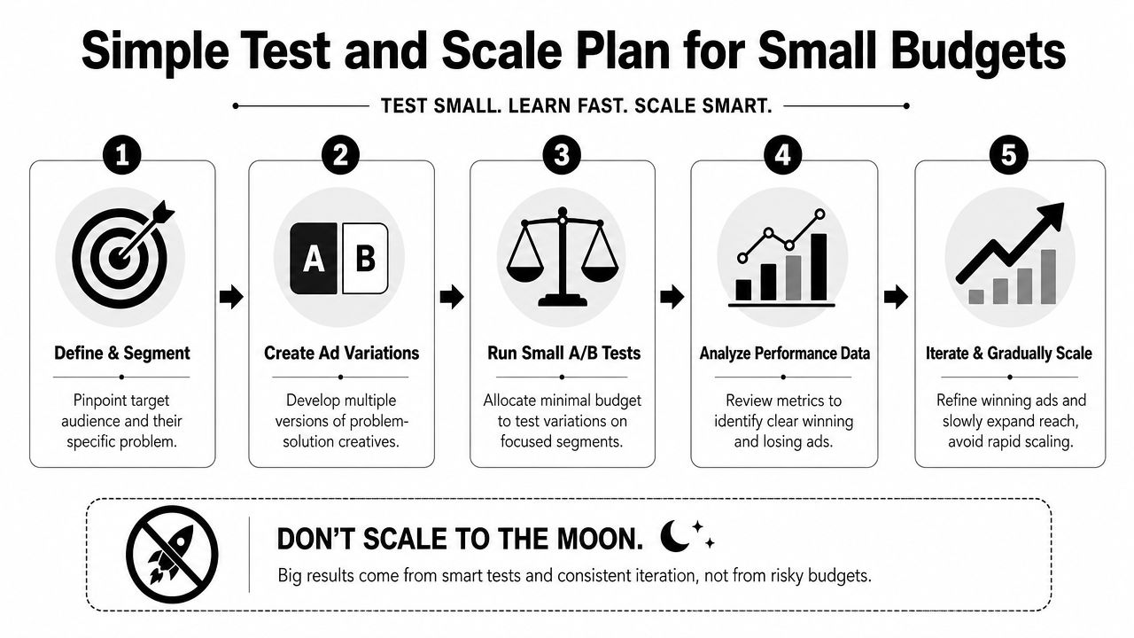
The worst advice a beginner can follow is “just find a winner and scale it fast.” That sounds efficient. In practice, it burns cash because early winners aren't always real winners. Some get cheap clicks because the hook is loud, not because the offer is convincing.
That difference matters a lot when your account is small.
Why early winners can fool you
Alex Fedotoff's LinkedIn post discussing winning ad angles cites Meta ad retrospectives showing that 42% of “winning” angles tested by novice merchants fail within 3 weeks because the CTR was inflated by hook fatigue rather than real buying intent.
That matches what beginners often see. The ad gets clicks. Maybe even a few sales. Then performance slips as soon as spend rises or the same audience sees the same hook too many times. The angle looked strong, but it wasn't sticky.
Watch for this: high curiosity clicks with weak buying behavior usually mean the hook is carrying more weight than the product.
A loud hook says, “You won't believe this.” A sticky hook says, “This solves a problem I have.” The first can get attention. The second can support a business.
A short explainer can help if you learn better by watching. This breakdown covers the basic idea of testing and iterating before scaling.
A lean testing plan for a small account
If you're around $50 a day, keep the plan narrow.
Round 1 is angle testing. Don't start with ten visual variations of the same vague message. Test a few distinct pains instead. For example, a cleaning product might attack grease buildup, wasted scrubbing time, or hard-to-reach corners. Same product. Different problem entry points.
Round 2 is message refinement. Once one angle shows real promise, make small changes to the hook, opening visual, and proof element. Keep the core pain the same.
Round 3 is creative expansion. Only after the angle proves itself should you branch into UGC-style versions, statics, demos, or different aspect ratios.
A practical small-budget process looks like this:
-
Pick one product only
- Don't split attention across your whole catalog.
-
Choose a few pain points
- Each ad should center on one problem, not a bundle of them.
-
Keep the offer consistent
- If you change message and offer at once, the read gets muddy.
-
Judge by quality, not excitement
- You want signs that the ad attracts people who make purchases.
-
Kill confusion fast
- If the hook gets clicks but the rest of the funnel doesn't hold, fix the message before spending more.
When to scale and when to slow down
Scale when the angle keeps making sense after repeated exposure. Slow down when results rely on novelty.
Good candidates for gradual scaling usually have these traits:
-
The problem is clear
- Buyers understand the use case quickly.
-
The proof is believable
- Demo, contrast, or visual explanation supports the claim.
-
The landing page matches
- The click doesn't lead to a disconnect.
-
The message survives iteration
- Slight changes don't break performance.
If performance falls apart the moment you tweak the creative, you probably didn't have a durable angle. You had a temporary spike.
Your Pre-Launch Checklist for Higher Conversions
A lot of ad failure happens after the click. The message works, the shopper lands on the page, and then the whole flow loses coherence. That's wasted money.
Landing page match
Check the page against the ad, line by line.
-
Headline match
- If the ad promises relief from a specific problem, the page should say that immediately.
-
Product clarity
- The visitor should understand what the product is and how it solves the issue without hunting.
-
Visual continuity
- Use the same use case, same pain point, and same tone from ad to page.
-
Proof placement
- Demo visuals, reviews, FAQs, or usage guidance should appear early enough to support the promise.
Audience and offer check
Target people likely to recognize the pain point. For a new account, broad can work later, but early on it helps to align audience cues with the problem your ad names. If the product solves kitchen mess, the ad should speak to cooks. If it solves pet pulling, the message should feel native to dog owners.
Also check the offer itself. A weak offer can sink a strong problem solution ad. The buyer needs a reason to act now, but that doesn't always mean a deep discount. Sometimes the better move is a clear bundle, a cleaner guarantee, or a sharper explanation of what makes the product easier to trust.
Before launch, ask one final question: if someone sees only the hook, the first visual, and the page headline, do they understand the problem and the fix? If not, tighten that chain before you spend.
If you want help turning a product page into a practical Meta launch plan, Social Loop AI is built for exactly that. It helps first-time ecommerce owners turn a product URL into ad angles, creative batches, and a budget-aware testing plan, so you're not guessing what to write, design, or test first.