Blog
Product Page Optimization: A Beginner's Guide 2026
Published June 5, 2026
You launched the product. You built the Shopify page. You turned on Meta ads. Clicks started coming in, and for a moment it felt like momentum.
Then nothing happened.
Maybe a few add-to-carts. Maybe a checkout started. Maybe just a stream of visitors who landed, glanced, and left. That's the point where most new store owners blame the product or the ad creative. Sometimes the problem is simpler. The ad did its job and the product page didn't.
A product page is your salesperson after the click. If the ad creates curiosity but the page feels unclear, generic, or hard to buy from, you're paying to send people into a weak close. Good product page optimization fixes that. Not with random tweaks, but with a clear order of operations that matches how real shoppers make decisions.
Table of Contents
- Why Your Ad Clicks Are Not Converting
- The Foundation Your Above-the-Fold Experience
- The Persuasion Engine Copy and Social Proof
- Removing Friction Price Clarity Mobile and Speed
- Your First CRO Test Plan for Any Budget
- From Optimized Page to Profitable Ads
Why Your Ad Clicks Are Not Converting
A common first-store pattern looks like this. You run a Problem to Solution ad for a posture corrector, a pet hair remover, or a kitchen gadget. The ad gets attention because the pain point is obvious. People click because they want the fix. Then they land on a page with a supplier-style title, a cluttered image gallery, and an Add to Cart button buried below a wall of text.
That disconnect breaks the sale.
The click came from promise and momentum. The page then asked the visitor to slow down, decode the offer, and trust a store they've never seen before. Most won't do that. They leave before they even figure out whether the product is right for them.
Your ad wins the click. Your product page wins the purchase.
This is why product page optimization matters so much for paid traffic. A weak page doesn't just lower conversion. It also makes ad testing harder because you can't tell whether the ad angle failed or the landing page failed.
A lot of beginners respond by changing everything at once. New theme, new colors, new headline, new offer, new product images. That usually creates more confusion, not less. You need a shortlist of fixes that carry most of the load: clearer above-the-fold messaging, stronger proof, fewer purchase blockers, and a simple testing plan tied to your ad angle.
If your ads get attention but your store doesn't close, start by tightening the page before buying more traffic. If your top-of-funnel is weak too, this guide on how to improve click-through rates helps you line up the click with the page experience that follows.
The Foundation Your Above-the-Fold Experience
A paid click lands with urgency. The shopper wants to confirm one thing fast: “Is this the product the ad promised, and can I buy it without extra work?” If the first screen hesitates, your ad budget absorbs the mistake.
That is why the top of the product page deserves disproportionate attention, especially on a small budget. Low-traffic stores do not get many chances to recover from a confusing first impression. Before testing long-form copy, bundles, or fancy page apps, fix the part every paid visitor sees first.
What the first screen must do
The opening view should answer three questions in seconds.
- What is this? Show the product clearly with a hero image that removes visual guesswork. A strong in-use photo often outperforms a plain supplier image because shoppers can immediately understand size, context, and purpose.
- Why should I care? The title and support text should state the product plus the main outcome. If the name reads like a catalog entry, the visitor has to translate it for themselves.
- How do I buy it? Price, variants if needed, and the Add to Cart button should be visible without hunting around the page.
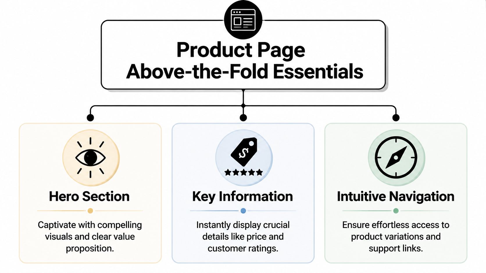
Store owners often treat this area like a design decision. It is really a message-matching decision. The ad created a specific expectation. The first screen either confirms it or weakens it.
A clear structure helps. If the product name, headline, image, price, and CTA do not line up around the same promise, visitors feel friction before they read a single bullet.
How to structure the opening view
For stores buying traffic to a single product or a small product set, this layout works well:
-
Product title with a built-in use case
“Portable Blender” is accurate. “Portable Blender for Smoothies on the Go” gives the shopper a reason to care without adding fluff. -
Primary image that matches the ad angle
If the ad featured the product in a car, gym bag, or kitchen counter, keep that context on the page. Continuity helps visitors feel they landed in the right place. -
One short line under the title
Use it to reinforce the fastest benefit. Focus on relief, convenience, comfort, speed, or cleanup, depending on what drove the click. -
Price and key variants near the CTA
Keep choices tight. If shoppers hit multiple dropdowns before they understand the offer, conversion usually drops. -
A clear Add to Cart button
Make it easy to spot. Do not hide it under long descriptions, oversized badges, or extra spacing that pushes the action below the fold.
Practical rule: If a new visitor cannot identify the product, the main benefit, the price, and the purchase path in one screen, start there before testing anything else.
For ad-driven stores, this section is also where testing should begin. With low traffic, run bigger tests, not tiny cosmetic ones. Test the main image first if the ad angle is visual. Test the title and support line next if the click is based on a specific outcome. Test CTA placement only after the offer is clear. That order gives small stores a better shot at seeing a real signal without wasting weeks on button-color experiments.
Search visibility still matters here, but clarity matters more. Descriptive product names, helpful alt text, and clean page structure support discovery. The primary role of the first screen is to convert the demand your ads already paid for.
If you want a useful benchmark for page structure, these landing page best practices for conversion-focused layouts line up closely with what strong product pages do above the fold.
The Persuasion Engine Copy and Social Proof
A clean first screen earns attention. It doesn't earn trust by itself.
The sale usually happens when the buyer finds enough evidence to answer three quiet questions: Will this help me? Is it worth it? Can I trust this store?

Why bland copy kills intent
Most weak product pages describe the object instead of selling the result.
“Water-resistant nylon exterior.”
That's a feature.
“Handles surprise rain without soaking what's inside.”
That's a buying reason.
The difference matters because ad traffic arrives with emotion. They clicked because they wanted a better outcome, not because they wanted to read a technical sheet. Good copy translates features into daily relief, convenience, or status.
A useful way to rewrite your product bullets is this:
| Feature | Weak version | Stronger version |
|---|---|---|
| Water-resistant fabric | Water-resistant material | Keeps your essentials dry during commutes and travel |
| Compact design | Small and lightweight | Fits in a tote, car door, or gym bag without taking up space |
| Rechargeable battery | USB charging | Easy to top up without replacing batteries |
The strongest bullets usually do one of these jobs:
- Solve a practical objection: “Easy to clean after greasy use.”
- Clarify the fit: “Works well for small apartments and dorm setups.”
- Reduce risk: “Simple setup with no tools.”
If your copy still sounds flat, study a few strong value proposition examples and rewrite the top of your page until the offer feels specific and human.
Social proof has to reduce doubt
Reviews matter most when they answer the hesitation your copy can't solve alone. Bazaarvoice says featuring customer reviews on a product page can increase traffic by nearly a third, about a 33% lift, which is why visible reviews aren't decoration but part of the conversion path in product page optimization (Bazaarvoice on product page reviews).
That doesn't mean dumping a reviews widget at the bottom and hoping for the best.
Use social proof where it helps the buyer decide:
- Near the title: A visible rating signal tells people the product isn't untested.
- Near the CTA: A short review can reinforce the buy moment.
- Lower on the page: Photo reviews and objection-handling testimonials work better once the shopper is comparing details.
A review is strongest when it sounds like a buyer talking to another buyer, not like a brand talking about itself.
Customer photos are especially useful because they validate scale, finish, packaging, and real-world use. If you're selling a desk lamp, show it on an actual nightstand. If you're selling a resistance band set, show how it looks in a home workout space. That kind of proof closes the gap between ad promise and physical reality.
This short breakdown is worth watching if you want to sharpen how you present proof on-page:
Copy creates desire. Social proof lowers skepticism. You usually need both. A page with great benefits and no trust feels risky. A page with reviews and weak messaging feels forgettable.
Removing Friction Price Clarity Mobile and Speed
A product page can do its job on the persuasion side and still waste your ad spend on the final stretch. The shopper clicks because the ad worked. Then the page makes the purchase feel uncertain, slow, or harder than expected.
That gap matters even more for low-budget stores. If you are paying for each visit, you cannot afford to lose people over preventable friction.
Run a friction audit before you buy more traffic
Open the page on your own phone. Come in from the ad, or at least from the same landing URL, and try to buy with the mindset of a mildly interested shopper. That is the right standard. Highly motivated buyers forgive problems. Cold ad traffic usually does not.
Start with the parts that create hesitation fastest:
- Price clarity: Show the current price clearly and explain what changes it. If variants, bundles, or subscriptions affect the total, make that obvious before the cart.
- Variant simplicity: Cut unnecessary choices near the top of the page. If size matters more than color, lead with size and push secondary options lower.
- CTA reliability: Keep Add to Cart easy to find and easy to tap. Avoid popups, sticky bars, or lag that interrupts the buy action.
- Shipping and returns: Put the core policy near the buying area. Buyers should not have to hunt for delivery timing, return windows, or exchange rules.
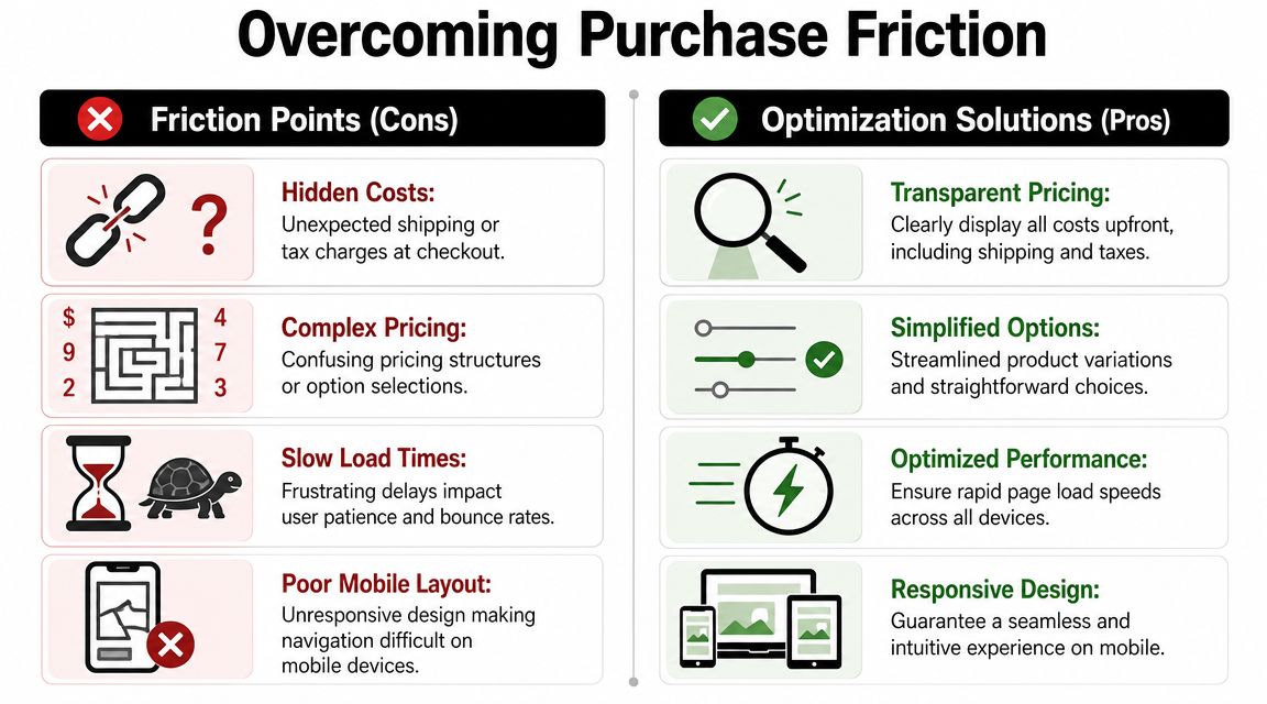
Late surprises kill intent. If a shopper learns about slow shipping, extra fees, or final-sale terms after they have mentally committed, many will leave and your ad click produces nothing.
I tell store owners to remove mystery before they add more persuasion. A clearer page usually beats a more clever one.
Remove surprises from the buying path. Surprise works in ads. It hurts at checkout.
What to fix on mobile first
For many stores, paid traffic lands on mobile first. That means mobile usability is tied directly to campaign performance, not just general site quality.
Focus on a short list of fixes:
- Thumb-friendly controls: Make buttons and variant selectors large enough to tap comfortably.
- Scannable layout: Use short paragraphs, bullets, and clear spacing so the page can be understood quickly.
- Fast-loading media: Compress product images so the page feels responsive and swiping through the gallery does not drag.
- Clear structure: Keep titles, images, price, options, description, and reviews in an order that feels predictable.
- Useful alt text and product data: Write descriptive alt text for accessibility and use structured product data so search engines can read price, availability, and ratings correctly.
These are not design trophies. They are conversion repairs.
If traffic is limited, this is usually where I start instead of with a full redesign. A cleaner mobile buying experience helps conversion rate now, and it also makes your ad tests easier to read later. When the page stops leaking buyers through basic friction, you can judge your campaigns on message and offer instead of on avoidable page problems.
Your First CRO Test Plan for Any Budget
If your store gets limited traffic, broad A/B testing is the wrong starting point. You don't need ten experiments running at once. You need one strong hypothesis tied to the part of the page people notice first.
Start with visible assets not big redesigns
Apple's Product Page Optimization in App Store Connect formalized this idea by letting developers test visible assets like screenshots, app previews, descriptions, and icons with built-in statistical analysis and Bayesian methods, rather than relying on opinion alone (Apple Product Page Optimization documentation). A related industry lesson for ecommerce is even more useful for low-traffic stores. MobileAction notes that for low-traffic pages, you should prioritize a few high-impact assets first, because smaller treatment counts and tighter hypotheses improve decision quality.
That's the key principle for beginner product page optimization. Test what the visitor sees before testing what they may never reach.
If your ad angle is “mess-free cooking,” don't start by testing footer icons or long-form specs. Test the hero image, headline, or first benefit block that either confirms or weakens that angle.
Here's the sequence I'd use for a new store:
- Match the hero image to the ad angle.
- Rewrite the title and first supporting line.
- Reposition or restyle the CTA if it's weak.
- Bring reviews or UGC closer to the decision point.
- Simplify options and reduce clutter around price.
Beginners CRO test plan
Use this as a working model. Keep one main change live long enough to observe direction before piling on another.
| Test Idea | Maps to Ad Angle | Effort / Budget | Primary Metric |
|---|---|---|---|
| Swap supplier image for customer-style in-use image | UGC | Low | Add to Cart rate |
| Rewrite product title around the main outcome | Problem to Solution | Low | Add to Cart rate |
| Add a short objection-handling review near the CTA | Social Proof | Low | Add to Cart rate |
| Change CTA copy and increase button contrast | Urgency or direct response | Low | Clicks on Add to Cart |
| Move key benefit bullets higher on the page | Problem to Solution | Low | Scroll depth and Add to Cart rate |
| Replace generic first paragraph with three benefit bullets | Identity or lifestyle | Low | Time on page |
| Simplify variant selection display | Practical buyer intent | Medium | Add to Cart rate |
| Add customer photos lower on the page | UGC | Medium | Purchase intent signals |
| Reorder sections so reviews appear before long specs | Social Proof | Low | Add to Cart rate |
A few rules keep this useful:
- Keep the hypothesis narrow: “A real-use image will align better with the ad and improve buying intent” is a better test than “make the page better.”
- Change one high-visibility element first: If results move, you'll know why.
- Use ad comments and click behavior as clues: If people keep asking the same question in ads, your page should answer it early.
- Don't redesign around low confidence: Sparse traffic produces noisy signals. Small, sequential changes are safer.
New stores often waste money. They scale ads before they've built a page that can absorb paid traffic. A solid page doesn't guarantee winning campaigns, but it makes your tests readable. That alone is a major advantage.
From Optimized Page to Profitable Ads
Product page optimization isn't a side task you get to after ads start working. It's the thing that gives your ads a fair chance to work at all.
A profitable setup usually looks simple. The first screen explains the offer fast. The copy sells outcomes instead of features. Reviews and customer proof reduce doubt. Price, mobile usability, and load experience don't get in the way. Then you test visible elements in a clear order that matches the angle used in the ad.
That's what makes paid traffic easier to manage. You stop guessing whether the problem is the creative, the audience, or the page. You tighten the handoff between ad promise and product-page reality.
If you're a new store owner, don't try to perfect everything. Fix the first screen. Strengthen the proof. remove friction. Then test one meaningful change at a time.
If you want a faster way to turn a product URL into an ad plan, landing page fixes, and budget-aware creative tests, try Social Loop AI. It's built for first-time dropshippers and new ecommerce owners who want a practical path from product page optimization to launch-ready Meta ads without hiring an agency.