Blog
Social Proof Ads: A Beginner's Guide to Meta Campaigns
Published June 8, 2026
You've got a product page, a handful of decent photos, and a Meta Ads Manager tab open that feels more expensive every minute you stare at it.
Most new store owners freeze. The product might be solid, but the ad still has to answer the question every cold prospect is asking: “Why should I trust this from a brand I've never heard of?” A clean image helps. A discount can help. Neither does the heavy lifting on its own.
That's where social proof ads come in. Think of them like a movie trailer for trust. Instead of asking strangers to believe your claims, you show them other people reacting, buying, reviewing, using, and validating the product in ways that feel real. For a new eCommerce brand with a small budget, that's often the shortest path from “interesting” to “I'll give it a shot.”
Table of Contents
- Why Your Ads Need More Than Just a Good Photo
- How to Source Social Proof When You Have None
- Turning Raw Reviews into High-Converting Ads
- Your Simple Social Proof Ad Testing Framework
- Make Your Landing Page Ready for Visitors
- Reading the Results and Scaling What Works
Why Your Ads Need More Than Just a Good Photo
A lot of first campaigns fail for a simple reason. The brand is talking about itself before it has earned the right to.
A founder uploads a sharp product image, writes “premium quality” in the primary text, adds a shop now button, and hopes the algorithm finds buyers. Cold traffic doesn't work like that. People scrolling Instagram or Facebook don't know you, don't know your standards, and don't care what you call premium. They care whether anyone like them has tried the product and come away happy.
That's why social proof ads outperform plain product-first creative so often. They shift the message from “trust us” to “see what happened when other people bought.” According to Genesys Growth's summary of social proof conversion data, products featuring reviews can see a 270% higher purchase likelihood, and video testimonials are associated with an 80% increase in conversion rates.
Those aren't small lifts. They tell you something important about buyer behavior. Validation from other people is not decorative. It changes how a product feels.
Practical rule: If your ad has to do all the persuading alone, it's working too hard.
Think of a plain product photo as the box art. It shows the item. Social proof is the scene where someone opens the box, uses the product, and tells you whether it delivered. For a new store, that borrowed credibility matters because you don't yet have brand equity to lean on.
The good version of a social proof ad doesn't look like chest-thumping. It looks like evidence. A customer saying the fabric held up after washing. A short video showing how the organizer fits in a small apartment. A review that answers the exact objection a cold prospect has in their head.
That's the job. Not louder claims. Better proof.
How to Source Social Proof When You Have None
The hardest part about social proof ads is obvious. You need proof before you can advertise with it.
New stores usually make one of two mistakes here. They either wait passively for reviews to appear, or they rush into using weak praise like “love it” and “great product.” Neither gives you much to work with. You need a small system that pulls out specific, believable details.
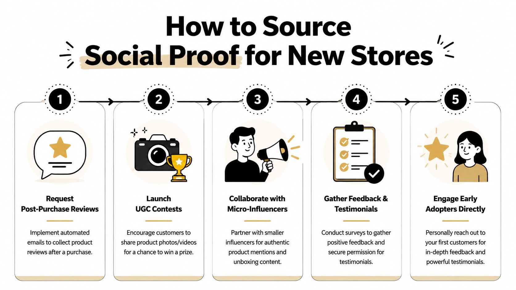
Start with the buyers closest to the product
Your first usable proof usually won't come from a huge customer base. It comes from the people closest to a purchase or closest to your niche.
Start with these groups:
- Recent buyers: These are the easiest win. Best practices summarized by Taggstar's guide to social proof collection recommend asking for reviews 5–10 days after delivery and following up about a week later.
- Friends of the brand, used carefully: If someone genuinely used the product, their feedback can help you identify language and objections. Don't present friendly freebies as broad customer consensus.
- Micro-creators and small niche pages: Send product to people who already make content in your category. You're not buying celebrity influence. You're trying to get honest demonstrations, unboxings, and reactions.
- Early adopters who replied to email or DM: If someone already told you they liked the product, ask permission to turn that into a testimonial with a bit more detail.
If you need ideas for encouraging customers to make content, this guide to a user-generated content strategy is a practical next step.
Ask for specifics, not praise. “What changed after using it?” beats “How much did you love it?”
Use prompts that pull out usable detail
Most customers won't write a strong testimonial on their own. That isn't because they disliked the product. It's because they don't know what kind of answer helps you.
Give them prompts. Good prompts make social proof more concrete and less generic.
Try a short email like this:
Subject: Quick question about your order
Hey [First Name], hope your [product name] has arrived and you've had time to try it.
I'd love to hear how it's going. A quick reply is perfect.
- What were you hoping this would help with?
- What stood out once you used it?
- Did anything surprise you about the fit, feel, setup, or result?
- Would you be okay with us using your feedback in our ads or product page?
Those questions line up with what you'll need later. Fit. Use case. Outcome. Before and after. Surprise. Skepticism removed.
Create a tiny repeatable collection system
You do not need a fancy stack to do this. A spreadsheet and a folder will do.
Use a simple workflow:
- Send the first review request after delivery. Keep it short and direct.
- Follow up a week later. People often need the reminder more than the incentive.
- Tag each response by theme. Examples: quality, comfort, fast setup, solved problem, giftable, worth the price.
- Save screenshots and permission status. Don't hunt for this later when building ads.
- Collect photos and short clips separately. A written review and a selfie-style video serve different ad jobs.
A small store owner should think of this like stocking shelves. Every useful review is inventory for future ads. A quote about comfort works on one product page. A clip showing setup might work in Reels. A comparison-style testimonial may become your best objection-handling creative.
Here's what usually doesn't work:
- Generic praise: “Amazing product” says almost nothing.
- Overwritten testimonials: If it sounds like ad copy, buyers will distrust it.
- Irrelevant feedback: A nice comment that doesn't match your target buyer often underperforms.
- Claims you can't support: Keep proof authentic. Don't inflate, rewrite, or force certainty where it doesn't exist.
The first goal isn't volume. It's a few strong, specific proof assets you can reuse in multiple ways.
Turning Raw Reviews into High-Converting Ads
A good review is raw material, not a finished ad.
Most founders make the mistake of dropping a full testimonial onto a creative and calling it done. That's like dumping ingredients on a plate and calling it dinner. The ad still needs structure. It needs a hook, a visual job, and one clear takeaway.
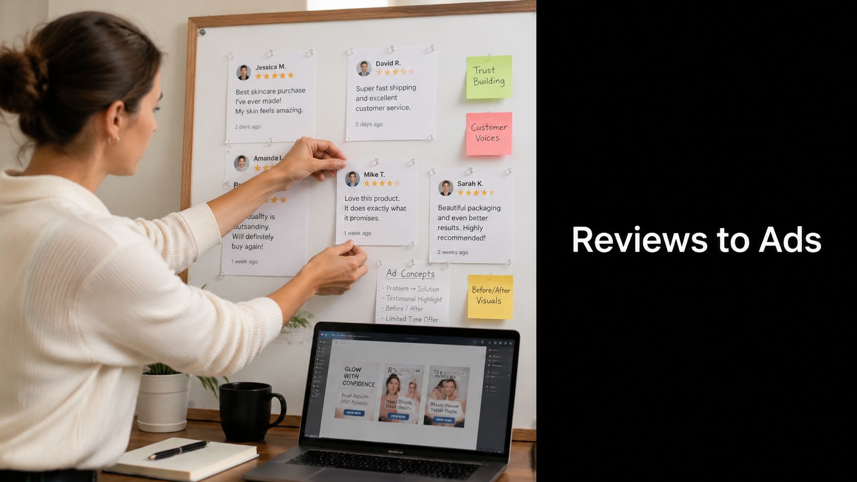
According to WiserReview's social proof statistics roundup, 98% of people read online reviews at least sometimes, and ads that feature customer reviews can achieve up to 4x higher click-through rates. That matters because it turns reviews from a nice-to-have website element into a legitimate paid media input.
Pick one job for each ad
Don't ask one ad to prove everything.
A social proof ad should usually do one of these jobs:
| Ad job | What the review should prove |
|---|---|
| Remove skepticism | “I didn't expect much, but…” |
| Confirm quality | Material, durability, finish, consistency |
| Show ease of use | Setup, sizing, routine, portability |
| Clarify fit | Who it's for, where it works, when it helps |
| Validate outcome | What changed after use |
If a customer writes, “I was worried it would feel cheap, but it feels sturdy and looks way better in person,” that's not a general brand testimonial. That's a quality validation ad.
If another customer says, “I used it right out of the box and had it running in minutes,” that's an ease of use angle.
Strong social proof ads don't just show praise. They answer a question the buyer already has.
Three easy formats you can build fast
You do not need an agency or editing team for this. You need repeatable formats.
1. Review over lifestyle image
Use a product-in-use photo. Pull one short line from the testimonial. Keep the overlay readable. Add the customer's first name and city only if you have permission and it strengthens credibility.
Formula:
- Image of product in context
- One review sentence
- Small header like “What customers say”
- Short primary text that frames the objection
2. UGC clip with text overlays
Take a customer video, creator seeding clip, or simple phone recording. Add subtitles and one or two review callouts on screen. Think of this like a low-budget trailer. Show the problem, show the product, show the reaction.
A quick example:
- Hook text: “I thought this would be another overhyped organizer”
- Clip of opening package
- Clip of using product
- Overlay: “It made my desk feel usable again”
If you want help tightening the message around this kind of creative, this walkthrough on how to write ad copy is useful.
Write copy that frames the proof
Your primary text doesn't need to repeat the review word for word. Its job is to set it up.
A few simple templates:
- Skepticism opener: “If you've been burned by cheap versions of this before, this is the part to pay attention to.”
- Use-case opener: “For small apartments, this is the kind of feedback that matters.”
- Outcome opener: “The best part of this product isn't the feature list. It's what people say happened after they started using it.”
Add your second media asset when you need to show rather than tell:
A few copy rules keep these ads believable:
- Shorten without changing meaning: Clean up filler words, but don't distort what the customer said.
- Use direct language: “Fits my narrow feet” is stronger than “excellent experience.”
- Lead with the strongest phrase: Put the most specific proof on the image or in the first seconds of the video.
- Match the visual to the claim: Don't talk about fit while showing packaging. Show the product being worn or used.
The founder advantage here is speed. You can build three to five versions from one good review by changing the job of the ad, the opening line, and the format. That's how you get a real test batch without needing ten different customers on day one.
Your Simple Social Proof Ad Testing Framework
Most beginners don't lose money because they tested too much. They lose money because they tested in a messy way.
They launch one campaign with too many variables, turn settings on and off every few hours, and never learn whether the ad worked because of the audience, the proof, the hook, or pure luck. A small budget needs structure more than scale.
Build one clean campaign
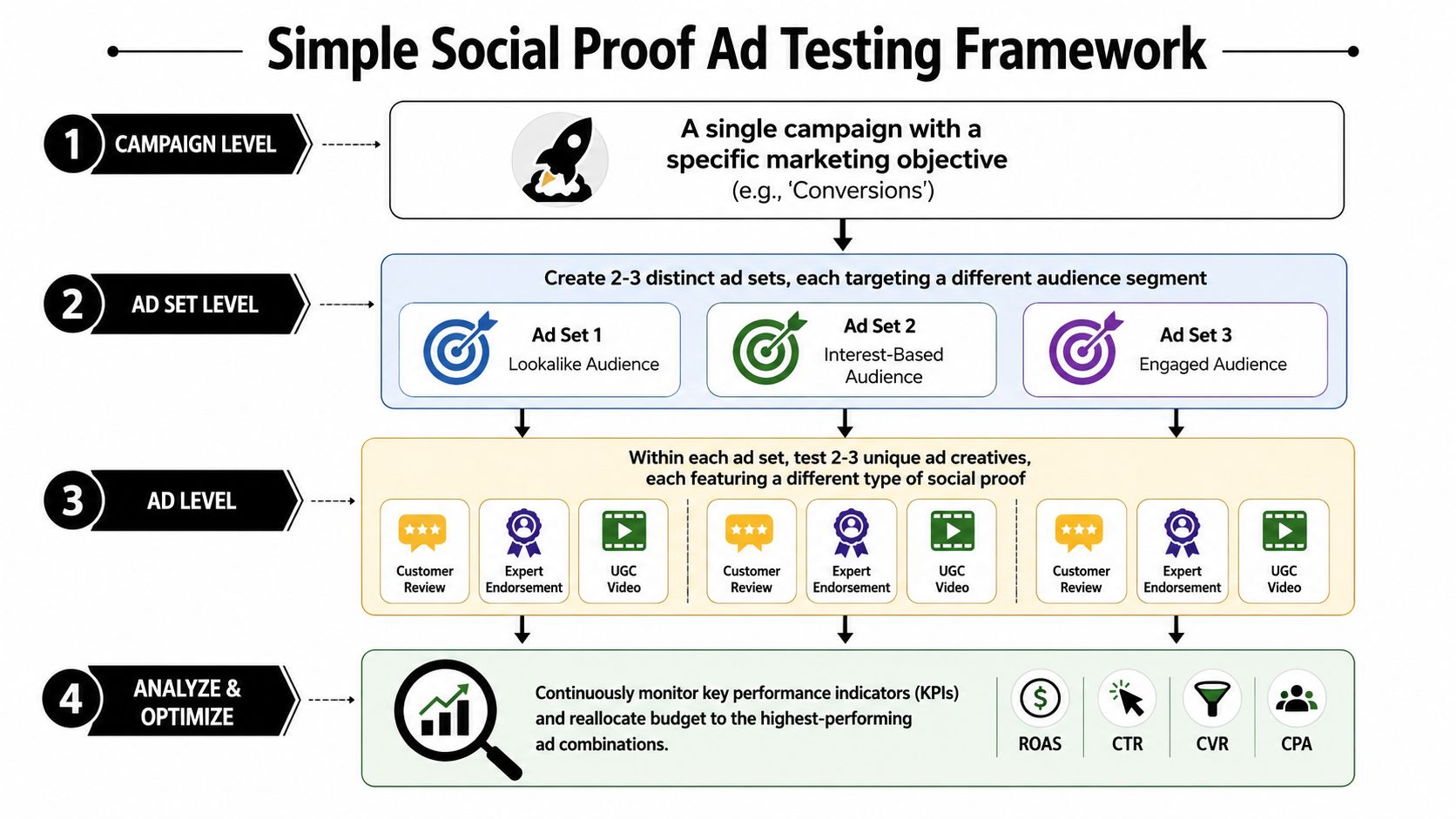
Keep the setup simple. One campaign. A small number of ad sets. A few ads inside each.
A practical beginner structure looks like this:
- One campaign objective: Pick the outcome closest to the action you want. Don't bounce between goals because you're nervous.
- Two or three ad sets: Each ad set should represent a different audience segment or buying context.
- Two or three ads per ad set: Each ad should use a distinct proof angle, not random creative variation.
The reason this works is straightforward. Scube Marketing's recommendations on social proof advertising emphasize segmenting audiences, matching proof type to each segment, and A/B testing those combinations. That targeted approach is reported to increase conversion rates by up to 15% when executed well.
Match proof to the audience
Generic testimonials usually underperform because they don't connect to the reason someone is considering the product.
Think in pairs:
| Audience type | Social proof that usually fits |
|---|---|
| Cold shoppers | Reviews that remove skepticism or prove legitimacy |
| Problem-aware buyers | Testimonials focused on the pain solved |
| Style-driven buyers | UGC showing how the product looks in real life |
| Practical buyers | Reviews about setup, durability, and value |
| Retargeting traffic | Stronger proof like detailed testimonials or creator demos |
If you sell a posture corrector, a cold audience might respond to “I was skeptical but noticed the difference after wearing it at my desk.” Retargeting traffic might need a fuller demonstration showing comfort and daily use.
Field note: Don't test “better creative” against “worse creative.” Test different proof angles that answer different buyer objections.
What to change and what to leave alone
When budgets are tight, clean tests beat clever tests.
Change one layer at a time:
- Change the proof angle: quality, problem solved, fit, ease, result.
- Change the format carefully: static review card versus UGC clip.
- Change the opening line: not the whole message stack at once.
Try not to change everything together. If you swap audience, copy, creative style, and landing page all at once, the result won't teach you much.
A beginner-friendly checklist:
- Name ads by angle. “Quality review static” is better than “Ad 3 final final.”
- Use broad enough placements to give delivery room. Don't overcontrol unless you have a clear reason.
- Avoid stuffing every testimonial into one ad. More proof isn't always better.
- Let the test breathe. Constant edits reset your read on what's unfolding.
- Keep notes outside Ads Manager. Track which review, angle, and objection each ad represents.
One overlooked point: the ad set shouldn't just represent a targeting idea. It should represent a hypothesis. For example, “This audience cares most about quality validation” is a usable hypothesis. “Women 25 to 44” is only targeting.
That mindset matters because it keeps you from treating social proof like decoration. You're not just adding reviews. You're testing which kind of proof closes doubt fastest for each slice of traffic.
Make Your Landing Page Ready for Visitors
A social proof ad can earn the click and still lose the sale.
This happens all the time. The ad shows a real customer quote about comfort, durability, or ease. The shopper clicks through. Then they land on a product page that feels bare, slow, or disconnected from the promise that got them there. That gap kills momentum.
Keep the message match tight
Your landing page should continue the same argument the ad started.
If the ad leads with “I thought it would feel flimsy, but it's surprisingly sturdy,” the product page should not force the visitor to hunt for confirmation. Put proof near the top. Keep the headline, images, and supporting copy aligned with the objection you just addressed.
The easiest way to think about this is handoff. The ad opens the door. The product page shouldn't make the visitor restart the conversation.
Five fixes to make before you spend
These are the fixes I'd make on almost any early-stage Shopify or WooCommerce product page before running social proof ads:
- Move proof closer to the buying area. Put reviews, testimonial snippets, or trust-building cues near the Add to Cart button.
- Repeat the ad's strongest claim in page language. If the ad is about fit, your page needs fit guidance and proof nearby.
- Use real customer wording. Product pages often sound polished but empty. Customer phrases tend to feel more grounded.
- Show the product in context. Studio shots are fine. In-use visuals answer more buying questions.
- Reduce obvious friction. Make shipping info, returns, sizing, and key FAQs easy to find.
If you want a stronger checklist for this stage, these best practices for landing pages are worth reviewing before launch.
The ad makes a promise. The page has to prove it fast.
The page doesn't need to be fancy. It needs to feel consistent, believable, and easy to buy from. A simple product page with visible reviews, clear benefits, and obvious next steps will usually beat a prettier page that feels vague.
One more practical note. Don't bury your strongest testimonial halfway down the page. Above the fold gets attention, but the area around price, variant selection, and Add to Cart is where reassurance often matters most. Put proof where hesitation happens.
Reading the Results and Scaling What Works
Once the ads are live, your job changes. You stop acting like a copywriter and start acting like a detective.
The numbers in Ads Manager are not just performance metrics. They're clues about whether your proof is doing its job. A social proof ad can attract clicks, calm hesitation, or fail in subtle ways depending on what kind of signal it sends.
Read the story behind the click
Start with the basic questions behind the metrics.
If one ad gets strong click interest but weak purchase follow-through, the proof probably did enough to earn curiosity but not enough to support the sale. That can point to a landing page mismatch, a weak offer, or proof that feels interesting without feeling persuasive.
If another ad gets fewer clicks but converts better once people land, the signal may be more believable and better matched to buyer intent. That's often the kind of ad worth protecting and iterating around.
Look at your results through these lenses:
- Click behavior: Which proof angle makes people stop and want to learn more?
- On-site behavior: Which angle brings visitors who behave like buyers, not browsers?
- Purchase quality: Which testimonial or format seems to attract the right customer?
- Comment quality: Are people asking genuine questions, or are they calling the ad fake, confusing, or overhyped?
A social proof ad can produce mediocre top-line numbers for a good reason too. Sometimes highly specific proof appeals to a narrower but better audience. That's why you read the full pattern, not one metric in isolation.
How to scale without getting sloppy
When you find a winner, don't instantly rebuild everything around it.
Scale in a controlled way:
- Keep the winning angle intact. Don't rewrite the core message just because it worked.
- Create close variants. Test a new hook, a different crop, or a UGC version of the same proof.
- Expand audience carefully. Move the same angle into a neighboring audience type.
- Improve the destination. If the ad is clearly working, the next lift often comes from the product page.
- Refresh before fatigue turns obvious. Build new creative from the same proof theme while the original still has momentum.
A useful habit is to separate scaling decisions from creative excitement. Just because a new ad looks cleaner doesn't mean it earned the right to replace the current winner. Let proof, not preference, drive the next move.
Scale the message that worked. Then test new packaging around that message.
When social proof hurts instead of helps
This is the part most beginner guides skip. Social proof is not automatically positive.
EmberTribe's discussion of social proof ad performance tradeoffs makes an important point: social proof can hurt performance if it's weak or generic. The quality of the signal matters more than the volume, and testing should determine whether a small, highly relevant proof cue beats a louder but less believable one.
That shows up in real campaigns in a few familiar ways:
- The testimonial is too vague. “Love it” doesn't lower doubt.
- The claim feels inflated. Overhyped wording triggers skepticism.
- The proof doesn't match the audience. A warm audience testimonial may not persuade cold traffic.
- The signal feels small or awkward. Low-confidence proof can draw attention to the lack of stronger validation.
- The comments look spammy or low trust. Even good creative can lose credibility fast.
If an ad underperforms, don't assume you need more social proof. You may need better proof. A short, sharp line about one specific outcome often does more than a crowded collage of generic praise.
The best founders I've seen treat social proof like ingredients, not wallpaper. They collect it deliberately, sort it by objection, test it in clean ways, and keep only what holds up under scrutiny. That's why their ads improve over time instead of just getting louder.
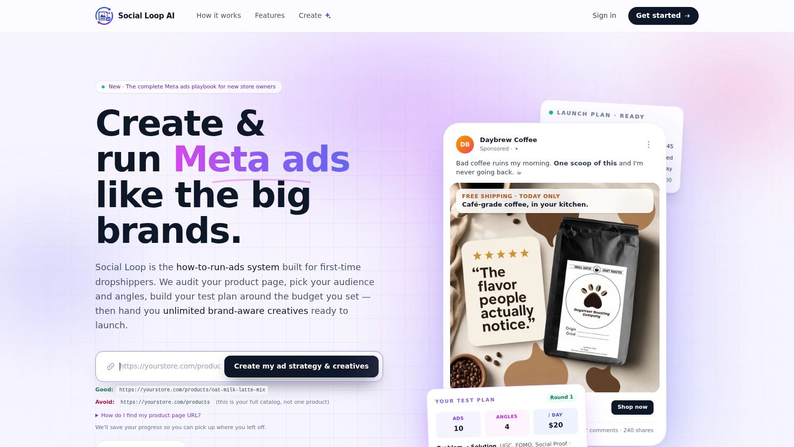
If you're launching your first Meta campaigns and want a faster way to turn a product URL into angles, creatives, landing-page fixes, and a practical testing plan, Social Loop AI is built for exactly that. It helps new eCommerce founders create ad-ready social proof concepts and run a more disciplined launch without hiring an agency.