Blog
10 Static Ads Examples That Convert for Dropshippers 2026
Published June 6, 2026
You launch the store on Friday night. By Sunday, the product page has a few visits, no sales, and a folder full of ad ideas that all look half-finished. You could wait until you have polished video creative, better footage, and a cleaner brand kit. New dropshippers usually do not have that luxury. They need a fast way to test whether the offer, hook, and audience angle have any chance of working.
Static ads are often the best starting point because they strip the job down to the parts that matter early on. Can the image stop the scroll? Does the headline communicate one clear outcome? Does the offer match the audience's level of awareness? If a still image cannot earn attention, a more expensive video usually will not save a weak angle.
That is a primary use of static ads. Speed, message clarity, and cleaner testing.
This article is not a swipe file of nice-looking creatives. Each static ads example below is a blueprint you can use to build tests around angle, audience, and buying psychology. The goal is to show what the ad is doing, why it works, where it breaks, and how to adapt it for a beginner-friendly store without guessing.
That matters because ad creative does not fail only inside the ad account. A strong ad can still collapse if the click lands on a weak product page, so tighten the offer, proof, and mobile layout with this guide to product page optimization for ecommerce conversions before scaling spend.
You will also see practical ways to turn each format into repeatable tests. Use one base concept, swap the hook, change the proof element, and match the visual to a different audience segment. If you are using a tool like Social Loop AI, that process gets faster. You can generate multiple static variations from one product angle instead of starting from zero every time.
The win for a new dropshipper is simple. Get signal fast, keep production light, and learn which message deserves more budget.
Table of Contents
- 1. Product-Centric Hero Shot
- 2. User-Generated Content UGC / Testimonial
- 3. Problem-Solution Text Overlay
- 4. Social Proof / Review and Rating Badge
- 5. Lifestyle / Aspirational Context
- 6. Limited-Time Offer / FOMO
- 7. Comparison / Before-and-After
- 8. Identity / Community Badge
- 9. Educational / How-To Infographic
- 10. Carousel Ad Frame Multi-Product or Story Arc
- 10 Static Ad Formats Compared
- Your Turn How to Systemize Your Ad Creative Process
1. Product-Centric Hero Shot
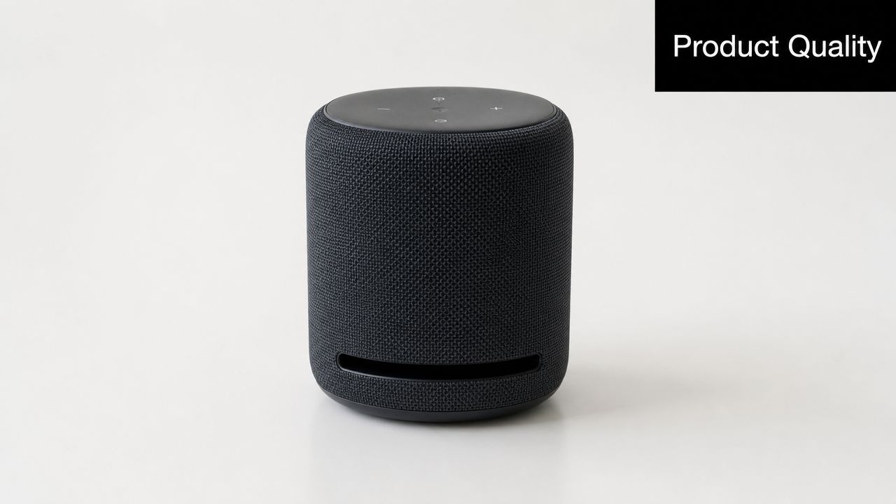
If you're selling something visually obvious, start here. A hero-shot static works when the product itself is the hook. Think Allbirds showing the shoe clearly, Glossier using clean flat-lays, or Dollar Shave Club putting the product front and center without making the frame busy.
This is one of the best static ads examples for new dropshippers because it answers the first question in the feed fast. What is it? If the viewer can't tell in a second, the ad gets skipped.
When this format wins
Use a high-contrast background, keep the product large, and add only a few words. For a posture corrector, that might be “Straighten posture.” For a portable blender, “Blend anywhere.” Short copy beats clever copy here.
A few strong tests:
- Background test: White background versus saturated brand color.
- Hand presence test: Product alone versus product in someone's hand.
- Text density test: No overlay versus one sharp benefit line.
Practical rule: If the product needs a paragraph to explain, the hero shot usually isn't your first test. Run problem-solution or educational first.
For mobile feeds, the product should dominate the frame. A lot of beginners shrink the product so they can fit in extra text, fake badges, and a logo. That usually weakens the ad because the eye doesn't know where to land.
If you're using this format, tighten the landing page too. The click only pays off when the product page repeats the same promise and visual hierarchy. That's where a product page optimization workflow for ecommerce ads helps, especially if your ad promise and product page headline don't match.
Copy-paste micro-template:
- Headline on image: Waterproof. Lightweight.
- Primary text: Meet the everyday bag that handles commute, gym, and travel without looking bulky.
- CTA angle: Shop the clean carry option.
2. User-Generated Content UGC / Testimonial

Polished brand photography can look expensive. It can also look easy to ignore. UGC stills work because they feel closer to a recommendation than a campaign.
That matters most when the buyer doesn't trust your store yet. A skincare jar in a founder-grade Shopify store feels risky. The same jar in a real customer's hand, with a short quote and an ordinary kitchen background, feels more believable.
What to borrow from winning UGC stills
Fashion Nova, Hoka, and Skims all benefit from this pattern. The common thread isn't celebrity. It's context. The customer looks like they use the product.
Use these ingredients:
- Real photo energy: Slightly imperfect framing often works better than studio perfection.
- Short proof line: Keep the quote tight, like “Stays on all day.”
- Visible trust cue: A small review badge or “customer favorite” note can help if it's true.
I'd avoid cramming too much text onto the image. One quote, one product, one face. That's enough. If the image becomes a screenshot collage, it starts to look like spam.
The best UGC static doesn't feel under-produced. It feels unforced.
New dropshippers usually don't need influencers first. They need believable usage photos. Ask early customers for images, offer simple prompts, and get clear permission before using anything in ads. If you need a repeatable workflow, this guide on how to make UGC for ads and product marketing is the right place to start.
Copy-paste micro-template:
- Quote on image: Didn't expect to love this.
- Primary text: She wanted something simple, easy to use, and giftable. This was the one she kept reaching for.
- CTA angle: See why customers reorder it.
3. Problem-Solution Text Overlay
A new dropshipper launches a clean-looking ad for a pet hair remover. Nice product photo. Soft brand colors. No clicks. Then the next version calls out the actual irritation, “Pet hair all over the couch?” and shows the clean result right beside it. That version usually has a better shot because it meets the buyer at the point of frustration.
This format works best for products bought to fix an annoyance, save time, reduce mess, or avoid embarrassment. Lint removers, cable organizers, leakproof lunch boxes, posture tools, under-seat car organizers, drain catchers. The visual does not need to be beautiful first. It needs to be instantly clear.
The job of the static is simple. Name the problem fast, show the fix fast, make the buyer feel understood.
Build the ad around one angle
New advertisers often cram four promises into one image. Better posture, less pain, premium materials, free shipping, eco-friendly. That usually weakens the hook. Run separate creatives by angle so you can see what pulls.
Use angle clusters like these:
- Pain: Pet hair on every surface
- Time: Clean up faster before guests arrive
- Embarrassment: Stop apologizing for the mess
- Waste reduction: Stop buying disposable refills
That gives you a testing structure, not just a design idea. Social Loop AI can speed this up by turning one product into multiple angle variations, so you are testing messages instead of manually rebuilding the same ad in Canva ten times.
What to put on the image
Keep the layout tight:
- Top line: The problem in 3 to 7 words
- Center visual: The product in use, or the solved state
- Bottom line: Short payoff or CTA
Readable beats clever here. If the buyer has to study the image, you already lost the scroll stop.
A few hooks worth testing:
- Pet hair on everything?
- Stop tangled cords fast
- Lunch box leaks again?
- Keep your tote organized
- No more crumbs in car seats
Notice the pattern. Specific problem. Plain language. No vague lifestyle copy.
Generic lines like “Improve your routine” or “Upgrade your life” rarely convert in this format because they ask the buyer to do the interpretation work. The ad should do that work for them.
Copy-paste micro-template
- Overlay: Tired of cords all over your desk?
- Primary text: This cable organizer keeps chargers, headphones, and work cords in one spot so your setup stays usable.
- CTA angle: See the clean-desk fix
One more practical trade-off. If the problem visual is too gross, too messy, or too aggressive, it can hurt clicks even if the angle is right. Call out the pain clearly, but keep the solved outcome more prominent than the chaos. That balance usually gets better results than a pure fear-based creative.
4. Social Proof / Review and Rating Badge
This format is for skeptical buyers. The product might look good, but the buyer still wants proof that someone else took the risk first.
Think of the familiar ecommerce card style. Product image, star graphic, short review line, maybe a “best seller” or “seen in” note if it's real. Wayfair-style product cards, Amazon-like review framing, and beauty brands using customer quotes all fit here.
What belongs on the image
A strong social proof static usually includes three elements only:
- Product visual: Keep it obvious and centered.
- Proof cue: Rating badge, short testimonial, or press mention.
- Buying nudge: “Shop customer favorite” or “See why buyers switch.”
Don't overdo badges. If the image has stars, trust icons, logos, discount labels, and a founder signature, none of it feels trustworthy anymore. Social proof works when it reduces hesitation, not when it looks assembled in Canva five minutes before launch.
This angle tends to work well for warm traffic, especially site visitors who already saw the product once. They don't need a full explanation anymore. They need a reason to believe.
Buyers don't read every review in the ad. They scan for enough credibility to justify the click.
A simple example for a kitchen gadget:
- Overlay: Loved by home cooks
- Small quote: “Use it every week”
- Primary text: The tool people keep buying because it saves counter space and cleanup time.
5. Lifestyle / Aspirational Context

A product shot sells the object. A lifestyle image sells the version of the buyer who owns it. That's the difference.
Gymshark, Lululemon, Away, and Glossier all lean on this logic. The product is still visible, but the underlying message is identity, environment, and emotional payoff. The leggings aren't just leggings. They're discipline, momentum, routine. The travel bag isn't just storage. It's movement and competence.
The identity shift
Use lifestyle creative when the after-state matters more than the mechanism. A candle brand can sell calm. A bag brand can sell readiness. A water bottle can sell consistency.
The trap is making the scene prettier than it is persuasive. If the product disappears into the photo, the ad becomes an aesthetic post instead of a sales asset. Keep the product visible and choose a setting that connects to the buying reason.
Recent independent guidance says static ads work best when the message is simple, the action is immediate, and the image delivers one idea at a glance. The same review also notes a trend toward bold fonts, more visible layouts, colorful backdrops, and even text-heavier creative in Facebook ads. That's useful here. Lifestyle doesn't have to mean minimal.
Try these variants for the same product:
- Confidence mood: Person using the product in a clean, capable routine.
- Community mood: Product shown in a shared activity.
- Calm mood: Product placed in a slower, more restorative environment.
For a crossbody bag, don't just show the bag on a table. Show someone moving through the exact day your buyer wants. Commute, errands, coffee, train, gym. The image should answer, “What kind of life does this fit into?”
6. Limited-Time Offer / FOMO
A buyer clicks, likes the product, then leaves to “come back later.” That later often never happens. A deadline gives that buyer a reason to decide now, which is why this format works so well for new dropshippers who already have interest but weak conversion.
FOMO ads are not decoration. They are decision accelerators. The job is simple: show the product, make the offer impossible to miss, and give a believable reason the window closes.
Make urgency specific
Generic pressure kills trust fast. “Ends tonight” repeated every week trains buyers to ignore you. Real urgency has a concrete structure behind it, and the creative should show that structure in one glance.
Use one of these angles:
- Launch window: Early buyers get a bonus item or lower intro price.
- Seasonal cutoff: A summer color, holiday bundle, or giftable version is about to leave.
- Inventory pressure: Restocked now, limited batch available.
- Bundle deadline: Buy together before the bundle pricing expires.
For new stores, launch and bundle angles are usually the safest place to start. They create urgency without sounding desperate, and they are easier to support on the product page.
Make the offer line the largest text element in the ad. Put the product second. Put the logo last. If people cannot understand the deal in two seconds, the ad is too polite.
If you want a stronger framework for building this format, study these limited-time offer ads for ecommerce and model the same offer hierarchy in your own statics.
What to test first
This format is less about visual variety and more about offer clarity. I'd test the same image with three different urgency mechanics before I spent time making six new designs.
Try these first-pass variations:
- Discount version: 15% off through Sunday
- Bonus version: Free travel pouch with first orders
- Scarcity version: Back in stock, limited units left
- Bundle version: Save more when you buy the pair this week
That is the core angle here. This article is not a gallery of nice-looking ads. Each example should give you a blueprint you can repeat by product, audience, and buying trigger. A tool like Social Loop AI can help turn one product into multiple FOMO variants without rebuilding the concept from scratch.
Copy-paste micro-template:
- Image text: Free bonus ends tonight
- Primary text: You already looked at it. Today you get the extra item with your order.
- Headline: Claim your launch offer
- CTA angle: Buy before the bonus disappears
For a pet hair remover, test “Free lint brush with today's order.” For a kitchen organizer, test “Bundle price ends Sunday.” For a beauty tool, test “Restocked now, first batch ships this week.” Same format. Different trigger. That is how beginners build a usable static ad system instead of guessing.
7. Comparison / Before-and-After
Before-and-after statics can be brutal in a good way. They compress the whole sales pitch into one glance. Messy desk versus organized desk. Frizzy hair versus smoother hair. Dull sink versus polished finish.
This format works when the result is visible and the viewer can instantly decode the difference. If the outcome is abstract, the ad usually needs more context than one frame can carry.
Keep the comparison honest
Use matched framing when possible. Same angle, similar lighting, similar crop. If the “after” looks dramatically more professional than the “before,” buyers notice the manipulation even if they can't explain why.
For a home organization product, split-screen is often enough. Left side shows the everyday mess. Right side shows the cleaned-up result using the product. Add one plain line of copy like “From cluttered to reachable.”
A few comparison angles beginners can test:
- Before versus after: Best for beauty, home, cleaning, organization.
- Old way versus better way: Best for utility products.
- Generic version versus yours: Best when design differences are visible.
If the transformation isn't visible in the image, don't force a before-and-after ad. Use social proof or education instead.
Be careful with exaggerated promises. If your ad claims more than your store can support, the click quality drops and refund risk goes up. The best version of this format doesn't shout. It demonstrates.
8. Identity / Community Badge
Some products spread because people want to join the category around them. Not just buy the object. Wear the thing. Carry the thing. Post the thing. Signal membership.
That's why identity ads work well for apparel, wellness, outdoor gear, hobby products, and products with built-in tribe energy. Patagonia does this through values. Peloton does it through motivation and community language. Glossier built an entire aesthetic around belonging.
Community-first copy ideas
This format often looks simple. Product in use, subtle phrase, maybe a low-pressure badge line. But the copy has to know exactly who it's speaking to.
Try prompts like:
- Made for early risers
- For people who hate bulky gear
- Built for carry-on only travelers
- A favorite among weekend lifters
The product becomes a flag. The buyer clicks because the ad seems to understand how they see themselves.
What fails here is forced exclusivity. If your copy sounds like “only true elites understand this,” it gets cringey fast. Identity ads should feel welcoming, specific, and lightly tribal. Not arrogant.
A good example for a minimal everyday backpack:
- Overlay: For people who move light
- Primary text: Clean design, easy access, no extra bulk. Built for commuters who don't want a hiking pack on city streets.
- CTA angle: Join the carry-light crowd
9. Educational / How-To Infographic
A shopper sees your ad, understands the product in three seconds, and clicks because the next step feels obvious. That is the job of an educational static.
This format works best when the product needs a quick demo before it feels useful. Skincare tools, supplements, kitchen gadgets, organization products, and problem-solving home items all fit. The ad should answer one practical question fast: how do I use this, or why would I use this?
Teach one job clearly
Educational ads fail when founders try to cram the full product page into one image. Tiny text, six callouts, three icons, and a lifestyle photo usually kills response.
Keep it narrow. One use case. One routine. One visual path.
A good educational static usually has four parts:
- A headline that names the benefit or use case
- Two or three steps max
- A product image that matches the steps
- One short proof point or outcome
If you sell a facial ice roller, the ad can be as simple as:
- Headline: De-puff in 60 seconds
- Step 1: Chill
- Step 2: Roll upward
- Step 3: Use before makeup
If you sell meal prep containers:
- Headline: One container, three uses
- Use 1: Work lunch
- Use 2: Snack prep
- Use 3: Leftover storage
The trade-off is straightforward. More education can raise clarity, but every extra word makes the ad harder to scan. For cold traffic, keep the lesson shallow and visual. For retargeting, you can afford a little more detail because the shopper already knows the product exists.
What to test first
New dropshippers should test educational statics by angle, not by color tweaks.
Start with three versions:
- How it works: Show the steps
- When to use it: Morning routine, travel, gym bag, work desk
- Why it helps: Less mess, faster prep, easier storage, fewer steps
That gives you useful signal. If "when to use it" beats "how it works," your audience probably already understands the product and just needs context. If "how it works" wins, your product needs more hand-holding in the ad.
Copy templates you can reuse
Use these as quick overlays or headline starters:
- 3 steps to better [result]
- How to use [product] for [outcome]
- Your 30-second [routine]
- Use it here, here, and here
- Start with this simple routine
A practical example for a posture corrector:
- Overlay: 3 steps to better desk posture
- Primary text: Adjust the straps, wear it during focused work, and build the habit without overthinking it. Good for remote workers who slump by noon.
- CTA angle: See how it fits
This is also one of the easiest formats to systemize. Tools like Social Loop AI can turn one product angle into multiple educational variations by changing the headline, use case, and step order. That matters when you're testing a new store and need volume without designing every ad from scratch.
10. Carousel Ad Frame Multi-Product or Story Arc
A shopper clicks your product page, likes what they see, then leaves because they still have one unanswered question. A carousel helps you answer that question card by card without cramming everything into one image. For new dropshippers, that makes it useful for bundles, variants, and products that need a clearer buying path.
The format works best in two setups. Use a story arc if the product needs persuasion in sequence. Use a multi-product arc if the buyer already wants the category and needs help choosing the right option.
A simple story arc looks like this:
- Card 1: Hook the problem or desired outcome
- Card 2: Show the product clearly
- Card 3: Show the product in use
- Card 4: Add proof, review, or result
- Card 5: Give a reason to click now
That structure keeps each card focused on one job. It also gives you cleaner test data. If card one gets attention but card three loses interest, the issue is usually the use-case framing, not the offer.
For a catalog-style carousel, shift the sequence. Lead with the best-selling variant or bundle, then show the other options, then close with the use case or offer. This works well for skincare sets, kitchen tools, matching accessories, and products with clear color or size preferences.
Here is a practical example for a skincare bundle:
- Card 1: Breakout-prone skin?
- Card 2: Cleanser for daily reset
- Card 3: Serum for post-acne marks
- Card 4: "My routine finally feels simple"
- Card 5: Start the 3-step set
A key advantage is testing angles without rebuilding the whole ad from scratch. Keep the same product and swap the sequence by audience. For cold traffic, lead with the pain point. For warm traffic, lead with the bundle or result. For impulse buyers, test card one with an offer hook against a benefit hook.
Use these micro-templates to build faster:
- Card 1: Tired of [problem]?
- Card 2: Meet the [product]
- Card 3: Use it for [specific moment]
- Card 4: Loved by [customer type]
- Card 5: Shop [offer or bundle]
Or for multi-product carousels:
- Card 1: Pick your [routine/style/setup]
- Card 2: Option 1 for [use case]
- Card 3: Option 2 for [use case]
- Card 4: Best-seller or review
- Card 5: Get yours today
This is also one of the easiest formats to systemize. Social Loop AI can turn one winning angle into multiple carousel versions by changing the first-card hook, product order, audience label, and closing CTA. That helps new dropshippers test more creative territory without guessing or designing every variation by hand.
10 Static Ad Formats Compared
| Creative Type | Complexity 🔄 | Resources ⚡ | Expected outcomes 📊⭐ | Ideal use cases 💡 | Key advantages ⭐ |
|---|---|---|---|---|---|
| Product-Centric Hero Shot (E-commerce) | Low–Medium, simple composition but polish required | High, professional photography and staging | High CTR and clear product recognition; strong early conversion | Physical DTC products, dropshipping, new store trust-building | Clear product focus; scalable once winning creative found |
| User-Generated Content (UGC) / Testimonial | Medium, sourcing, permissions and curation | Low–Medium, low production cost, time to manage submissions | Very high trust and CTR; strong social proof lift | Beauty, fitness, repeat-purchase items, budget-conscious sellers | Authenticity and relatability; often outperforms brand shots |
| Problem-Solution Text Overlay | Low–Medium, copy-driven design testing | Low, simple design + strong copywriting | High for pain‑point audiences; cuts through ad noise | Pain-point products, cold audiences, objection-aware buyers | Direct value proposition; easy to iterate and test variants |
| Social Proof / Review & Rating Badge | Low, simple overlays on product image | Low, minimal design, needs real reviews | Moderate–High uplift in trust and conversions | Products with strong reviews, retargeting, credibility building | Quick credibility boost; easy to implement and update |
| Lifestyle / Aspirational Context | High, cohesive aesthetic and storytelling | High, photoshoots, models, styling and location | Strong brand affinity and long‑term ROI; emotional resonance | Premium/lifestyle brands, subscriptions, identity-driven audiences | Sells identity and aspiration; high shareability |
| Limited-Time Offer / FOMO (Fear of Missing Out) | Low, templateable urgency creative | Low–Medium, creative + accurate inventory data | Immediate conversion spike; short-lived effects | Flash sales, clearance, inventory moves, first-time buyer conversion | Drives fast purchases; measurable uplift in short term |
| Comparison / Before-and-After | Medium, requires controlled before/after documentation | Medium, sourcing validated transformation assets | High engagement and trust when results are tangible | Transformation products (beauty, fitness, home) | Visual proof of efficacy; reduces skepticism |
| Identity / Community Badge | High, strategic brand and audience alignment | Medium–High, community content and consistent messaging | Strong loyalty and advocacy over time; emotional connection | Mission-driven, community-focused, premium lifestyle brands | Builds belonging and brand differentiation |
| Educational / How-To Infographic | Medium, information design and factual accuracy | Medium, design work plus subject-matter input | Builds authority, engagement and shareability; educates buyers | Products needing instruction (tools, supplements, skincare) | Positions brand as expert; reduces purchase friction |
| Carousel Ad Frame (Multi-Product or Story Arc) | High, narrative planning and multiple assets | High, 3–10 quality cards, longer production timeline | Higher engagement and time-on-ad; supports multi-angle testing | Multi-product lines, routines, bundles, storytelling campaigns | Tells a full story; tests several value props in one ad unit |
Your Turn How to Systemize Your Ad Creative Process
You launch a new product on Monday. By Wednesday, you have one clean product image, one discount graphic, and no clear read on why sales are weak. That happens when creative is built ad by ad instead of as a testing system.
The fix is simple. Treat each static ad as one hypothesis about why someone buys. Then organize your tests by angle, audience, and objection. A product-centric ad tests clarity. A problem-solution ad tests pain awareness. A testimonial still tests trust. Once you frame creative that way, each result gives you direction instead of just a yes or no.
That matters most for new dropshippers because static ads are fast to produce and cheap to iterate. You can test buyer motivation before spending time on custom shoots, editing, or a bigger content workflow. The goal is not to find one pretty ad. The goal is to find the message that gets the click, the add to cart, and the sale.
Here's the workflow I'd use for a first launch:
- Pick 3 core angles. Start with product-centric, problem-solution, and UGC or social proof. These usually cover clarity, pain, and trust.
- Create 2 to 4 variants per angle. Change one major variable at a time: headline, image crop, proof element, call to action, or offer framing.
- Name each creative by hypothesis. Example: “Angle 1, pain relief,” “Angle 2, trust proof,” “Angle 3, giftable convenience.” This keeps reporting clean.
- Match the product page to the winning promise. If the ad wins on convenience, the first screen of the landing page should repeat convenience, not switch to discount language.
- Iterate winners before replacing them. If one angle is getting traction, make three more versions of that same idea before moving on to a new concept.
- Cut losers with a reason. Don't just say an ad failed. Log whether the issue was weak hook, weak proof, weak click quality, or weak landing page match.
A simple testing matrix keeps this organized:
- Angle: What buyer belief are you testing?
- Audience: Who is this version for?
- Visual: What image or layout carries the message fastest?
- Copy hook: What stops the scroll?
- Proof: What reduces skepticism?
- Offer or CTA: What gets the next click?
That is the key difference between an inspiration gallery and a usable creative process. The ten formats above are not there to give you design ideas. They are blueprints. Each one maps to a different stage of belief building, and each one can be turned into a repeatable test.
Here are a few copy-paste micro-templates to make that practical:
- Problem-solution: “Still dealing with [problem]? [Product] helps you [desired outcome] without [common frustration].”
- Social proof: “Rated highly by [customer type] who wanted [result].”
- Lifestyle: “For [identity], who want [outcome] without [trade-off].”
- Comparison: “Why buyers choose [product] over [old option].”
- FOMO: “Ends soon. Get [offer] before stock runs out.”
Social Loop AI helps turn that framework into output. You can start with a product URL, define the buyer, select the angles you want to test, and generate static ads built around specific objections and hooks. That saves time, but the bigger benefit is structure. New advertisers usually do not need more creative freedom. They need a repeatable way to produce variations that are tied to a clear testing plan.
Use the tool the same way a performance marketer would. Generate a batch around three angles. Launch them with clean naming. Review results by click quality, add to cart rate, and purchase intent signals, not just CTR. Then brief the next round based on what resonated.
That process is how small stores stop guessing. It is also how they get more value from a limited budget.
If you want a faster way to turn a product URL into angle-based static ads, test plans, and launch-ready copy, try Social Loop AI. It's built for first-time dropshippers and new ecommerce owners who need a practical Meta ads system, not another gallery of inspiration.